flux branding

What is “Blanding” and Why are So Many Brands Doing It?

If branding is about differentiation, then blanding is the exact opposite.

In the age of algorithms, it can be risky for brands to stand out. Here’s why: We’re always making judgments. It’s how we get through a world of infinite choices. We pick what looks better, safer, smarter, happier, or whatever we’re seeking.

As consumers, we base our choices on a gut feeling that’s almost unconscious. It’s intuitive. 

But in the age of social media, our opinions are constantly recorded. What you like on Instagram fuels an algorithm that attempts to reinforce your preferences with more related content. As your profile is continually expanded with more and more judgments, the content you’re shown is increasingly narrowed.

Branding is about differentiation– it’s about finding your distinct flavor.

But in the age of algorithms, it can be risky for brands to stand out too far from the pack. Aligning with peers has become a branding strategy. It may help reach audiences through social media.

The result is a homogenization of the brand landscape. It’s called blanding. 


What is blanding?

Text “the rise of BLANDING” on a pastel mint background

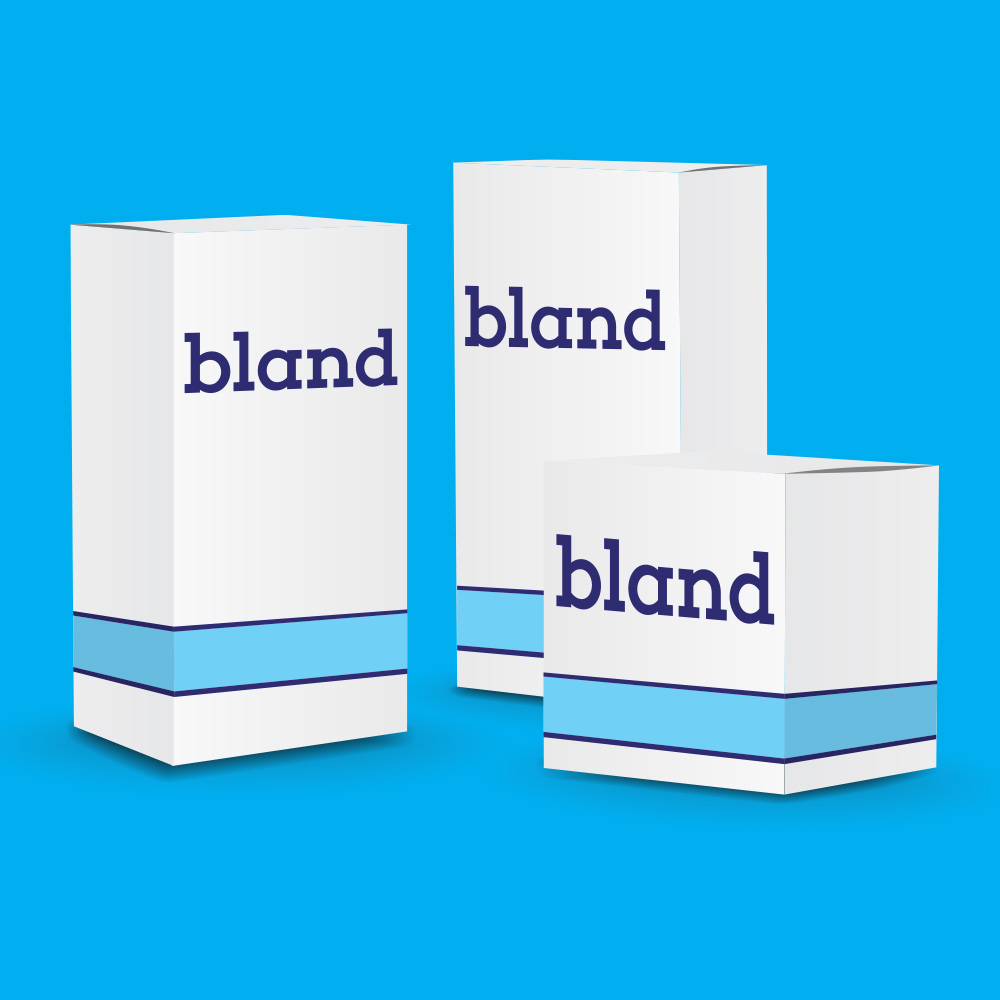
Blanding refers to the cross-market phenomenon of brands adopting similar minimalist aesthetic cues. 

Ruled by the dictum “less is more,” blanding is often embodied by the following branding elements:

  • Sans serif fonts
  • Clean lines
  • Limited color palette
  • Overall simplification

Blanding is a visual brand identity that’s: 

  • Controlled
  • Ahistorical
  • Flat

In the eyes of consumers, blanding branding efforts are often feel: 

  • Current
  • Agreeable
  • Sanitized

Blanding, by definition, is a move toward looking the same in an effort to feel familiar.

The style can be seen across all sectors, and major companies are hiring rebranding agencies to fit the new trend. But as a creative branding agency ourselves, it makes us ask the question:

If the point of branding is to express what makes you unique, why is blanding so popular?

Why are brands rebranding – or “reblanding”?

Collage of different pictures, and text: "Blands Play It Safe" superimposed on a pink background

History is constantly being reinterpreted through current norms. With the amplification of reactions through social media, brands are increasingly thinking about how today’s brand positioning will be received tomorrow. This is at the core of our branding methodology and all of the branding services we offer here at Flux.

And it’s a very valid concern.

The reach of online communications allows brands to reach wider audiences than ever before, but it also presents a danger. If the court of public opinion turns against you, reactions can trend globally.

The consequences can be disastrous.  

Strong brands have personalities. They take stands.

But it’s riskier to position yourself – you can’t be sure how your current message will age. With the eternal preservation of public posts, shares, and images on the internet, brands are becoming increasingly cautious about bold self-expression. More brands than ever have a brand reputation strategy and/or use reputation management services in order to keep their name pristine in the court of public opinion.


Blending in is the new “branding”

Blanding removes associations, attempting neutrality. As simple and streamlined as possible, a bland brand aesthetic leaves nothing that could alienate consumers now – or in the future. 

In the past few years, major luxury fashion houses have undergone this exact kind of blanding rebranding effort. Using all caps, san serif, and bold type, their new word marks are a blank slate. However, by removing all flourishes and references, they are erasing their own history.

Peter Saville, who rebranded the Burberry logo in 2018, said that he wanted the design to “look like it’s been there forever, but it’s still contemporary.” 

Blanding exists outside of a specific timeframe – they exist in a perpetual present. 

On the surface, there’s safety in simplicity. But as the luxury rebrands show, there’s also a danger: bland creative that doesn’t deliver a message or make a memorable impact. It’s just there, blending in with the rest. 
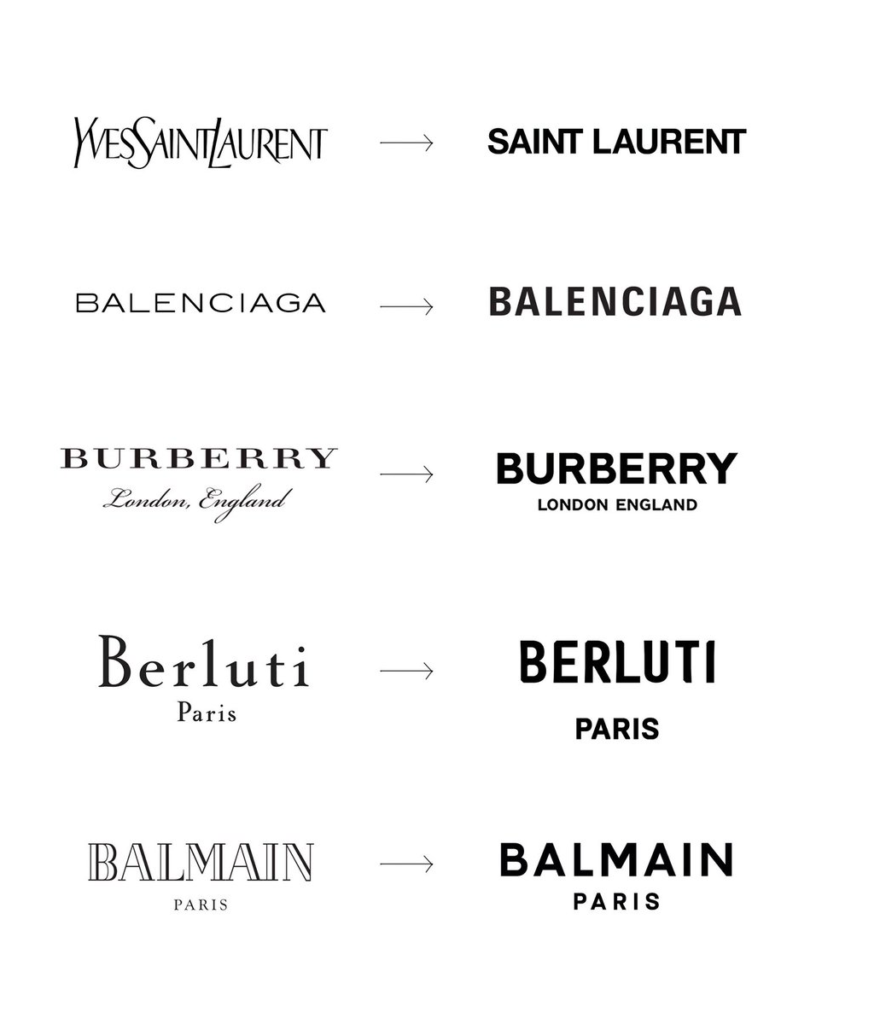
Famous fashion brands’ old vs new logos

Benefits of rebranding to bland

Text: “Bland Association™️” on a light blue green background

Blands all look the same, and that’s partly on purpose. Blanding is defined by a lack of historical references, but it’s also self-referential.

On one hand, simplification in your brand positioning can be bold.

Apple, Google, Uber, and other big tech companies are prime examples. They have strong, streamlined identities that match their strong, streamlined offerings. 

Their recognizable visual language:

    • Is associated with ease, improvement, and innovation
    • Is perceived as new and now
    • Makes you want to be a part of it

It’s no wonder that brands from across all industries have moved to align with this message. There has been an influx of rebranding efforts that resulted in a similarly minimal aesthetic. No doubt the idea is to intuitively communicate similar promises– we’re faster, newer, better, and easier.

It’s also easy for the aforementioned social media algorithms to group look-alike brands together, boosting visibility.
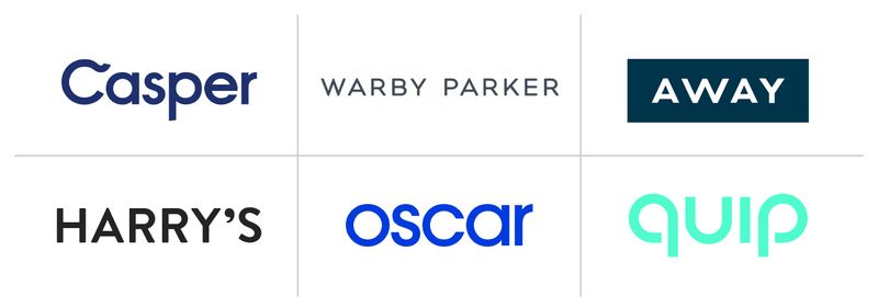
Look-alike brands’ logos on a white background

But this rebranding effort comes at the risk of being lost in a sea of sameness. 

Aligning with peers can be useful, but it can’t be the core of your brand identity. Your brand should ideally show why you’re unique – not how you’re the same as everyone else. 

Design is a powerful tool. But without a distinct personality, unique promises, and your specific set of values, there’s nothing for people to hold onto. Looks capture their attention, but it’s branding that inspires them to stay. 


Disadvantages of rebranding to bland

Collage of different quotes, and text: "THE SINISTER SIDE OF BLANDING" superimposed on an orange background

Blanding is a trend created by the power of visual associations

The minimalist design aesthetic has come to be a shorthand for particular messages, making it a powerful tool for intuitive communication. Its instant association with the tech industry evokes legitimacy and modernity. Meanwhile, its simplicity makes it non-threatening and easily digestible. 

It’s not just product brands that have taken notice.

Even conspiracy theorists are using the language of blanding, too. 

Aesthetic Instagram post using white and pink colors: an example of blanding

The Atlantic and Vox recently reported that misinformation associated with far-right conspiracy theories is being promoted by parenting, fitness, and lifestyle influencers on Instagram. With pastel colors, flat aesthetics, and clean lines, influencers are using blanding to normalize otherwise radical ideas. It’s a major rebrand that plays on established visual references to change judgments. 


But looks only go so far.

No matter what you’re selling or saying, looking streamlined, simple, and innovative won’t be enough to inspire brand loyalty if the experience fails to impress.

That can only be achieved by following through on your promises. 

When brands show up, they show their personality. Owning that authentic personality is what sets apart true brands from the sea of blands.


Rebranding your brand to stand out

Text: “PEOPLE WANT FLAVOR”, and a white rooster on a red background

Strong brands aren’t trying to be anyone else – and that is their staying power.

They know who they are, what they believe in, and how to effectively communicate their messages. Real brands stand out– not necessarily because they’re colorful, loud, or elaborate, but because they’re authentic. They adapt to the times without losing sight of their core identity.

Your brand is never static. That’s why a successful rebranding campaign should be part of an evolution to become more and more YOU.  

Your brand is the salt. It’s the necessary spice that tickles the senses and elicits a response. It’s what keeps people coming back for more. Real brands have taste. Sour, sweet, or spicy, they’re anything but bland. 

Ready to find your flavor and stand out – in all the right ways?

We’re a creative branding agency in Los Angeles dedicated to launching successful, authentic branding and rebranding efforts. Get in touch with us to learn more about our proven methodology.
Inspiration: Boutique Hotel Brands

We’re thrilled to reveal a branding project we just finished for a boutique hotel: The Groveland, a historic hotel at the gateway to Yosemite. The new ownership of this 150 year old establishment needed a brand to support their forward thinking vision and appeal to a wider clientele, but they didn’t want to forget their historic roots. We built a brand that’s equal parts contemporary cool and classic California heritage. Check it out.

Since we’ve been crafting messaging, experiential design, and a full brand identity for The Groveland, we’ve been thinking a lot about hospitality brands that have a sense of place. This month on the blog, we’re talking about boutique hotels that express who and where they are at first glance. We’d love to stay at any of these spots.

El Cosmico
Marfa, Texas


El Cosmico


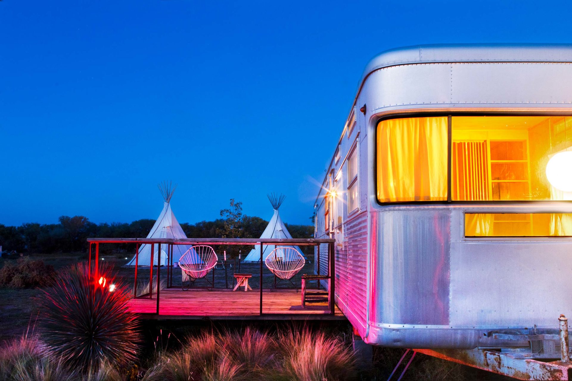
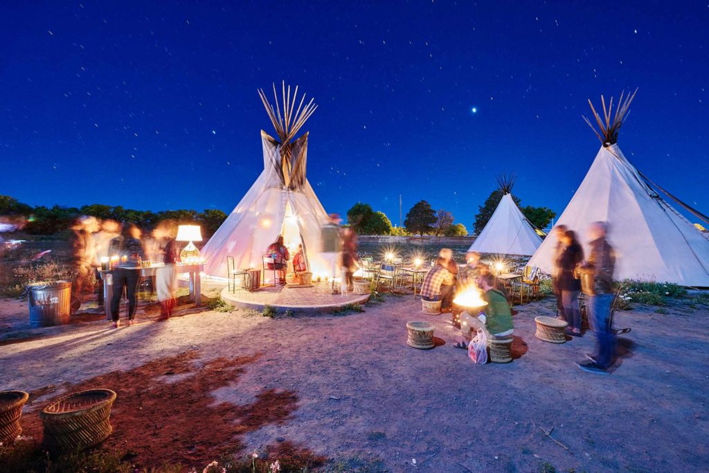
A collection of refurbished airstream trailers and decked-out tents in Marfa, Texas, El Cosmico is a boutique hotel that creates an atmosphere right away. We love the mystical, 70’s inspired motifs and colors. Their “Mananifesto” and culture of “Dolce Far Niente” are pieces of poetry that give you a sense of what it’s like to be there before you even arrive. It creates a desire to not only take a getaway, but step into a different state of being.


Teepee image


Sparrows Lodge
Palm Springs, California


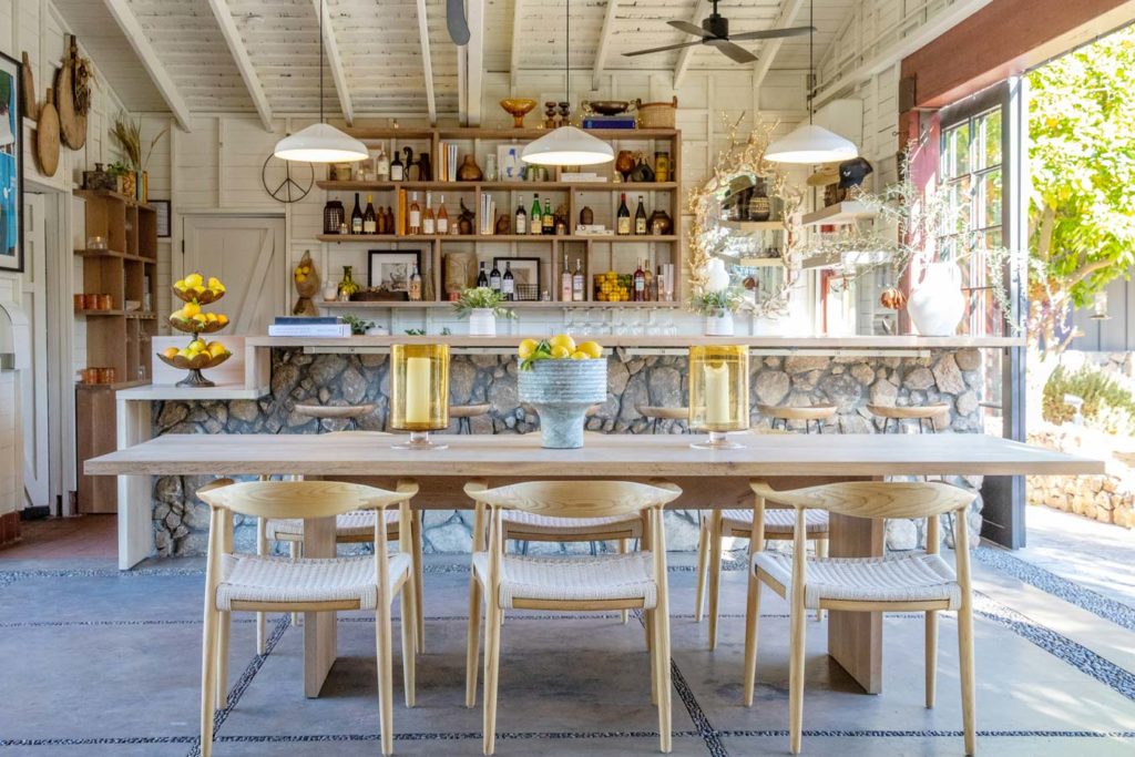
Sparrows Lodge kitchen


This sweet boutique hotel in Palm Springs has a sense of whimsy. We love the illustrated motifs throughout the website, which give the brand a hand-made, personal touch. Simple but well crafted. Light earth tones reflect the desert landscape, and the tone gives a feeling of ease, simplicity, and laid back times in the sun.


Sparrows sign


Esme Hotel
Miami Beach, Florida


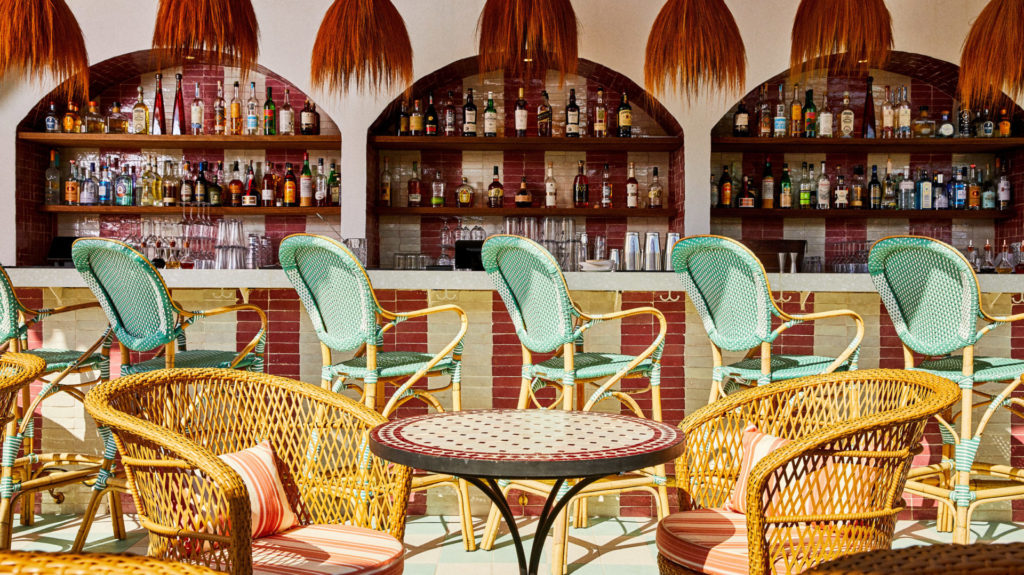
Esme Hotel Bar


Wonderfully eclectic, the Esme in Miami Beach uses rich jewel tones and delicate illustrations to nod to the property’s opulent past. With Art Deco motifs throughout the building and branding of this boutique hotel, it’s the perfect balance of grandeur and contemporary design, giving it a sense of history without feeling kitsch.


Esme jewel colors


The Iron Horse Hotel
Milwaukee, Wisconsin


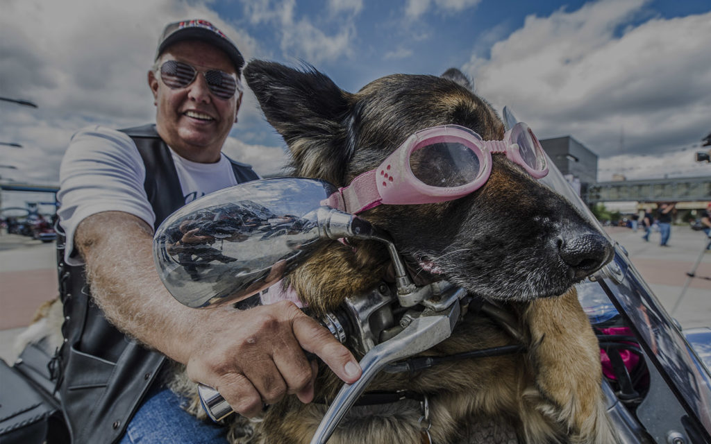
Harley week


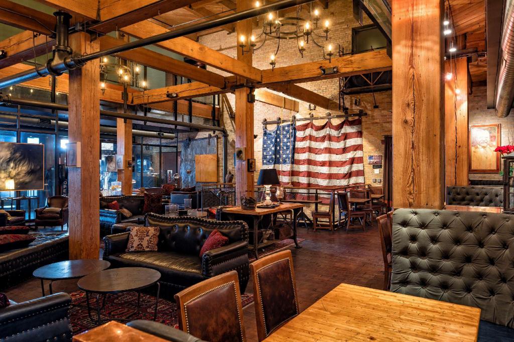
Milwaukee boutique hotel The Iron Horse has tons of personality. With a punchy voice and a big dose of hometown pride, you really feel like you’re seeing the city through the eyes of a local. We love brands with something to say, and The Iron Horse is speaking loud and clear.


Iron Horse lobby


Where would you like to stay next? Drop us a line and tell us about it.

> GET IN TOUCH


Brand Identity is Marketing Infrastructure

Brand Infastructure titel Header
Infrastructure: the basic physical and organizational structures and facilities (e.g. buildings, roads, power supplies) needed for the operation of a society or enterprise.

Infrastructure is trending. USA lawmakers agreed on a $1.2 trillion infrastructure bill. Regardless of your opinion, it’s a once-in-a-lifetime investment that compares to the WPA. It’s a landmark move that will fund new infrastructure across the nation—bridges, roads, broadband, water, energy systems and more. The hope is that it will push towards a sustainable economy, get us on the path to net zero emissions and create millions of jobs in the process. 

Infrastructure doesn’t sound exciting. The topic doesn’t ruffle feathers like migration, climate change or deep state conspiracy theories. But infrastructure is crucial. We can all agree that having smooth roads, solid bridges and working pipes makes our lives better. Without proper infrastructure, society can’t function. It’s the foundation. 

We’re revamping our national infrastructure to keep up with the times. Is your brand infrastructure up to date? As a branding services agency, we know a thing or two about building solid brands. Read on to discover the essential brand framework. 

Inspect your Brand Foundation Title Header 

Your brand is more than just your logo—that’s just a picture of it. A brand is your emotional foundation– it creates atmospheres and inspires feelings through visuals, metaphors and references. People remember personalities that make them feel something more than words. If your personality isn’t clearly understood by your internal team and communication partners, your brand will get lost in the noise. 

The infrastructure of your brand is the strategic intelligence and visual language that define who you are. Creative campaigns and targeted marketing efforts are a critical part of messaging strategy, but a solid foundation of essential components is necessary for consistent and authentic communications. Without well built roads and bridges, you can’t expect your brand to go the distance. 

Just as the country’s infrastructure is made up of many different elements, your brand infrastructure should include two major structures: your Brand Platform and your Brand Identity. 

1. Brand Platform

This is the essential document that provides the foundation for all external communication. It’s an internal document that explains the essence of the brand to new partners and hires, keeping everyone aligned. Overall, the platform sets the tone, communicates the big idea, and gives anyone a sense of your identity, offering and beliefs. This key intelligence can be passed on to digital agencies, social media companies, marketing teams and branding services agencies to ensure they are creating on-brand campaigns. The platform has several components:

> Who you are: also called the market position, this is the big idea that your brand rests on. Often just a few words, it sums up your identity in a brief, poetic statement.   

> What you believe: your core values are a huge part of your identity. These are the pillars that your success is built upon. What are you committed to? Why do you do what you do?

> Why you’re better: clear understanding of your unique selling principles that differentiate you from the competition is critical for effective messaging. 

> Who you speak to: distinguishing audience personas refines brand strategy. Knowing your audience, their hopes, fears, likes and dislikes lays the foundation for successful engagement. 
> How you communicate: defining brand voice, tone and key messages ensures communication feels authentic and consistent. Documenting core messages also gives outside creative teams a strong framework to build upon.  

2. Brand Identity 

The Brand Identity is the visual expression of the intelligence laid out in the brand platform. Your personality must inform how you look, not the other way around. While the Brand Platform should give a sense of your brand look and feel through colors and imagery, the Brand Identity document sets a series of visual standards and rules to be used by design professionals. It creates a consistent visual language that can be expanded across all mediums. Any branding services agency or design studio should be able to work from existing style guides when creating collateral. The brand identity has several components:

> Logo: your logo reflects your brand position while also providing a readable expression of your name. It’s crucial that your logo is easy to read and recognize. 

> Colors: identifying a defined set of brand colors is critical for maintaining a consistent look and achieving visibility and memorability. Depending on your brand personality, you may tend light or dark, high or low chroma, you may want to fit in or stand out. Your colors should reflect your overarching identity. 
> Typography: letterforms have immense power in communicating a particular feeling to viewers. Certain typography can make you feel modern, authoritative, playful or anything else. Careful choice of typography and consistent use is key. 

> Iconography: your brand may have a series of illustrations or icons to express complex concepts more efficiently. These can be a powerful tool in streamlining communications and capturing limited attention.

Is your brand built to last title hwader

As 2021 comes to a close, it’s time to take a look at your brand infrastructure. Do you have the essential structures to support you into the future? 

We often write off infrastructure because it doesn’t feel exciting. Marketing campaigns are active– they promise to generate leads, giving a sense of instant gratification. But if your brand isn’t solid, lead generation can’t be maximally effective. Just like funding infrastructure, branding is a capital investment. The return happens over a longer period of time, but the effects are also longer lasting. Investing in your brand will have relevance for years to come. 

A brand identity agency can work with you to build a rock-solid foundation for your brand. With the right support, you can grow to new heights. 

Flux has the tools. Ready to get started?  Let’s talk.

Things We Love: Pantone 151

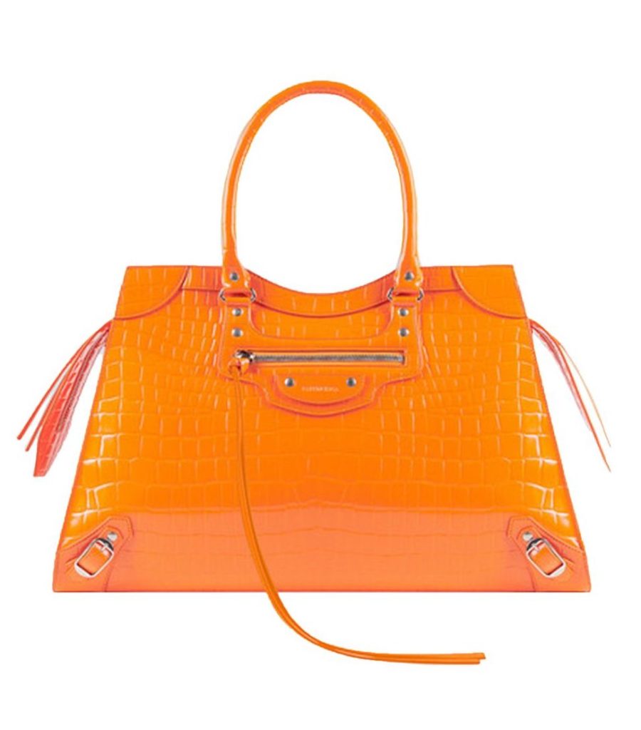
Luxury Handbags- Balenciaga
Whether you love Fall or fashion the bold beauty of Pantone 151 always brings excitement.

The Flux color has changed many times. From olive drab to marigold yellow, we love playing with the capacity of color to speak our multi-faceted personality. For a few years, our Flux color was Pantone 151– a luminous, vivid orange that makes a bold statement. We also think it happens to be the perfect color for this season. Thanksgiving has just passed and Autumn is sliding into winter, so we’re showing our appreciation for all things orange. A secret tool in the designer tool chest many shy away due to its bold nature. But in fashion it has always found a home. Catching your eye and radiating confidences in those who choose to embrace it.


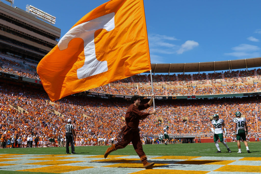
 Sep 17, 2016; Knoxville, TN, USA; General view during the first half of the game between the Ohio Bobcats and Tennessee Volunteers at Neyland Stadium. Mandatory Credit: Randy Sartin-USA TODAY Sports
The perfect color to cheer for!


Pantone 151 brings to mind sweet potatoes, persimmons and butternut squash, blazing Autumn leaves and of course Fall football. But what we really love about this color is it’s incredible versatility. Enjoy it on the palette of your thanksgiving table or as  you watch  a football game.  Orange has always had a place in team sports. While it fits perfectly in a fall tableaux, it’s just as at home in a summer atmosphere. Think orange creamsicles, citrus, carrot juice and sunsets. It adds a beautiful sense of warmth without feeling overly sweet and brings energy wherever it goes. 


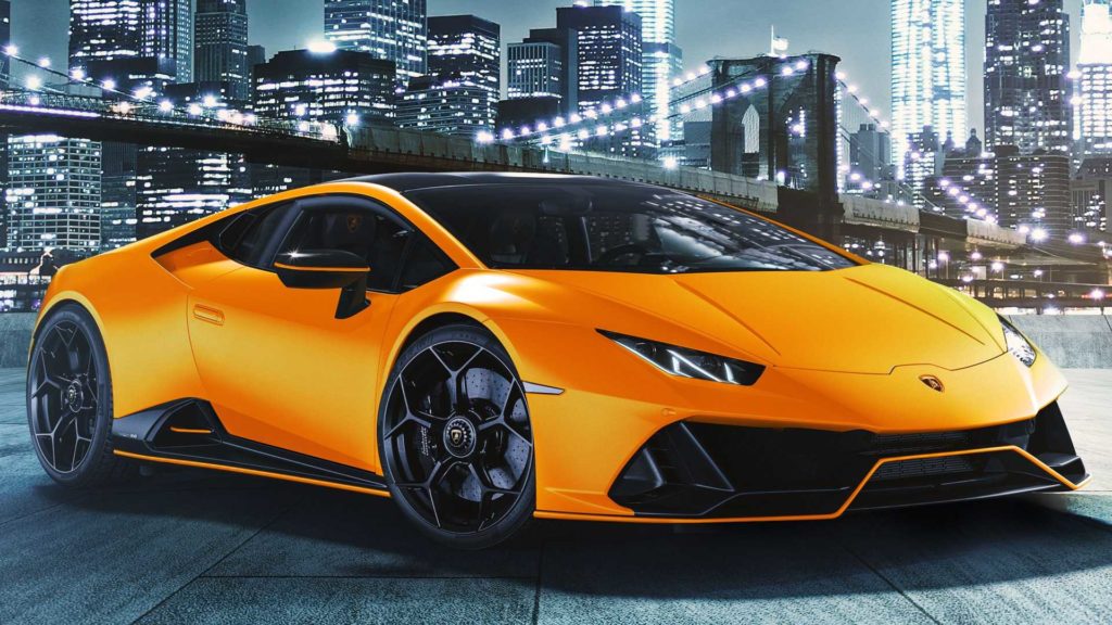
crazy orange ferrari
Make a scene or make yourself seen with Pantone 151.


Because it’s not often used, orange is highly attention grabbing. While it’s easy to over-do, just the right amount of this color can add zest, spark, and power to your visual language. This color has a lot to say– give it room to speak, and your brand will gain a whole lot of personality. 


What color are you? Let’s swap stories. 

CONTACT US >


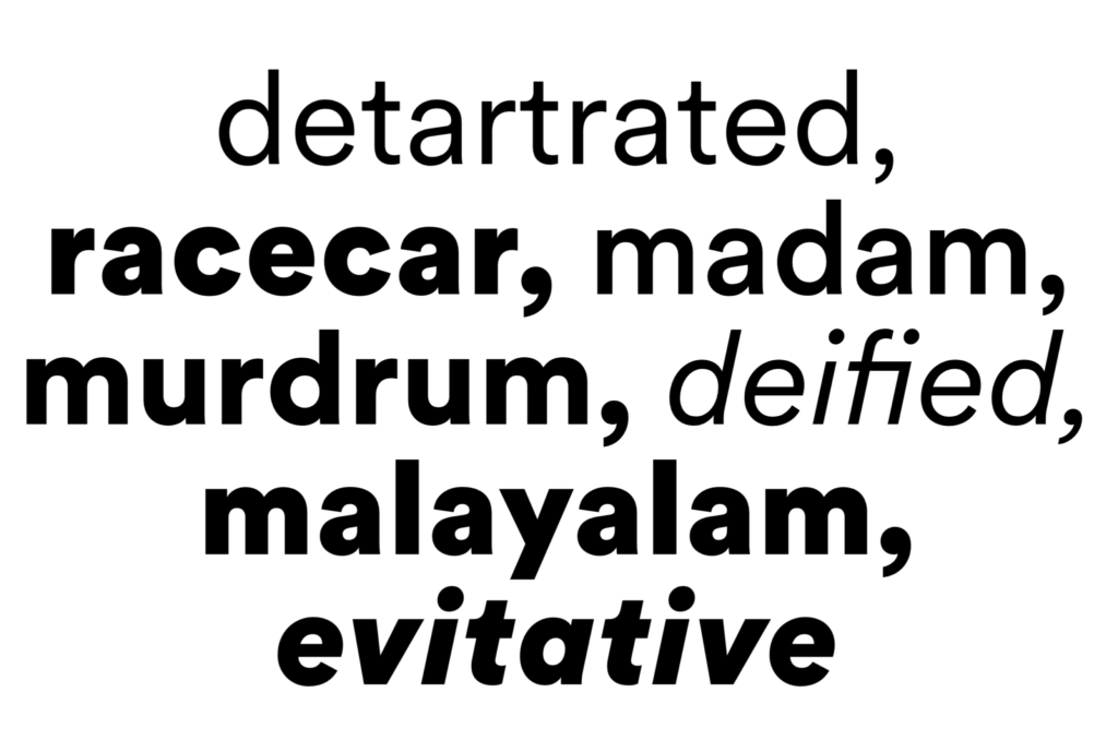
Things We Love: Circular Standard


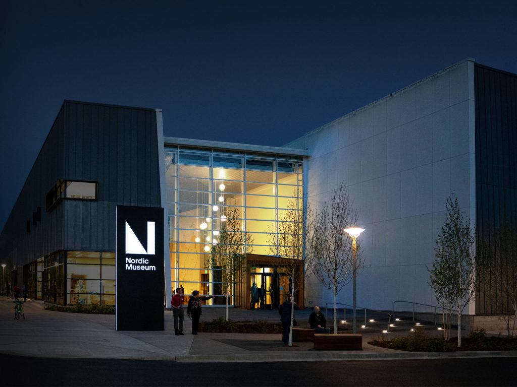
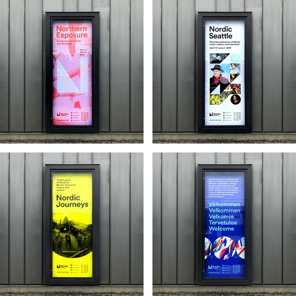
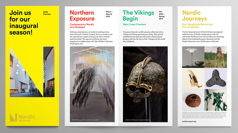
We love it so much, we made it our official Flux typeface. See how the Nordic Museum used it as well.

Do you see a product and buy it just for the packaging? Do you stop dead in your tracks when you see a sign with beautiful typography? Welcome to the club. Recently on the blog we’ve been talking about what makes our design hearts beat, from infographics to olive drab. This month, we’re talking about a font that we love so much, we made it our official Flux typeface. Say hello to Circular Standard, a font that feels approachable, a bit irreverent and timelessly modern– all things we like to think Flux is, too. 

CircularSt

Created by Laurenz Brunner, LL Circular offers a fresh take on the genre of the geometric grotesk. This typographic current was prevalent in pre-war Germany, exemplified by Jakob Erbar’s Erbar Grotesk (1926–29), Paul Renner’s Futura (1927–28), Rudolf Koch’s Kabel (1927–29) and Wilhelm Pischner’s Neuzeit Grotesk (1928–29). It later found prominent re-visitations in the 1970s with Herb Lubalin’s Avant Garde and in the 1980s with Adrian Frutiger’s Avenir.

nordic_museum_signs
With both unmistakable character and near-universal appeal, this friendly font proved popular in editorial, advertising or branding contexts.

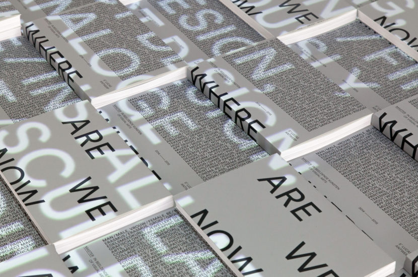
nordic_museum_brochuree

According to the website of the Swiss type foundry that produced LL Circular, Lineto, the design began in 2008 and  evolved from a purely geometric approach to a more complex formal conception by the time of its 2013 release. The result is a geometric sans serif that marries purity with warmth and strikes a balance between functionality, conceptual rigour, skilled workmanship and measured idiosyncrasy. With both unmistakable character and near-universal appeal, this friendly font proved popular in editorial, advertising or branding contexts. It lends itself beautifully for use in headlines or for body copy.

What’s your favorite font? Tell us about it.


Safety Brands

Safety Brands Part 6 of 6
What are Safety Brands and how do they use emotional motivators to make us act?

Brands provoke us. They make us feel excited, inspired, powerful, and hopeful. Brands work across the whole spectrum of emotions to engineer our reactions. They get us to engage, believe and return for more.

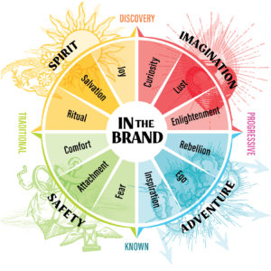
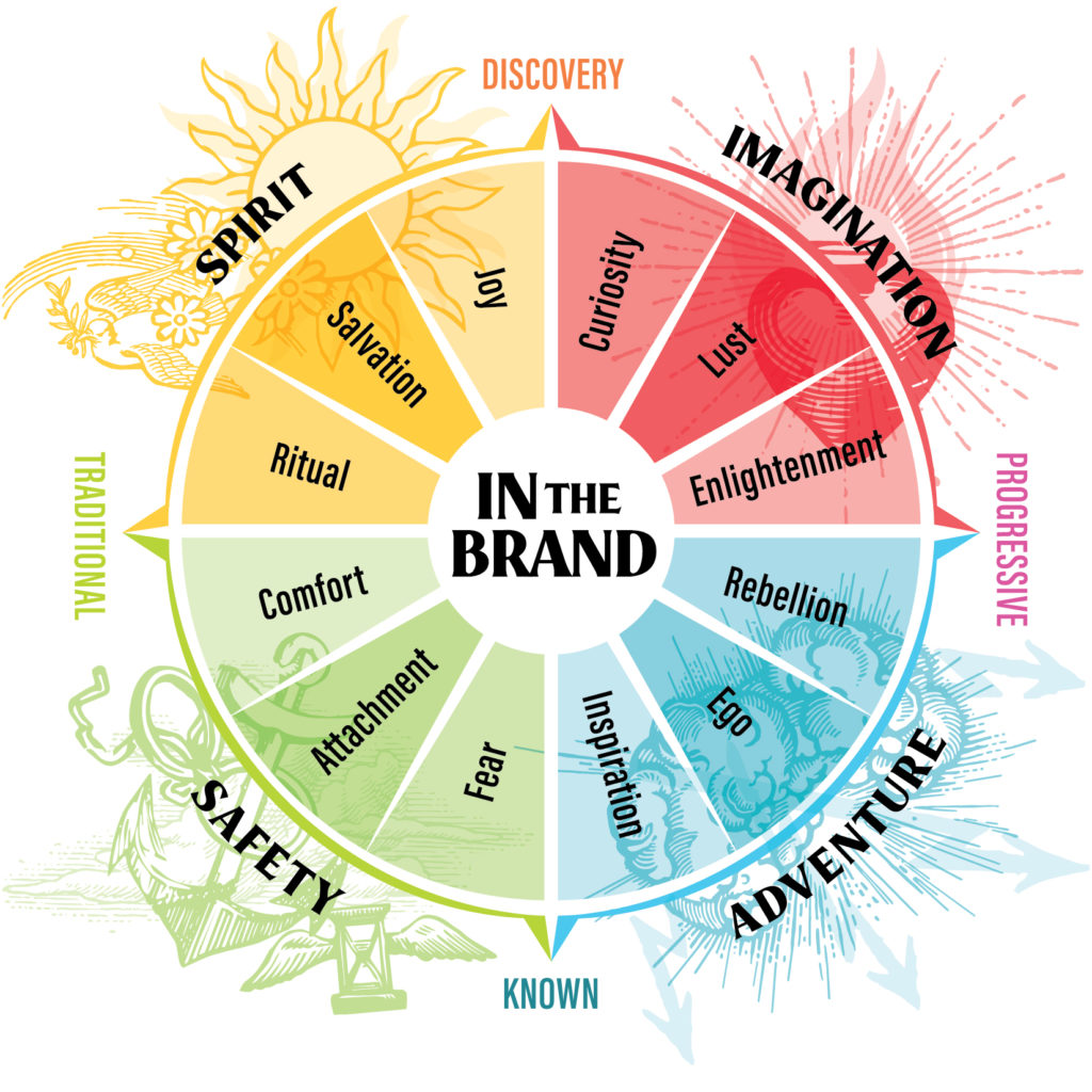
For the past few months at Flux, we’ve been exploring the Brand Feel Wheel. It’s a branding strategy framework we crafted that explains how brands use strategic emotional triggers to craft memorable communications.

You see, when brands make us feel, brand interaction is elevated from a simple transaction to an experience.

We use it to guide our brand strategies.

This month, we’re looking at the quadrant of brands that make us feel safe. In a world filled with uncertainty, Safety Brands are in high demand. So, what are Safety Brands and how do they use emotional motivators to make us act? 

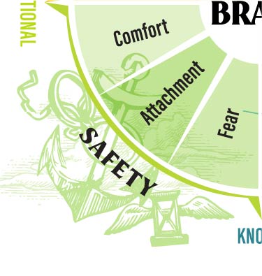
Safety Quadrant


Safety: the condition of being protected from or unlikely to cause danger, risk, or injury.

Safety brands give a sense of protection, stability, and trust. They’re recognizable and authoritative, playing on history, memory, nostalgia, and shared cultural understandings. With safety brands, we’re firmly in our comfort zones.

On the Brand Feel Wheel, the Safety Quadrant exists on the Known+Traditional side of the Perception Axes.

Brands in this quadrant provide a known experience with a traditional position.

• Safety Brands provide classic offerings to established markets. They’re not doing anything new– their strength comes from the fact that they are clear, constant, and recognizable.

• Safety Brands protect us from harm. They implicitly or explicitly present a loss, danger, or risk that they help us avoid. They also provide a way for us to access a previous state of insulated safety, like bringing us back to childhood or reminding us of simpler times.

• These brands earn our trust by building authority. They can do this by referring to an established history and/or crafting a reputation for consistently high quality.

Because they combine the known with the traditional, Safety Brands often become heritage brands. 

• Heritage brands fall into two categories. They can be legacy companies, which are supported by a long history of establishment and are firmly rooted in the cultural consciousness. They can also be newer companies that play on a historical aesthetic to spark nostalgia and build authority based on an idealized past.

• High-end luxury brands are usually heritage brands. Think Chanel, Porsche, and Rolex. They’re universally known, synonymous with their commitment to craft and quality. You get exactly what you expect– a top-quality product from the master makers in their sector. We pay a high price to be assured we’re getting something timeless. Their offering is classic, known, and constant, and the brand experience echoes that.

• Brands that play on nostalgia make us feel safe in an ever-shifting present. Comfort food brands are a perfect example, like Hershey’s and Campbell’s Soup. These brands have kept their look and feel constant since their founding, providing a sense of constancy that’s expected, understood, and comforting.

Motivators and Positioning for Safety Brands

Safety Brands & Motivators

Safety Brands play on our desire for consistency and clarity. They help make us feel secure and protected in a world that’s ambiguous, dangerous, and constantly changing.

They do this by tapping into three main emotional motivators: comfort, attachment, and fear.

Successful Safety Brands correlate their product or service with achieving the desired feeling, providing an emotional incentive that proves much more powerful and memorable than the offering alone. Let’s look at three examples of campaigns created by Safety Brands that play on these powerful emotions.

1. Comfort

What it is: A state of physical ease and freedom from pain or constraint.

Why brands use it: Comfort is a universally positive and desired emotion. We’re exposed to a lot of frustration and discomfort in our daily lives– sitting in traffic, standing in the rain. We crave brands that make us feel at ease, and will quickly form a habitual connection with them.

How to tap into it:  Brands comfort us by transporting us to a moment of safety and relaxation. They often play on nostalgia, bringing us into a world that reminds us of happier times, simplicity, childhood, and home.

Branding Example: Comfort

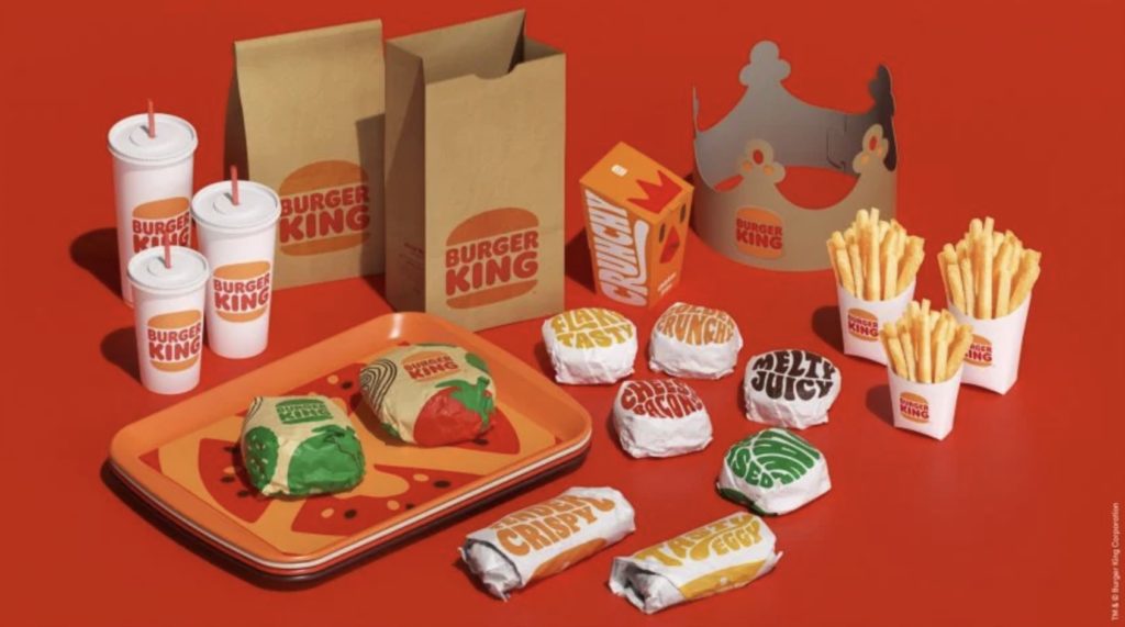
Burger King Rebrand

Brand: Burger King
Campaign: 2021 Rebrand

Burger King has unveiled their first brand update in more than 20 years, with a new logo, packaging, and employee uniforms. The new logo harkens back to their 1970s logo, with slightly updated typography. The flat warm colors, retro illustrations, and groovy lettering are total 70s nostalgia.

It feels happy, welcoming, and easy, transporting us back to an idealized past when things were simpler. It’s comfort food with a comfortable look to match.

2. Attachment

What it is: Affection, fondness, or sympathy for someone or something.

Why brands use it: When brands forge a bond, it’s a lasting impression that turns customers into lifelong loyalists. When we feel attached, the brand ceases to be solely a company with offerings. It becomes part of us.

How to tap into it:  Brands inspire attachment by fundamentally connecting their offering with an emotional moment or experience. They act as a time capsule through which the memory lives on into the future, creating a lasting attachment.

Branding Example: Attachment

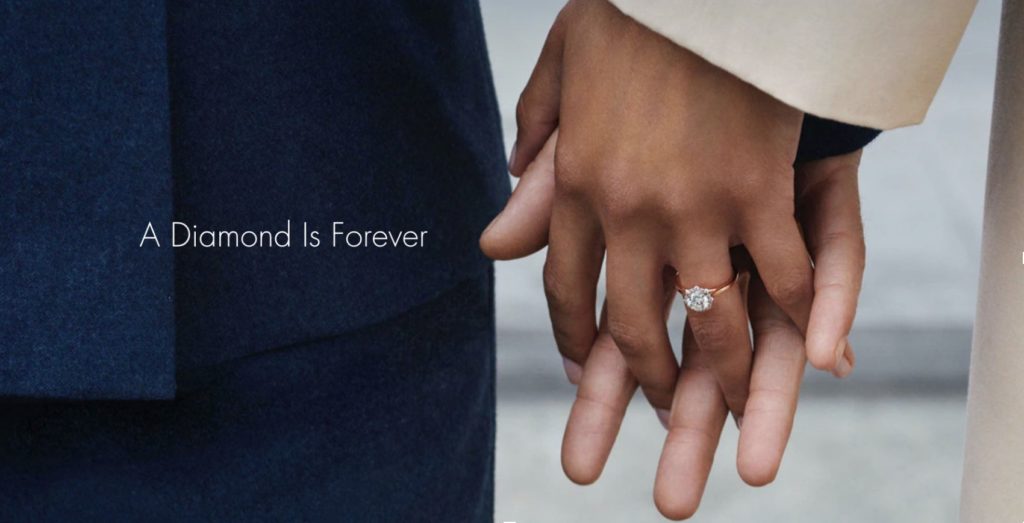
Debeers

Brand: De Beers
Campaign: A Diamond Is Forever

One of the most famous slogans of all time, this concept essentially invented the diamond engagement ring when it was written in 1947.

“Over a billion years old, a diamond is one of the closest things to Forever that we can hold in our hands,” reads the De Beers website. “In a world of short-term fixes where so much is disposable, symbols of enduring strength are more important than ever.”

De Beers imbued the diamond with the ability to capture moments of emotional intensity. You can’t relive the proposal, but you’re brought back to it every time you look at your diamond ring. The moment is fleeting– but the diamond is forever.

3. Fear

What it is: An unpleasant emotion caused by the threat of danger, pain, or harm.

Why brands use it: Fear is an incredibly powerful motivator. It plays on one of our base emotions, triggering instinctual action. While it can’t work for all offerings and sectors, when done right fear can mobilize a highly vocal audience that’s willing to spread the message.

How to tap into it:  Because it’s a negative emotion, brands have to be very careful when using fear-based messaging. It’s important to present the risk and then clearly associate how your offering helps avoid this loss or danger.

Branding Example: Fear

Volvo Climate change

Brand: Volvo
Campaign: The Ultimate Safety Test

Volvo is one of the safest car manufacturers on the market. Safety has long been a central part of their brand, focusing on how Volvo technology will protect passengers from fatal injuries in a car crash. Their 2021 campaign, “The Real Safety Test,” takes this even further.

After the spokesperson examines a series of traditional Volvo crash tests, he wonders what is the ultimate test for safety. The camera cuts to the Arctic ice shelf crumbling into the ocean.

Global warming puts all humankind at risk, and Volvo’s ad effectively stirs up that fear. But they also show what they’re doing to mitigate the threat, pledging to be fully electric by 2030.

How to Position your Own Safety Brand

the brand

Brand Feel Wheel

Safety Brands, Spirit Brands, Imagination Brands, and Adventure Brands are the primary quadrants of the Brand Feel Wheel. Brands use different emotional triggers to inspire a sense of spirit, adventure, or imagination.

After working with hundreds of clients at our branding agency in Los Angeles, we’ve created a graphic representation of how brands use emotions to make their way into our hearts and minds.

We call it the Brand Feel Wheel.

Locating brands on the wheel allows us to take a deep look at how today’s most influential companies are shaping our consciousness. The most influential brands are able to communicate more than the goods they’re selling. They’re offering us something far less tangible and yet much more powerful: a feeling. They play into our base human desires, influencing our every move.

All brands have the potential to resonate on this deeper level.

But it requires a clear understanding of who you are, what you believe, and what you represent. Locating your brand on the Feel Wheel helps you draw out these big ideas, providing a rich set of emotions that can be used to inspire loyalty, action, and memorability.

Do you need help finding your place on the Brand Feel Wheel? Contact us and let us help you solidify your brand’s positioning.

We Love Color: Pantone 581


gucci
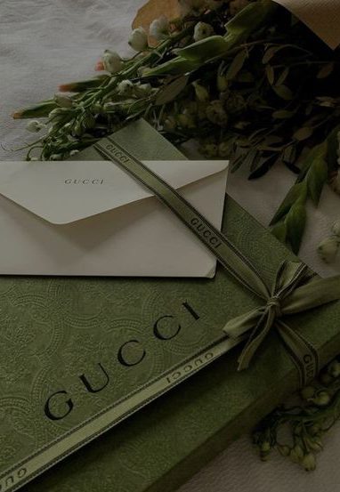
Warm and luxurious this green is anything but “Drab”


At Flux, we craft brands for companies across sectors. Whether automotive, real estate, hospitality, products, consumer facing or B2B, we’ve positioned and built unique visual languages for hundreds of different brands. The sources we take inspiration from are as varied as our clients. Every month on the blog, we’re featuring something that puts a glimmer in our eyes and a spark in our hearts– a color, a typeface, a style, a painting, a song and more.


gucci


This month we’re focusing on color, and one in particular: PMS 581. When Flux was founded over 20 years ago, this olive drab was our company color. It’s rich and refined while being incredibly versatile, lending itself to small accents or large swaths. Reminiscent of military uniforms, laurel leaves, olives and moss, it’s natural without feeling overly earthy. Though it’s a neutral, it still feels memorable and powerful. 

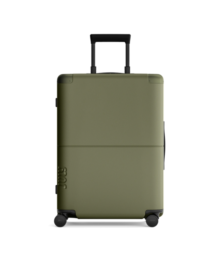
suitcase
Reminiscent of Army fatigues we are reminded that utility is beautiful.

Colloquially, we now use drab to mean something without life or style, but “olive drab” is anything but dull. The term drab comes from the 16th century to describe a dull light brown color of cloth made from undyed homespun wool. It took its name from the old French word for cloth, drap. We love that it has a warm dustiness without feeling washed out. It’s a multi-layered shade that pops up in all kinds of interesting places. 


Spirit Brands

Spirit Brands Part 5

Brands are influencing you. They make you think, make you smile, make you change your mind. They’re masterminds of emotional manipulation. Whether they make us laugh or cry, they keep us coming back for more. 

Brand Feel WheelFor the last few months, we’ve been discussing how some of the world’s most powerful brands are offering us something far less tangible than products– they’re promising us feelings. We’ve used the Brand Feel Wheel to understand how brands engineer our emotional responses in their favor. It’s a graphic representation of the kinds of emotional motivators brands use to get into our minds and under our skin.    

We’ve already explored Adventure Brands and Imagination Brands. This month, we’re diving into Spirit Brands. What are Spirit Brands and how do they use emotions to draw us in?

Heart & Soul Spirit Brands

Spirit: the vital principle or animating force within all living things; the emotions, character, essence of a person or thing.

Spirit is a multi-faceted brand-feel. It’s a deeply felt emotion that can be difficult to verbalize. 

• It refers to the feeling of belonging and excitement that you get when you’re part of something bigger than yourself (think school spirit or being in high spirits).

• Spirit also transcends into the metaphysical, referring to a feeling of being in contact with the authentic essence of something, tapping into a force that exists in all beings (think spirit guides or communing with spirits). 

• Spirit brands create an atmosphere of belonging, happiness, compassion and possibility.  

Spirit Brands exist at the Traditional-Discovery intersection of the Perception Axes. 

• They take a traditional position while offering an experience filled with discovery. 

• These brands are often grounded in traditional craft, but at the same time seek to help their followers discover new emotions and ideas to expand their lives. 

Because Spirit Brands are rooted in tradition, they are typically Artisan brands. Artisans are committed to craft, drawing attention to their historical background and expressing a down-to-earth, personalized ethos. 

Spirit Brand Example: Jack Daniel’s

Jack Daniel’s logo and bottle label hasn’t changed much since the 1950’s, and their traditional position is right there in the name: Jack Daniel’s “old time.” They pride themselves on their 150 year history and whiskey making expertise, leaning into the classic Americana aesthetic. 

But the Jack Daniel’s experience is anything but stuffy. It’s all about discovering who you are. Their current campaign is that Jack gives you the courage to do what you’ve always wanted to do– hang up on your boss, buy drinks for the whole bar. It’s about accessing your true spirit and stepping into who you were meant to be.  Their new tagline “Make It Count” taps into a sense of possibility and transcendence. We’re all worried about wasting our lives. Jack Daniel’s is selling us the idea that with their whiskey, we won’t lose out.  

Jack Daniel’s has an established, classic position coupled with the promise of a new and extraordinary experience. They’re selling more than whiskey. It’s a way to revive your soul and free your spirit.

Spirit Brand + Motivation

Spirit Brands play on our need for transcendence and belonging. They invite us to be part of something bigger than ourselves and to tap into our authentic selves. They ask us to look for the beauty in the everyday, the extraordinary in the ordinary. They do this by tapping into three main emotional motivators: ritual, salvation and joy. When we engage with Spirit Brands, we’re engaging with a world of vitality and hope. We can’t help but smile. 

Successful Spirit Brands correlate their product or service with achieving a desired feeling, providing an emotional incentive that proves much more powerful and memorable than the offering alone. Let’s look at three examples of campaigns created by Spirit Brands that play on these powerful emotions. 

1. Ritual: Everyday Miracles

What it is: A series of actions or type of behavior regularly and invariably followed by someone.

Why brands use it: Ritualizing brand experience makes every interaction highly memorable. It takes a simple act of consumption into a much more meaningful realm. The things we do everyday to wake up, cheer up, or unwind are deeply special to us, meaning brands that successfully utilize ritual are accessing an extremely loyal audience that consistently comes back.

How to tap into it: We all have habits and routines that affect our mood. Brands must align their offering with a ritual that’s meaningful but also broad enough to resonate with a wide range of consumers. But adoption isn’t fast. Rituals are only built up over time. Consistent brand presentation and repeated association of product with desired emotional result are critical for building ritualized consumption. It’s a long game with big payoffs.

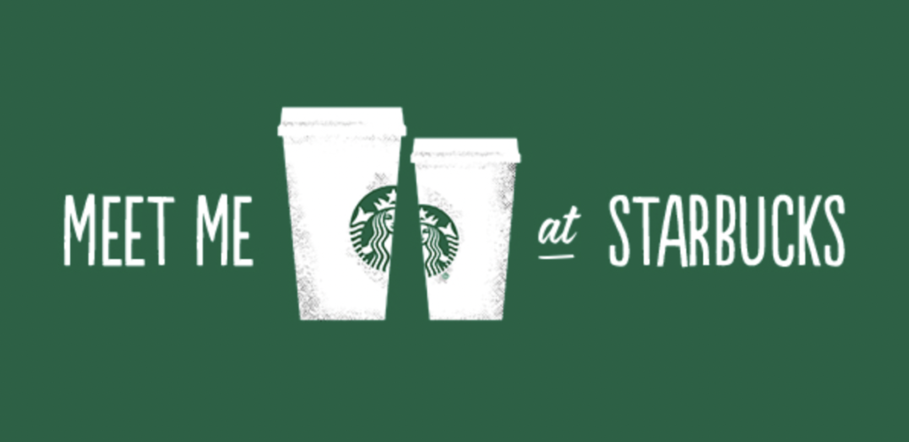
Meet Me at Starbucks

EXAMPLE:

Brand: Starbucks
Campaign: Meet Me at Starbucks

Starbucks’ huge success rests on its role as a “3rd place,” a setting outside of work and home where people can get together. Starbucks prides themselves on a commitment to the craft of coffee, but the whole Starbucks experience isn’t really about coffee– it’s about finding a place where you can feel good, everyday. 

Starbucks’ 2014 campaign “Meet Me at Starbucks” expresses this concept beautifully. Filmed at 28 different Starbucks locations around the world in one day, it shows all of life’s moments, from business meetings to marriage proposals, happening at the coffee shop. “Everyday good things happen when we get together,” the ad tells us. It elevates Starbucks from much more than just the place where we get our daily caffeine– it’s the place where we live our lives. It’s also a reminder that Starbucks transcends space and culture. Whether you’re in Tokyo or Cleveland, Starbucks is part of your everyday. This feeling of ritualized coming together sets Starbucks apart from the many other coffee offerings on the market, inspiring a deep sense of brand loyalty.

2. Joy: Can’t Stop Smiling

What it is: A feeling of great pleasure and happiness.

Why brands use it: Joy is a powerful motivator. It’s instantly gratifying, uncontroversial and universally desired. It doesn’t promise anything long term, but it’s a quick burst of positivity that we crave to get ourselves through the day. People want to feel good. They will gravitate towards brands that make them smile and willingly return for more.

How to tap into it: Brands often use humor to tap into joy. If we see simply someone else happy, we might feel jealous that we aren’t in such a good mood. But humor allows us to join in, instantly brightening the moment.

EXAMPLE:

Brand: Coca-Cola
Campaign: Open That Coca-Cola

From the original “I’d like to buy the world a coke” campaign in 1971 up until today, Coke has always been about joy. Having a coke uplifts your day. 

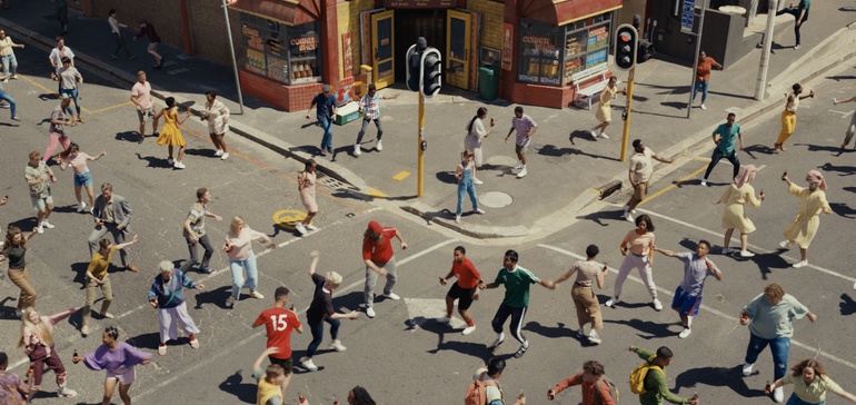
Coke’s latest campaign pumps up the joy level. The ad is saturated in bright colors, big smiles and lots of dancing, meant to “describe the indescribable feeling of drinking a coke.” There aren’t even any words in this ad– it’s pure emotion. Joy isn’t something we rationally talk about, it’s something we feel. This campaign celebrates the happy experience of taking the first sip of that ice cold Coke. Using the universal language of dance and music, it’s a shot of happiness that makes us smile, and pulls us back to re-engage. 

3. Salvation: Do Something Good

What it is: Preservation or deliverance from harm, ruin, or loss.

Why brands use it: We’re constantly bombarded by bad news. With the social, environmental and economic issues facing us, it’s easy to feel overwhelmed and despaired. Brands offering salvation from these challenges by making us feel like we’re proactively fighting against them occupy a powerful place in society. Tapping into salvation gives brands access to an impassioned and loyal audience, forging a cause based connection that’s much deeper than their offering alone.

How to tap into it: Brands often use humor to tap into joy. If we see simply someone else happy, we might feel jealous that we aren’t in such a good mood. But humor allows us to join in, instantly brightening the moment.Brands often use humor to tap into joy. If we see simply someone else happy, we might feel jealous that we aren’t in such a good mood. But humor allows us to join in, instantly brightening the moment.

Toms

EXAMPLE:

Brand: TOMS Shoes
Campaign: For One Another

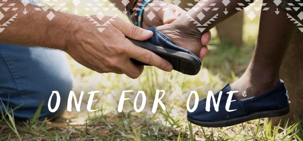
TOMS Shoes popularized buy one, give one marketing with their “one for one” program. For every pair of TOMS shoes you buy, the company would donate a pair to a child in need of shoes. The approach made the brand hugely popular, clearly differentiating them from the many other shoe options on the market. They weren’t just selling shoes, they were selling the chance to make someone’s life better. Wearing TOMS was not just a fashion statement, it became a mark of moral character. Their “For One Another” campaign depicts all the wearers of TOMS as an interconnected community, dedicated to making a difference. 

TOMS has since changed their business model, in part from criticisms that giving out shoes didn’t really improve the lives of those in need, in part from big losses in profits. Now, they donate ⅓ of all their profits to “grassroots efforts.” Their shoes are a purchase that benefits more than just the consumer. It makes us feel good about ourselves, and gives us the extra push to buy another pair. 

Branding + Emotion

Brands are selling more than just products and services. They’re selling us states of being. When brands make us feel, brand interaction is elevated from a simple transaction to a memorable experience.

Emotional branding isn’t only for big companies like Starbucks and Coca-Cola. Every brand has the power to resonate on this deeper level. But it requires a clear understanding of who you are, what you believe and what you represent. Locating your brand on the Brand Feel Wheel is a good place to start parsing through these big questions. 

Are you a Spirit Brand? Tell us about it