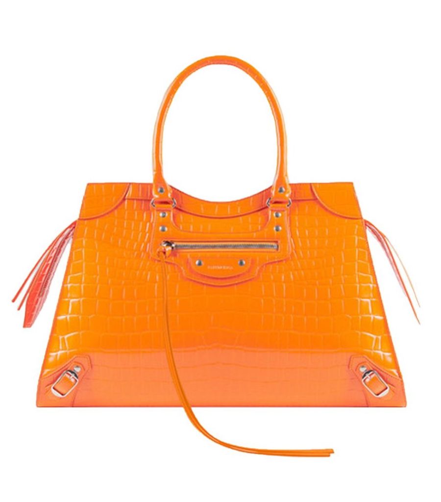
The Flux color has changed many times. From olive drab to marigold yellow, we love playing with the capacity of color to speak our multi-faceted personality. For a few years, our Flux color was Pantone 151– a luminous, vivid orange that makes a bold statement. We also think it happens to be the perfect color for this season. Thanksgiving has just passed and Autumn is sliding into winter, so we’re showing our appreciation for all things orange. A secret tool in the designer tool chest many shy away due to its bold nature. But in fashion it has always found a home. Catching your eye and radiating confidences in those who choose to embrace it.

Pantone 151 brings to mind sweet potatoes, persimmons and butternut squash, blazing Autumn leaves and of course Fall football. But what we really love about this color is it’s incredible versatility. Enjoy it on the palette of your thanksgiving table or as you watch a football game. Orange has always had a place in team sports. While it fits perfectly in a fall tableaux, it’s just as at home in a summer atmosphere. Think orange creamsicles, citrus, carrot juice and sunsets. It adds a beautiful sense of warmth without feeling overly sweet and brings energy wherever it goes.

Because it’s not often used, orange is highly attention grabbing. While it’s easy to over-do, just the right amount of this color can add zest, spark, and power to your visual language. This color has a lot to say– give it room to speak, and your brand will gain a whole lot of personality.
What color are you? Let’s swap stories.