At Flux, we craft brands for companies across sectors. Whether automotive, real estate, hospitality, products, consumer facing or B2B, we’ve positioned and built unique visual languages for hundreds of different brands. The sources we take inspiration from are as varied as our clients. Every month on the blog, we’re featuring something that puts a glimmer in our eyes and a spark in our hearts– a color, a typeface, a style, a painting, a song and more.

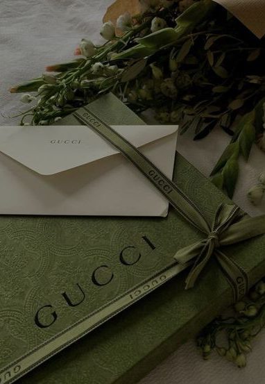
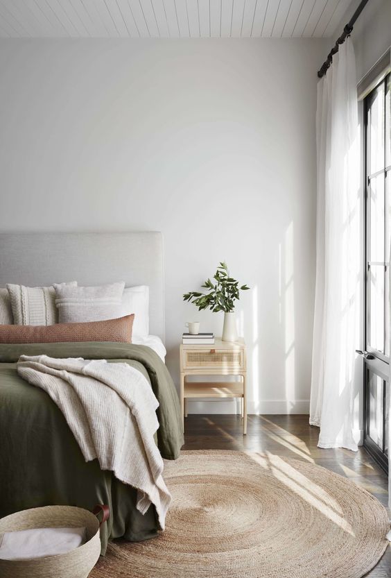
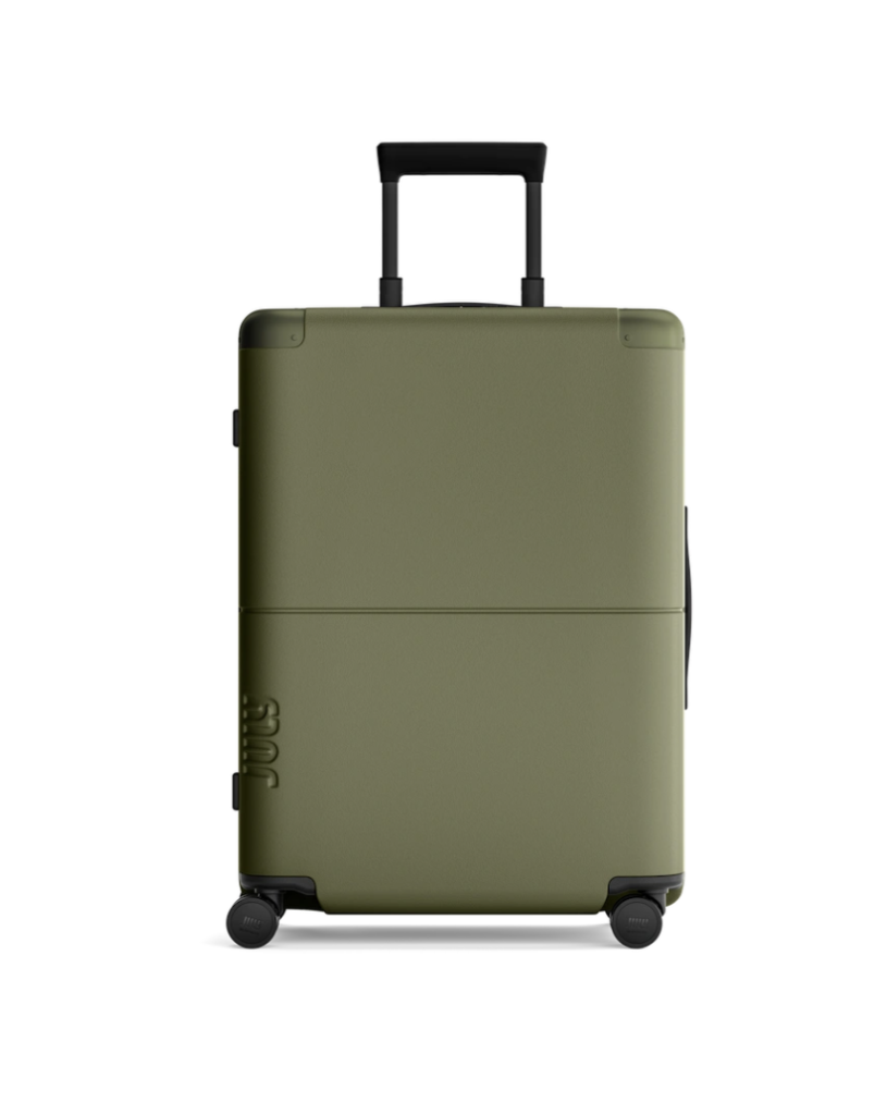
This month we’re focusing on color, and one in particular: PMS 581. When Flux was founded over 20 years ago, this olive drab was our company color. It’s rich and refined while being incredibly versatile, lending itself to small accents or large swaths. Reminiscent of military uniforms, laurel leaves, olives and moss, it’s natural without feeling overly earthy. Though it’s a neutral, it still feels memorable and powerful.

Colloquially, we now use drab to mean something without life or style, but “olive drab” is anything but dull. The term drab comes from the 16th century to describe a dull light brown color of cloth made from undyed homespun wool. It took its name from the old French word for cloth, drap. We love that it has a warm dustiness without feeling washed out. It’s a multi-layered shade that pops up in all kinds of interesting places.