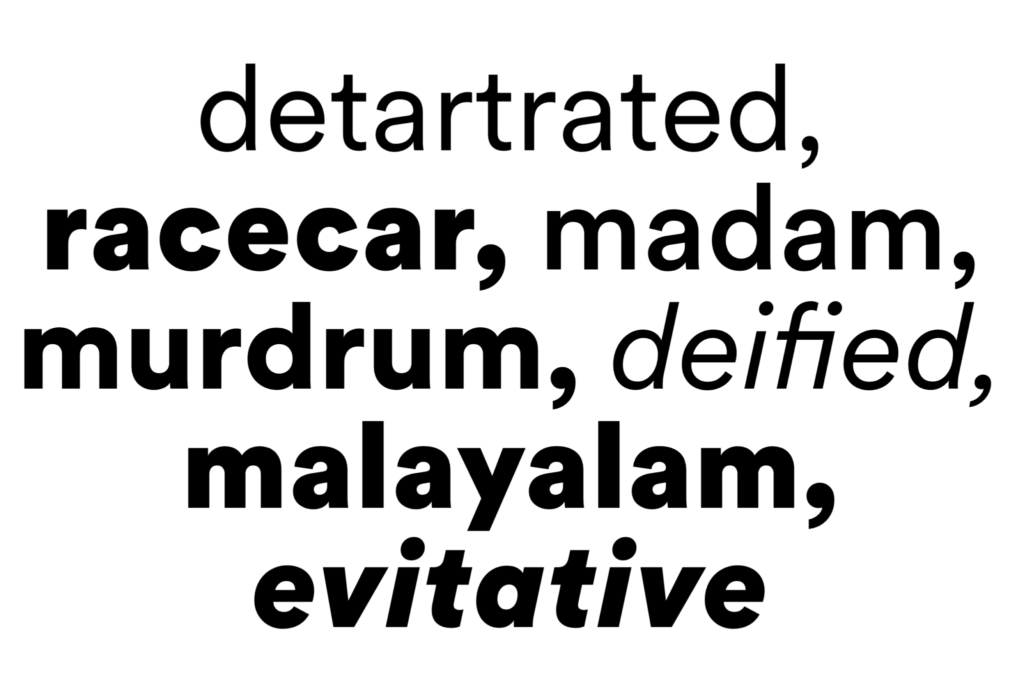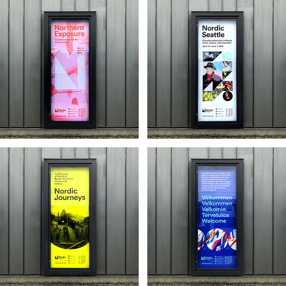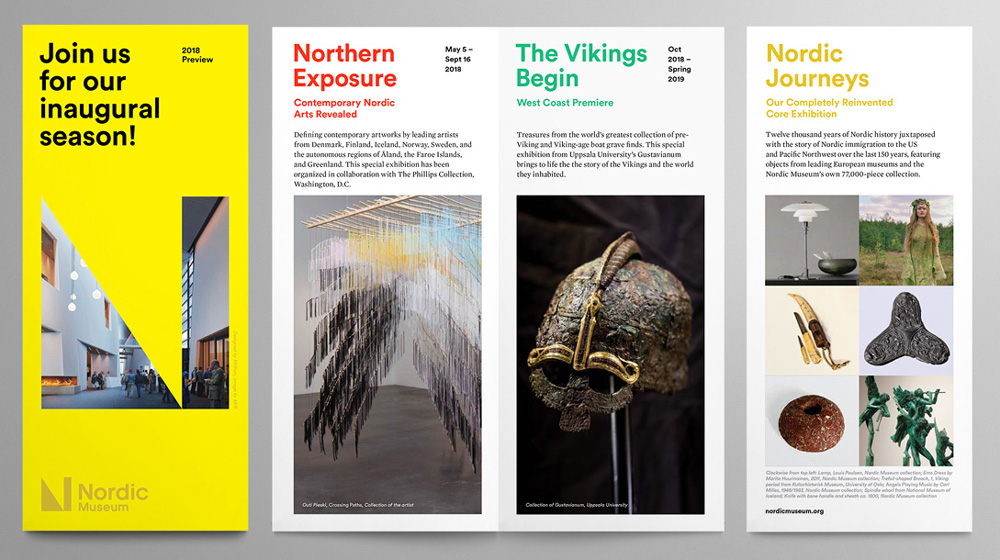
Do you see a product and buy it just for the packaging? Do you stop dead in your tracks when you see a sign with beautiful typography? Welcome to the club. Recently on the blog we’ve been talking about what makes our design hearts beat, from infographics to olive drab. This month, we’re talking about a font that we love so much, we made it our official Flux typeface. Say hello to Circular Standard, a font that feels approachable, a bit irreverent and timelessly modern– all things we like to think Flux is, too.

Created by Laurenz Brunner, LL Circular offers a fresh take on the genre of the geometric grotesk. This typographic current was prevalent in pre-war Germany, exemplified by Jakob Erbar’s Erbar Grotesk (1926–29), Paul Renner’s Futura (1927–28), Rudolf Koch’s Kabel (1927–29) and Wilhelm Pischner’s Neuzeit Grotesk (1928–29). It later found prominent re-visitations in the 1970s with Herb Lubalin’s Avant Garde and in the 1980s with Adrian Frutiger’s Avenir.


According to the website of the Swiss type foundry that produced LL Circular, Lineto, the design began in 2008 and evolved from a purely geometric approach to a more complex formal conception by the time of its 2013 release. The result is a geometric sans serif that marries purity with warmth and strikes a balance between functionality, conceptual rigour, skilled workmanship and measured idiosyncrasy. With both unmistakable character and near-universal appeal, this friendly font proved popular in editorial, advertising or branding contexts. It lends itself beautifully for use in headlines or for body copy.
What’s your favorite font? Tell us about it.