|
flux branding
|
|
As we celebrate Labor Day, it’s an opportune moment to reflect on the monumental impact of the Works Progress Administration (WPA), a cornerstone of New Deal-era America. Established in 1935 under President Franklin D. Roosevelt’s administration, the WPA was designed to address the economic hardship of the Great Depression by providing jobs to millions of Americans. While it was known for a range of public works, from roads and bridges to parks and schools, one of its most enduring legacies is its art program. Today, let’s delve into the captivating world of WPA posters, a visual testament to both the era’s struggles and triumphs.

The WPA was part of Roosevelt’s New Deal, aimed at economic recovery through federal spending. At its peak, the WPA employed over 8 million Americans in various capacities. One of its most culturally influential branches was the Federal Art Project (FAP), which sought to employ artists and bring art into the public sphere. This initiative gave rise to a stunning array of posters, murals, and paintings that continue to captivate audiences today.

WPA posters, often created between the late 1930s and early 1940s, are celebrated for their striking visual style and powerful messages. These posters were designed not only to promote public services and events but also to instill a sense of pride and purpose in a country grappling with economic hardship.

The WPA posters are distinguished by their vibrant, graphic style. Artists employed bold colors and strong, simple lines to create visually arresting images. This approach was influenced by both Art Deco and modernist trends of the time. The use of geometric shapes, stylized figures, and dramatic contrasts made these posters not only effective in capturing attention but also aesthetically memorable.
Many of these posters utilized a form of streamlined realism, where figures were depicted with a blend of realism and abstraction, making them both relatable and idealized. Typography was another key element, with large, legible text often integrated into the artwork to ensure that the message was clear and impactful.
The subject matter of WPA posters was diverse, reflecting the broad range of services and events that the WPA sought to promote. Key themes included:
Public Health and Safety: Posters often encouraged health practices, such as vaccination and sanitation. These designs frequently featured cheerful, encouraging imagery to promote positive behaviors.


Civic Pride and Participation: Many posters aimed to foster a sense of community and civic responsibility. Images of workers, schools, and public services were depicted to instill pride in public projects and encourage community involvement.


Education and Culture: The WPA also emphasized the importance of education and the arts. Posters advertising libraries, theaters, and educational programs were common, showcasing the era’s belief in the transformative power of education and culture.


Social and Economic Contributions: Some posters highlighted the achievements of the New Deal programs themselves, celebrating infrastructural advancements and the spirit of progress.


A recurring theme in WPA posters is the celebration of American resilience and optimism. Despite the economic struggles of the time, the posters exude a sense of confidence and forward momentum. They often feature robust, heroic figures engaged in various forms of labor or community activities, symbolizing the nation’s collective effort and enduring spirit.
The use of patriotic colors—reds, blues, and whites—along with symbols like the American flag, underscores the posters’ role in fostering national unity. Additionally, the depictions of diverse workers and families reflect a commitment to inclusivity and solidarity during a time of widespread hardship.

The legacy of WPA posters extends beyond their immediate impact. They offer a visual history of an era marked by innovation and determination. Today, these posters are not only cherished collectibles but also serve as historical documents that capture the essence of a transformative period in American history.
As we honor Labor Day, let’s take a moment to appreciate these remarkable works of art that not only promoted vital public services but also provided a beacon of hope and pride during one of the most challenging times in American history. The WPA posters remind us of the power of art to inspire, mobilize, and uplift—a timeless message that resonates as strongly today as it did then.
As creatives we are always looking for inspiration. Something that sparks an idea or makes us feel something profound. Eventhough inspiration can be found in our day to day world it is important to get out and explore. Last month we were fortunate to travel to Morocco and refill our creative cup with the sights, smells, tastes and people of North Africa.

I have always loved the Moroccan aesthetic. The Riads are beautiful and the the craft is amazing: traditional Berber rugs, amazing tile work, incredible leather goods, etched metal lamps, carved wood… it is endless. Sadly, these traditions are slowly disappearing. Fortunately the government stepped in to assist the artisans of Morocco by subsidizing cooperatives that make traditional items. Thank goodness, we would hate to see these traditions die or to be solely produced in China – which is already happening. Take a stroll through the Medina and shops have boxes in the back that say Made in China. So buyer beware.


We stayed in elaborate Riads with carved walls, and refurbished Kasbahs ( a traditional fortress that houses many families like a reinforced neighborhood). We visited nomadic Berbers and stayed in a camp on the edge of the Sahara Desert. It was far to get to Erg Chebbi, a large sea of wind blown sand located on the far western edge of the Sahara Desert, but totally worth it.


Before I left for Morocco I thought that my favorite part would be seeing all the traditional architecture and colorful shopping Medinas. What I did not realize is that Morocco has a stunning landscape. A country of extremes. High Atlas Mountains, lush green farmland along the mediteranean, silent deserts next to a palm filled oasis.


Honestly, I found my greatest inspiration in the vast emptyness of the Sahara Desert. The Sahara is unlike anything I have ever seen. Waking up at dawn to watch the sun rise over Algeria was breathtaking. I hope some of these images can give a taste of this unique place and maybe inspire you to get out and explore.

As a Branding Studio in Los Angles we love creativity and beauty in all forms. We are always looking for inspiration and we found it in Morocco. Where would you like to explore next? We’d love to know
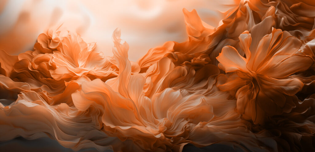
The color experts at Pantone have spoken, and “Peach Fuzz” is their pick for 2024’s Color of the Year. This choice is a soft blend of pink and orange, exuding a warm, nurturing presence. It’s a color that seems to say, “Take a moment, relax, and find joy.” As described by Pantone, “PANTONE 13-1023 Peach Fuzz is a velvety gentle peach whose all-embracing spirit enriches heart, mind, and body.”

In choosing Peach Fuzz, Pantone continues its tradition, started in 2000, of selecting a color that mirrors the current cultural mood. This soft, inviting hue reflects our collective longing for tranquility and comfort in a fast-paced world. It’s a color that promotes empathy and compassion, fitting for a time when we’re all seeking a bit more understanding and kindness. It creates a soft sanctuary in what often feels like a hard, chaotic world, and embodies both the joy of coming together and the peace of reflective solitude. It reflects changing value systems, shifting away from external accomplishments to a focus on internal well being.

What’s wonderful about Peach Fuzz is its versatility. It’s a color that can adapt to different settings and moods. In design, it pairs beautifully with warm tones like buttery yellows or soft pinks to create a cozy, welcoming atmosphere. Yet, it can also hold its own alongside bolder colors for a striking effect. For designers, Peach Fuzz offers a fresh palette to inspire creativity and warmth. It’s also beautifully tactile, giving a sense of fuzzy softness to any design.


Pantone’s selection of Peach Fuzz as the color for 2024 speaks volumes about our current societal state. Pantone seems to be saying this is a time for gentleness and softness, peace and comfort. It’s a reminder of the importance of nurturing our inner selves and uplifting others.

Pantone’s 2023 Color of the Year, “Viva Magenta,” presented a starkly different vibe from 2024’s “Peach Fuzz.” Viva Magenta was a bold, vibrant shade, almost pulsating with energy and audacity. It was a color that symbolized strength, empowerment, and vivacity. In contrast, 2024’s Peach Fuzz is soft spoken in comparison, offering a calming, nurturing presence.

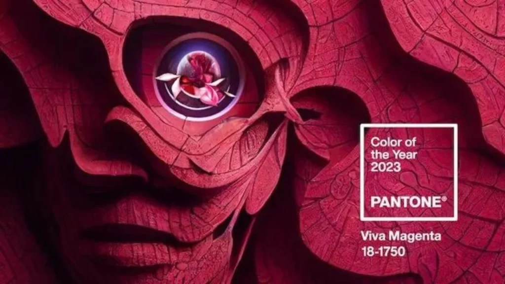
The choice of Viva Magenta for 2023 was a reflection of a world emerging from challenging times, symbolizing a fighting spirit and the optimism in overcoming obstacles. It was a color that encouraged self-expression and experimentation. On the other hand, Peach Fuzz for 2024 seems to acknowledge our collective need for calm and healing. It represents a shift towards introspection and finding solace in simplicity and warmth.

In a way, these colors together reflect the human journey over these two years. While 2023 was about having the strength and motivation to move forward, 2024 seems to be about looking inward and nurturing ourselves. This contrast in colors highlights the diversity of human experiences and emotions, and how our collective mood shifts over time.

The influence of Pantone’s Color of the Year extends far beyond the design world. It sets trends across various industries, from fashion to home decor, and often reflects broader societal shifts. Peach Fuzz is more than a color; it’s a cultural statement about where we are and what we aspire to be.

As we embrace 2024, let’s welcome Peach Fuzz into our lives and designs, letting it inspire us to find comfort, connection, and peace in our everyday moments.
Need more… check out additional winners at Pantone.
Whats your favorite Pantone color?
With Thanksgiving behind us the holiday season is in full swing. I bet most of you spent last Friday, like myself, scouring the internet for great deals on gifts for your loved ones or maybe yourself. Now that we are done I hope that you have a bit left over to share with those less fortunate, or help save animals, the environment, or maybe a favorite arts program.
It feels great to give back and reminds us how fortunate we all are. Below are just a few amazing organizations that are local to the City of Angels that we call home. As well as being close to our hearts. Consider giving to them this season.
PATH has been working to house the homeless well before it was part of the national conversation. It all started with a letter written by Claire and Rev. Charles Orr, calling for the community to address the ever-increasing issue of homelessness. In response, on the night of December 8, 1983, 60 people gathered together to figure out how to help people who were experiencing homelessness in their neighborhoods. On that night, PATH was born.
The group started by distributing food and clothing to people living on the streets. As homelessness continued to grow nationwide, research revealed that Housing First—a best practice model that first connects people to permanent housing and then focuses on stabilization through voluntary supportive services, proved more effective. Now, over thirty years later, we provide services in more than 150 cities in five regions, and have more than 1,500 units of permanent supportive housing completed or in the pipeline.
Across the state, we help people find permanent housing and provide case management, medical and mental healthcare, benefits advocacy, employment training, and other services to help them maintain their homes stably. Since 2013, we have connected more than 9,000 people to permanent homes.
Making a Differnce on Heart at a time. This organization is about as grass roots as it gets. Founded in August of 1994- They have been of service for 30 years to these sector of our community:
The homeless; people with AIDS / HIV, Or whose lives have been adversely impacted by such, especially children; at-risk youth (abused, neglected, impoverished, abandoned, orphaned, runaways, homeless, learning-disabled, etc.); the elderly; and the environment and the earth.
They also present educational workshops designed to provide psychological and emotional healing from abusive or dysfunctional childhoods and provide beneficial skills which can be used to improve the quality of our relationships with others and ourselves. As we heal ourselves and grow emotionally and spiritually, we are naturally drawn to service as a path to personal enlightenment. We call this path : KARMA YOGA.
Check them out. If donating is a challenge they are always looking for volunteer at their events. Hey kids get those community service hours in!
Los Angeles, to many, is a concrete jungle. But we are all very fortunate to have the Pacific Ocean as our largest playground. Whether you live in DTLA, Silverlake, the Valley or on the westiside we all have the ocean in our bakckyard.
But historically this natural beauty was being devastated by trash and polluted by city runoff. Then in 1885 Heal the Bay was established. They are dedicated to making the coastal waters and watersheds in Greater Los Angeles safe, healthy, and clean. Through science, education, community action, and advocacy.
Heal the bay has done amazing work over the years to clean up the ban but also to enroll all of us in the importance of keeping our beaches and oceans clean.
This is the best public radio stationand we are lucky to have it here in LA. So lets be real- they are not housing the homless but they do give back and KCRW just makes life better in LA. I’ve been listening for over 30 years, and a member for about that long.
KCRW Features the newest and most eccleticmusic, they host amazing events around town, plus the Hollywood Bowl Summer series. There are one of a kind studio sessions, NPR and lots of original proramming. I just can’t say enough about this amazing resource. I am definately part of the KCRW tribe.
Definitely take a listen if you have never checked it out. And these days you can listen from anywhere in the world. Ahh… technology.
Let us know if your ready to make a change in 2024. If our services align with your resolutions please reach out. In the meantime check out a few of our posts on rebranding like; 10 Rebranding Services Your Company can Benefit From or Why do Companies Rebrand? Maybe your looking for some needed inspiration. Checkout these posts where we share what inspires us: What’s Cooking; The Art of Cookbook Design or Sweet Escape: Chocolate Packaging.
All of us here, at Flux Branding wish you a happy and healthy holiday. A request while you spend this season with the ones you love, take a moment to send positive peaceful energy to those facing war and hardship. It is a fragile time on our planet; here is to hoping our collective positivity can change this trajectory.
The 2023 Housing Awards, presented by the AIA Housing and Community Development Knowledge Community, emphasize the importance of good housing as a necessity of life, a sanctuary for the human spirit, and a valuable national resource. This year, 10 projects were recognized for this honor across five categories:
In this article, I highlight 5 exceptional Award winners that focus on multifamily, affordable, and specialized housing. Be sure to check out all 10 2023 Housing Award Winners.

One of the first developments in the city to capitalize on supportive housing funds. The project delivers 64 sorely needed apartments to low-income and homeless seniors in one of the country’s most expensive housing markets.
The team’s focus on establishing connections to the outdoors across multiple levels ensures residents can engage with their surroundings and neighbors without feeling crowded. They have woven connections through all levels to reach users regardless of their age or mobility.
Architect: Kevin Daly Architects

Adaptive reuse of the original structure is highlighted by steel purlins and trusses, timber decking, mushroom-capital columns, and board-formed concrete.The factory’s reuse resulted in a 60% reduction in new construction costs at the time, a financial success for the client.
Architect: Trivers

Just a short jaunt from Los Angeles’ famed Coliseum and the University of Southern California, the LEED Gold-certified MLK1101 Supportive Housing shapes an environment that nurtures health and community.
This project is a part of a wider strategic plan by the city to address homelessness. To bolster its street presence, the team tucked the parking behind a storefront space and wide staircase that connects to the community spaces on the second level. The resulting stoop is both a gathering space and a public gesture that encourages resident and neighborhood interactions not often found in supportive housing projects. Additionally, two retail units on the street level generate income that helps subsidize the housing costs while also providing workforce training for residents.
Architect:Lorcan O’Herlihy Architects [LOHA]
Sister Lillian Murphy Community, San Francisco

This new addition to the neighborhood, named after a champion and developer of affordable housing, offers 152 homes, from studio apartments to five-bedroom units, for households that annually earn up to 80% of the area median income.
The building’s main entry and ground-floor child development center face Mission Bay Kids Park. The south entry fronts Mission Bay Commons, viewed as the neighborhood’s “backyard” park. It contains a children’s music school, courtyard, and community room. The final wing is lower in height to respect the scale and intimacy of a mid-block pedestrian passage.
Architect: Paulett Taggart Architects Associate Architect: StudioVARA

Along one of Philadelphia’s major north-south connectors, The Block adds 49 apartment units through a building. It successfully navigates the rift between the pedestrian-focused and car-centric realms. At a moment when many cities are struggling with soaring land and construction costs, The Block demonstrates an innovative low-rise and high-density approach to urban housing with potential applications for communities, both urban and suburban, across the country.
Architect: ISA – Interface Studio Architects
We love branding multi-family and adaptive reuse projects. After 25 years we have seen a lot of change in the industry. It is great to be inspired by these new projects that really address the current needs of our society.
Check out some of our other real estate projects and don’t forget to you can see the complete list of winners at AIA 2023 Housing Awards.
We’d love to know what you think. Send us a note and tell us about it.
We’ve stumbled upon something truly exceptional and couldn’t wait to share it with you!
Nestled in the heart of the charming town of Black Mountain, North Carolina, we’ve uncovered a gem that’s sure to tickle your creative senses: ShirtManDude.

For over 15 years, ShirtManDude, led by the imaginative mind of owner and chief designer Jay Longshore, has been making waves with their incredibly cool and hilariously quirky T-shirt designs. Jay, with a background in advertising, brings a unique blend of creativity and humor to every shirt he crafts.

With a collection of over 300 designs, you’re guaranteed to find a T-shirt that resonates with your individuality. Whether you’re an outdoor enthusiast, a music lover, or simply someone who appreciates clever wordplay, ShirtManDude has the perfect shirt waiting for you.

But it’s not just the humor that makes ShirtManDude special; it’s the diversity of designs that truly sets them apart. From whimsical illustrations of Bigfoot riding the Loch Ness Monster to witty slogans like “Meow is it going?” and “Find a cure for the stupid” ShirtManDude offers something for everyone.

Quality is paramount at ShirtManDude. Each design is meticulously hand-printed using screen printing techniques, ensuring that not only will your shirt bring joy, but it will also stand the test of time. We love the eclectic world of ShirtManDude. From humorous to thought-provoking, each shirt tells a unique story and celebrates the spirit of being unapologetically YOU.

We invite you to explore this T-shirt haven where cool meets quirky, and laughter is always in style by visiting Shirt Man Dude in Black Mountain, or online at shirtmandude.com Prepare to be inspired and amused!

Stay tuned for more delightful discoveries from Flux Branding – we’re always on the lookout for the coolest things to share with you.