Successful rebranding examples happen a lot more quietly than unsuccessful ones. When a rebrand is unsuccessful, people get loud about how much they hate it. The company has to endure a slew of criticism from customers, think pieces, and shareholders.

When a company rebrands successfully, people don’t make memes or Twitter threads about it. The new brand feels comfortable and natural. So when you’re considering a rebranding project, finding tips on what not to do is much easier than finding tips on what to do.
Today, we’ll be looking at 5 rebranding case studies from Flux. In each of these, we used our tried-and-true IDEA Method to successfully create fresh, new versions of existing brands.
But before we look at successful rebranding examples, here’s a quick refresher on what a rebrand is.
What is a rebrand, and who needs one?
A rebrand is a change that a company makes to an existing public image. Rebranding can touch every part of a company, from the mission statement to the visuals. It all depends on what kind of change you’re looking to make.
You might be creating company culture for the first time and want to update your internal brand.
Maybe you feel a need to strip everything to the studs and start over because your brand isn’t resonating with your current customers.
Or maybe your brand needs to be brought into the now in a powerful way.
Rebranding can handle all of these needs, and it’s an effective way to increase your brand’s market value.
All that said, successful rebranding examples have always been done intentionally. Rebranding is a huge project, and successful rebrands always have an equally large goal. It’s not the kind of project that should be taken on because you’re feeling bored with your current brand or are looking to shake things up among your competitors.
When do you need a rebrand?
So when do you actually need a rebrand? There are several times in a company’s life when you’ll need to rebrand – which means rebranding examples are more common than you’d think.
First, a light rebrand – often called a brand refresh – is recommended every five years or so. This project is always on the smaller side. It involves updated visuals and copy and exists only to keep your brand up-to-date.
If your brand hasn’t been touched for decades, it’s time for a change!
Other situations are less frequent but more important. When companies go through a merger or acquisition, a rebrand helps them revise and strengthen their core values and image.
A negative public image can also be a call to rebrand, although these projects need to be handled with special care.
Lastly, a major loss of market share is an excellent reason to rebrand. You might be looking to strengthen your standing against a new competitor. Maybe you need to differentiate yourself in an increasingly crowded market. Or maybe, with today’s competitive hiring standards, you need help attracting and retaining talented employees.
Rebranding examples will include companies who used their brand to accomplish all these goals, so let’s look at just a few of the brands Flux has helped with a rebrand.
5 successful rebranding examples
These rebranding examples were all achieved using Flux’s IDEA Method. The IDEA Method is the unique framework we approach each and every project with. It starts with a deep, 360° view of the current brand, including its competitors, customers, and image. From that strong foundation of research, we begin crafting a beautiful brand.
1. FGS: Brand evolution for a 140-year-old company
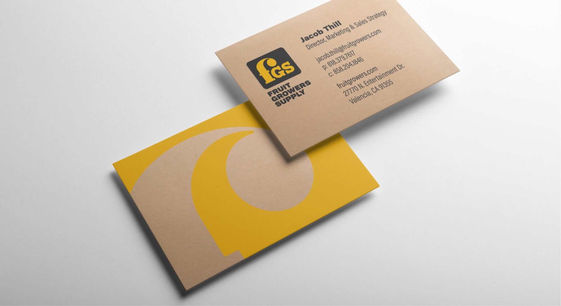
Rebranding examples for companies with a rich history are always works of art. So when FGS approached us for a brand refresh project, we were honored to be their chosen rebranding agency. This brand is a division of Sunkist, and has a proud 140-year history to build on.
During this rebrand, we knew that FGS needed to honor that past while forging a new future. This meant keeping the classic “F” logo that their customers associated with them. In order to bring that logo into the company’s bright future, we redrew it with clean, balanced proportions.
Their present – and future – has also come to include more than just fruit, so we recommended a slight name change to “FGS Growers Supply” as a nod to their rich heritage.
We closed out this project by creating a brand launch plan to bring the new brand to the world, including a welcome box for new clients that celebrates the company’s past and reflects its current identity.
See what we did for FGS here.
2. G12: Life at the speed of luxe

Successful rebranding examples for luxury brands can be hard to come by. Many luxury brands in recent years have fallen prey to “blanding,” discarding their historic brands in favor of flat, safe imagery.
When G12 came to Flux for a rebrand, we embraced the idea of opulence. The multi-family project wanted to appeal to a young, fashion-conscious consumer. The interior design was already luxurious and elevated, so we helped them craft a brand to match.
Bold brass and gold coloring contrast with black and gray to make a statement. Alongside the colors, geometric shapes like hexagons and a simple, functional logo incorporate smooth waves for a delicious finish.
This rebranding case study also included updating their signage. Every passerby is treated to eye-catching window clings, and column wraps that hint at the luxury inside.
In the leasing gallery, a custom sign with beaded curtains makes a statement: This is no ordinary experience. Finally, brass wayfinding signage offers a sense of cohesion throughout the building, bringing the experience into every moment with G12.
See more of how we helped G12 here.
3. The Taft Building: A Hollywood original
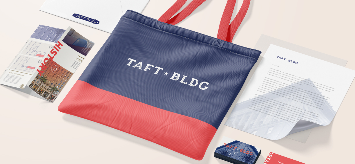
If you’re still wondering, “Why do companies rebrand?” look no further than The Taft Building. This classic building truly deserves its place among our rebranding examples.
After approximately $43 million was spent on acquiring and renovating the building, a fresh new brand was an absolute necessity. Flux was more than able to deliver, bringing a brand that celebrated this building’s storied history and creative future.
With icons like Charlie Chaplin holding offices in the past, the rebrand was built around crafting your legacy. The world-famous intersection of Hollywood and Vine, where the building is located, played a secondary role in the creation of this fresh new brand.
We grounded this color palette in neutral colors, but included an exciting pop of coral as an accent. For typography, we combined serif and sans-serif fonts to bring both a classic and contemporary feel to the print.
Before shelving this project with our other successful rebranding examples, we created a custom brochure. This brochure alludes to the building’s place in movie history by mimicking the style of classic movie posters – doubling as a unique memento from the building.
Check out more of The Taft Building’s rebrand here.
4. The Groveland: Roam. Rest. Repeat.
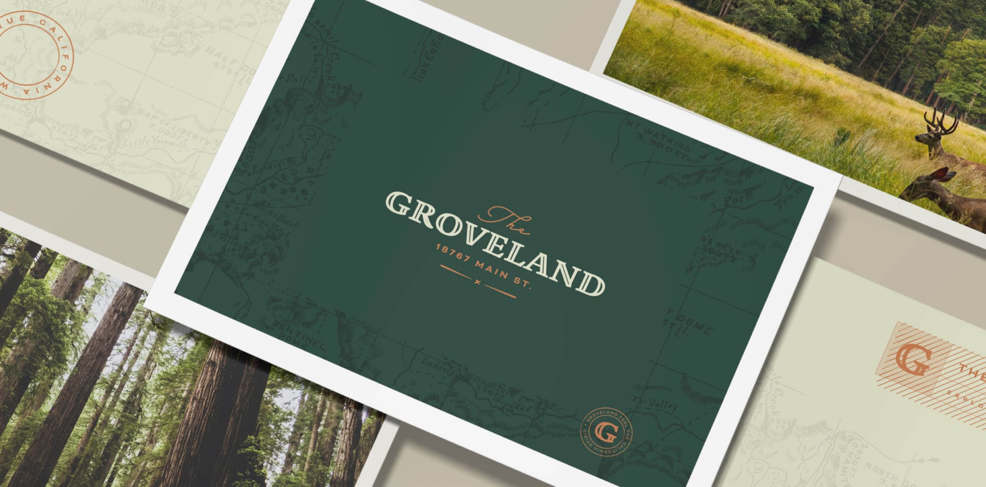
Next on our list of rebranding case studies is another historic building. The Groveland needed a special touch for their company rebranding project.
The hotel began as a trading post in 1849, officially becoming The Groveland hotel in 1875. Making this one of our top rebranding examples meant we needed to be able to bring their history into the new brand without making them look stuck in the past.
California, where The Groveland is located, has a rich history and a promising future in exploration. The rebrand leaned into the feeling of adventure, exploration, and awe that visitors experience in the natural surroundings of the hotel.
We incorporated strong earth tones, like rich greens and browns, as a call back to the concept of discovering the landscape. The typography is a blend of a custom serif reminiscent of old typeset with a gentle, hand-drawn cursive to bring a relaxing, soft feel.
See more of what we did for The Groveland here.
5. Rakuten Super Logistics: Fulfillment superstars
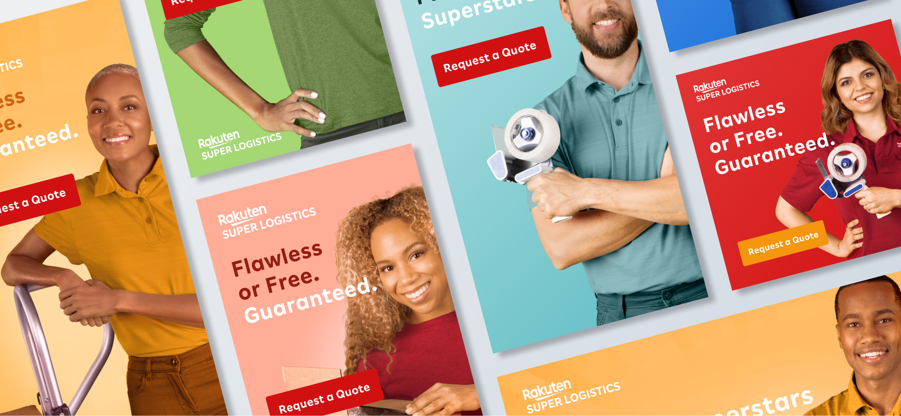
There aren’t many successful rebranding examples in the logistics sector, and during this project, we discovered why. Strong brand voices and eye-catching visual branding are unusual in logistics. However, logistics companies are the cornerstone of many e-commerce businesses.
So when Rakuten Super Logistics came to us for a rebranding project, we knew this was going to be something special. Surprisingly, “super” wasn’t being used within their old brand’s messaging. We chose to highlight this in the new brand, making it the cornerstone of their identity.
The rebrand proclaimed Rakuten as “Fulfillment Superstars.” The messaging focused on something that we noticed during customer research.
Rakuten’s current customers weren’t sure what made Rakuten better than other fulfillment services. We renamed and reorganized their key differentiators and presented them to the world as the “Flawless or Free Guarantee.” They’ll get the right order to the right place on time, or you don’t pay.
Then, we introduced each and every one of these differentiators through social media campaigns. Bright colors and original photography created a welcoming, personable look that matched the new messaging perfectly.
See more of how we helped Rakuten become one of our top rebranding examples here.
Rebranding case studies: why do they matter?
Finding great rebranding examples from companies is key to choosing the right rebranding agency for your business. These case studies will give you a snapshot of the skill set and thought process behind the work the company can do for you, as well as open the door to learning about their methods and beliefs about branding.
When you’re ready to talk to a brand identity agency, these rebranding examples can jump-start the conversation and help you craft your most successful brand yet.