flux branding

Inspiration: Drinking Up Design

Whether it’s romantic and whimsical, bold and modern, or historic and classic, there are so many ways to express who you are.

We think a lot about packaging here at Flux. Packaging is where design and brand experience come together at an individual scale, making it deeply personal and highly powerful for forging brand to consumer connection. A beautifully branded bottle is more than just an aesthetic choice. It forms an emotional connection that elevates the brand interaction from transaction to experience.

This month we’re talking about liquor labels. We’ve been known to cruise the spirits aisle just to check out the sheer variety of packaging. We love the power of these labels to tell a brand story in so few words and images.

The bottle is the brand ambassador– it needs to stand out to consumers, communicate the brand personality, and elicit a sense of reaction or affinity. That’s a huge job for a rectangle smaller than a postcard. It’s inspiring to see how much communication happens in such a confined space. Keep reading for some examples of labels that we love.


Mystical Spirit: A. Junod Absinthe


A.Junode label desigm

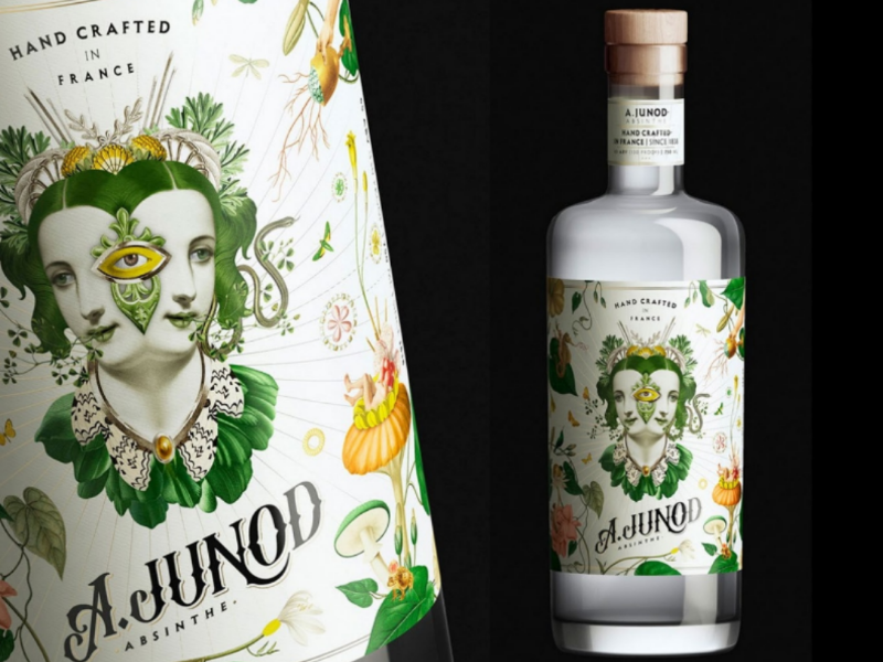
This stunning absinthe label draws upon turn of the century French botanical illustrations. Collaged together, the Belle Epoque aesthetic gets a poetic, surrealist twist. It tells the story of this mysterious drink, legendary for its hallucinogenic power. The design has a sense of magic and whimsy while still feeling sophisticated and enticing.


Minimal + Modern: Sorbo Tequila


Sorbo Tequila

Designed to stand out in the Tequila industry, this simple bottle design is totally unique. Contrasting to the vintage and distressed look of many other tequila brands, Sorbo uses bold lettering without any other motifs. The typeface has a bit of a retro, mid-century modern vibe that keeps it from feeling overly serious. It’s totally unexpected, communicating a sense of playfulness and modern purity that come together beautifully.

floating aejo


Drink to History: Hotel Tango


Hotel Tango is the nation’s first combat-disabled, veteran-owned distillery. They wanted their brand to emphasize their military roots while still appealing to a broad range of audiences. Their aesthetic plays with historic military posters and packaging for a look that’s both resonant with the brand story and interesting to non-military consumers. It’s a heritage vibe that doesn’t verge into kitsch, still feeling thoroughly modern.

collection hotel Tango

The variety of these liquor labels make it clear: brands come in all shapes and sizes. Whether it’s romantic and whimsical, bold and modern, or historic and classic, there are so many ways to express who you are. It’s all about finding the path that resonates with you and your customers. Ready to find out your true identity?

Let’s talk. >


Under the Cover: Album Art


At Flux, we’re always thinking about the power of design to communicate. From liquor labels to book covers, good design tells stories. Recently, we’ve been fascinated by album cover design. An album is a sonic journey, and the cover has to represent the world the music seeks to create. The translation from sound to image opens up brilliant creative possibilities. Here are some of our favorites.

Joy Division – Unknown Pleasures (1979)

A classic of enigmatic, atmospheric design. Are they sound waves? Mountains? According to the band, the lines are actually the radio waves from a rotating neutron star, discovered by Bernard Summer in an Astronomy magazine.


Alladin Sane_Bowie

David Bowie – Aladdin Sane (1973)

Photographed by Brian Duffy, this cover made the image of Bowie with a lightning bolt painted across his face iconic. This otherworldly portrait sparks a million thoughts, highlighting Bowie’s power as a master storyteller.

Grace Jones

Grace Jones – Nightclubbing (1981)

This image of Grace Jones is totally unique. Created by her partner Jean Paul Goude, it shows Jones’ cutting stare and stature– angular shoulder pads, flat top hair, perfect cheekbones. The contrast of the suit and her white cigarette are perfect. She’s looking out directly at us, ready to conquer the world.

Sgt Peppers-Beatles

The Beatles – Sgt. Pepper’s Lonely Hearts Club Band (1967)

Theatrical and fantastical, this iconic Beatles album cover is timeless. Featuring the band in colorful military attire surrounded by famous contemporaries and historical figures, the original album came with paper cutouts for an unprecedentedly interactive experience.

rolling stones sticky fingers

The Rolling Stones – Sticky Fingers (1971)

This Stones cover was a feat of engineering. The original idea and photograph came from Andy Warhol, but the actual production of the album with a physical zipper on top took weeks to make possible.

Music inspires awesome visuals. Check out the work we did for The Sun Rose, a new live music venue on Sunset Blvd inside the Pendry hotel. Inspired by Hollywood sounds and night club ambiance, we created a unique name and logo that mixes retro and contemporary.

Like the sound of it? >Tell us what you think.


Off the Street: Streetwear Aesthetics

We just completed a project for Spotify Studios, a new podcast and music production division of the streaming giant Spotify. And we wanted to share some branding examples that inspired our project.

Spotify Studios came to Flux Branding agency in Los Angeles to develop a collection of branded merchandise to celebrate their grand opening in DTLA. We came up with the concept of a capsule collection of hats, shirts, and jackets to be given to artists and collaborators.

In order to reflect Spotify Studios’ place as a leader in new sounds, we took inspiration from the cutting edge of fashion– streetwear.

This month on the blog, we’re featuring streetwear collaborations that make us think. While streetwear has fully entered into the high fashion space, with streetwear super-brands like Supreme collaborating with everyone from Tiffany’s to Louis Vuitton, we’re more interested in some of the less expected partnerships.

These branding collabs show the curious power of very different brands teaming up to make something great.

MTA Metro x Supreme


Supreme MetroCard

New York streetwear giant Supreme has collaborated with pretty much every name in high fashion. But one of their coolest partnerships? The New York subway system. The Metropolitan Transit Authority teamed up with Supreme to create metro cards with the Supreme logo and even a Supreme-branded train.

DHL x Vetements


DHL shirt as streetware

In 2015, Vetements, a high fashion brand inspired by streetwear aesthetics, broke the fashion world with a T-shirt featuring the DHL logo.

The collaboration, which grew to feature a whole line of shirts and sweatshirts, takes a kitsch, pop art perspective on the importance of brands in our everyday lives. Streetwear is all about taking what exists and remixing it in an unexpected way.

The Vetements x DHL collaboration certainly succeeds at that.

Ikea x Off White


Virgil Abloh Streetware

Off White, led by luxury streetwear visionary Virgil Abloh, teamed up with Ikea for an unexpected homewares collection. Featuring rugs with bold text warning you to “KEEP OFF” or one in the likeness of an Ikea receipt, the collection has a sense of the absurd and surreal that makes streetwear so interesting.

Streetwear is all about the unexpected.

These collaborations show just how far streetwear aesthetics have come– they’re not only in the luxury fashion space, but also integrated into brands that we use in our daily lives. Streetwear is clearly here to stay.

What’s your take on it?

Interested in working with an experienced branding agency in LA to bring your branding ideas to life? Contact us and let’s talk about it. 

Inspiration: Classic Movie Posters

This month, we’re highlighting the brand we created for the Taft Building. At the intersection of Hollywood and Vine, this creative office is an icon of Hollywood history. Home to the offices of Charlie Chaplin, Will Rogers, and the Academy of Motion Pictures, the Taft Building has earned its place in the movie business.

We crafted a position, identity, website and print collateral for the building to support leasing initiatives. To harken back to its star studded past, we designed a brochure that folds out like a movie poster. In thinking about our design, we poured over tons of classic movie posters. We love when beautiful design occurs in unexpected places. Here’s a collection of some of our favorite posters.


metropolis poster
Designed by German artist Heinz Schulz-Neudamm,

Metropolis (1927)

There are just four known surviving copies of this version of the poster for Metropolis, the sci-fi dystopian film which was at the time one of the most expensive movies ever made. The poster, too, is one of the most expensive ever sold at auction– $1.2 million. Designed by German graphic artist Heinz Schulz-Neudamm, it has a distinctly Art Deco look.


Mae West- Go West young man


Go West Young Man (1936)

This highly stylized graphic of Mae West was unique for at a time when movie posters were largely illustrative. We love the classic lettering and the bold red background.


Sunset Blvd movie Poster


Sunset Blvd (1950)

This magnificent poster is one of the most important in the film noir genre. The knotted film strip cuts across the image, and the juxtaposition of the characters immediately creates a sense of intrigue.


anatomy of a murder
Classic Saul Bass

Anatomy of a Murder (1959)

Designed by Saul Bass, this graphic poster uses just three colors and blocked shapes to set the mood. We love the powerful simplicity of this design.


Vertigo movie poster
Designed by Saul Bass

Vertigo (1958)

Another iconic design by Saul Bass, this incredible mid-century modern graphic speaks volumes using only simple lines. It’s abstract and doesn’t even show the main celebrities, making it a rarity of movie posters of the time. For an interesting read, check out this article on how the design of the Vertigo poster shifted to appeal to audiences around the world.

What’s your favorite movie poster? We’d love to know.

Get in touch and tell us about.>


Inspiration: Book Cover Design

Visual communication is incredibly powerful. Because the brain processes images faster than words, how something looks is integral to how we understand it. At Flux, we’re always on the lookout for inspiring communication strategies– from liquor labels to infographics to chocolate bars, examples of design that speaks loud and clear are all around us. This month, we’re talking about a particularly interesting object at the intersection of visual and textual communication: book covers.


Book cover design is a fascinating challenge of visual communication. The cover carries a huge responsibility– to catch the reader’s attention on the shelf, give a sense of the book’s tone and atmosphere, draw them into the story, and create a kind of visual emblem for the entire narrative. And it’s not just that book cover designers must translate words in images, which is itself a creative challenge. They must translate imagination into a physical object. We all “see” differently when we read. The beauty of narrative is that, no matter how detailed the descriptions, we build our own pictures of settings and characters in our minds, colored by our own experiences and memories. How can a book cover represent an image of something that we all see differently?


The book is a magical object– both physical and imaginary. The book is here and yet also nowhere. We hold the book in our hands, but the story is intangible. The cover is the threshold between the real book and the imaginary book, straddling both existences. It’s an invitation. Here are a few book cover designers that get us excited to open the first page.


Peter Mendelsund

Mendelsund’s redesign of a new edition of some of Franz Kafka’s most famous works is a surprising, and new take on the author’s work. Using bold colors, flat graphics, and a repeated eye motif, Mendelsund gives the books a modern refresh by drawing on Kafka’s sense of humor and absurdity. We’d love to have this stunning series on our bookshelf.

Book Cover: Joyce-1024x529

Simple is hard. That’s what makes these incredibly simple covers for a series of reprinted James Joyce novels so impactful. Particularly noteworthy is the cover of Ulysses, one of the 20th century’s most complex masterpieces. Mendelsund strips back the cover to pure color and text, highlighting the novel’s famous last word in the title. The contrast of beautiful simplicity, messy human handwriting and elegant type create a whole atmosphere.

book covers:clothbound classics stack
Coralie Bickford-Smith

Bickford-Smith is the designer for the Penguin Clothbound Classics series. Her use of pattern, color and delicate designs speak volumes about these works while still feeling fresh and enticing. Reinventing a classic is never easy, especially because you’re working within an entire tradition of covers that have already been created and loved by readers. Bickford-Smith successfully subverts the traditional imagery that has been expected on these classic books to create something beautiful and surprising at the same time.

John Gall

Gall’s designs for Haruki Murakmai’s Vintage paperbacks are out of this world. They perfectly capture a feeling of nostalgia for a time that doesn’t exist, with an absurdist, retro-meets-future bent. These covers are mysterious and enigmatic, just like the books. Together they create an entire system that works together, each playing off the other as a comprehensive visual statement of Murakami’s oeuvre.

If your brand was a book, what kind of cover might you have? What imagery, colors, or patterns would evoke the feeling that you want to give your customers? Branding, like book covers, uses images to speak complex concepts simply and effectively. Developing a clear visual style is essential to crafting a solid brand. The process is similar to designing a book cover– we take thoughts, feelings, and ideas and turn them into visual and textual assets that communicate immediately and intuitively. If you’re ready to turn ideas into bold communication, let’s talk.


Sweet Escape: Chocolate Packaging

Grand Cruz_1

We’re always looking for inspiration. Whether it’s maps, posters or packaging, whether we’re on the road or at the grocery store, design is everywhere. Valentine’s Day is coming up in a few weeks, so we’re thinking about one thing in particular that makes our design hearts beat: chocolate. We don’t really need another reason to buy chocolate, but if a bar has incredible packaging we’ll snap it up in a minute. Here are some of our favorites. 

Deux-Cranes choco Pkg
1. Delicate Minimalist

Deux Cranes’ visual identity is infused with inspiration from their Creative Director’s Japanese and American backgrounds, referencing origami to classic kimono patterns she wore growing up. We love these rich jewel tones and delicate gold with a nice contrast of modern geometric patterns embossed on the bars. Classic, elegant and new all the same time.  

Grand Cruz Choco Pkg
2. Textural Trip

The Mexican chocolate company Gran Cruz is taking us on a psychedelic ride. According to the company, the detailed patterns and holograms in both branding and packaging aim to communicate the product’s authenticity and level of attention to detail, effort and demanding selection process. The mixture of serif, sans serif and handwritten texts highlight the brand’s human aspect and artistry. A modern and vibrant color palette is contrasted against sober and monochromatic tags as a reference to Mesoamerica’s colorful culture juxtaposed with colonial era’s industrial European influence. It’s totally unique.

3. Elegantly Tactile

Dandelion chocolate is a “bean to bar” chocolate company based in San Francisco. Because their chocolate is only made of beans and sugar, with no added emulsifiers or flavorings, they went for packaging that feels very real, but also special. We love their use of heavy, textured paper with beautiful patterns and gold leaf. It feels simple, down to earth and elegant all at the same time, perfectly communicating their ethos. 

For Valentine’s day, we’ll be treating ourselves to a sweet bit of design inspiration with one of these bars.

Which is your favorite? We’d love to know. 

CONTACT US >


Inspiration: The Political Posters of Sister Corita Kent

corita-kentt-it-can-be-said-of-them-1969-
Sister Corita Kent maintained that art was revolutionary, joyful and powerful.

This month, we’re thinking about the power of design to change hearts and minds. To shift the political needle. To fight for what’s right. As January 17th is Martin Luther King Jr. day, we’re thinking about how design has been an integral part of social justice throughout time. We’re focusing on one of our favorite graphic designers and political activists, LA native Sister Corita Kent.


Smiling_corita

Corita Kent entered the Immaculate Heart of Mary when she was 18, and later taught at the Immaculate Heart College in Los Angeles. Passionate about screen printing, she was deeply influenced by Andy Warhol and Pop Art, utilizing bright colors and repurposing found imagery from advertisements and consumer culture. 


CoritaKent_GetWithTheAction_forweb-1024x845

In the 1960s her work became decidedly political, protesting war, advocating for civil rights, calling for peace and encouraging love across humanity. She spoke with a voice of a dissident but always from the perspective of someone who believed deeply that humans were inherently good and capable of love. With bold, bright color combinations, innovative layout and inventive typography, Kent created political posters that were disarming, direct and unignorable.  She maintained that art was revolutionary, joyful and powerful.


Corita at the press
Sister Mary Corita with her students art Immaculate Heart in Los Angeles.

Her ten rules for her students at Immaculate Heart should be required reading for everyone.  


Corita Kent_Help-or-something

Kent used design to change the status quo. Her unwavering commitment to art as a tool for the betterment of society is a huge inspiration.

love-justice-corita-kent by corita kent

We hope you find her work as interesting as we do. To view more of her work check here .

Drop us a note and tell us what you think.   

CONTACT US >