For our project spotlight this month, we are focusing on the brand we built for ArtHaus, a multifamily development firm that’s reimagining workforce housing across the Bay Area. They create thoughtfully designed spaces and buildings to uplift residents and the surrounding community. One of the unique ways they do this is by commissioning local artists to paint murals on the exterior of each of their buildings, supporting artists as well as bringing art into the urban landscape.
We love this commitment to artistic expression, and it makes us think about how powerful art can be in public spaces. That’s why we’re highlighting mural artists making unique work around the world. Check it out.
Curiot (Favio Martine)
Mexican artist Favio Martinez, better known as Curiot, creates vibrant murals that blend mythical motifs with bright, often neon colors to invoke the folklore of his native country. His works feature fantastical creatures and humans morphing into animals, which are meant to reconnect urban dwellers with ancient, nature-centric narratives. His murals can be found beautifying walls from Mexico City to Los Angeles. View more here.
Blu
Blu is an enigmatic Italian street artist renowned for his large-scale murals that often carry strong social and political messages. Emerging from the graffiti scene in Bologna during the late 1990s, Blu’s distinctive style involves vivid, surreal imagery that critiques contemporary issues such as consumerism, environmental degradation, and global warfare. Check out more Blu.
eL Seed
A French-Tunisian artist, eL Seed is known for his unique style of calligraffiti, which blends traditional Arabic calligraphy with modern graffiti art. His murals often carry messages of peace and unity, subtly weaving complex cultural and social narratives into colorful, flowing Arabic script. We love his work on “lost walls” – marking abandoned architecture throughout Tunisia with his signature style, bringing them out of the past and into the present. Read more about the Lost Walls of Tunisia.
Lauren Ys
Lauren Ys, also known as Squidlicker, is a prolific muralist and illustrator known for their vibrant and fantastical creations that often explore themes of identity, sexuality, and the surreal. Their murals are characterized by a bold use of color and intricate detail, featuring a mix of mythical creatures, human figures, and dream-like landscapes. Want to see more? Check out Squidlicker on instagram.
BREAKING: Flux Branding Contributes to SmartCups Victory in 2023, Clinching $250,000 Grand Prize
Kudos to Chris Kanik of SmartCups on clinching the grand prize of $250,000 investment from Gordon Ramsay in the 2023 edition of Gordon Ramsay’s Food Stars! We’re ecstatic that we could play a role in refining your brand’s essence. Check out the video to see the brand strategy crafted by us that aided SmartCups in securing the coveted top spot.
When Hollywood comes knocking, Flux opens the door.
When Flux Branding was approached by a television producer last year, we were informed only that our expertise was sought for a new competitive reality show hosted by a prominent figure. Intrigued and eager to learn more, we engaged in several conversations and were eventually thrilled to discover that the show was Gordon Ramsay’s Food Stars, and even more excitingly, Flux was handpicked by Ramsay for a pivotal role in the season finale.
Flux Branding with finalist Chris, the founder of Smart Cups, on Gordon Ramsey’s Food Stars.
The Challenge.
The series follows the journey of emerging food entrepreneurs, all competing for a life-changing $250,000 investment from Ramsay. Each episode involves a series of challenges, with contestants voting off the least successful until only one remains, combining elements of Top Chef, The Apprentice, and Shark Tank.
Our mission on the show was clear yet challenging: refine the brand messaging for one of the finalists, SmartCups, a food technology startup specializing in 3D printing dry ingredients. Ramsay saw potential in the contestant’s business but believed it needed a more accessible and intelligent narrative for consumers. Flux Branding appears to help this contestant go from confused to clarity.
Flux conducted an Ignite Session to uncover the essential brand promises that resonated the most. Following this, we developed an evolved Brand Platform that repositioned the brand for an exciting relaunch. Armed with this strategy, a pop-up storefront was created to showcase the brand as the final test to determine the winner.
Jamie & Olivia have their Network TV debut!
The culmination of our journey was a moment of immense pride and joy for the entire team at Flux Branding. After weeks of intense competition, nail-biting challenges, and tireless efforts to redefine and refine the brand messaging of SmartCups, the moment of truth arrived. SmartCups was announced as the winner! It wasn’t just a victory for innovative food tech, but a toast to the power of crystal-clear storytelling. It was a moment where technology met tradition, and a cup of innovation was raised to the timeless power of a well-crafted narrative. Cheers to SmartCups and to the alchemy of branding and innovation.
Clarifying your message.
Having a clear and compelling story behind your company is not only crucial for your customers but also for your investors. The value of potent messaging cannot be underestimated. Remember, successful branding isn’t just about being seen—it’s about being understood.
Perhaps you’re just exploring how to rebrand your business, or maybe you’re at the point where you’d like to bring in help from an expert branding agency in Los Angeles.
If you’re ready to embark on a project with the rebranding team at Flux, get in touch today.
July 1st is national Postage Stamp Day. Stamps are how the mail gets around the world– but they’re also tiny canvases that have captured pivotal moments, notable figures, and cultural milestones throughout history. At Flux, we think a lot about creating impactful design in everyday objects and often tiny spaces. We can find inspiration in postage stamp designers creating impactful images in some of the smallest areas.
The Early Days: Classic Elegance
The story of postage stamps began in 1840 with the issuance of the Penny Black, the world’s first adhesive postage stamp. Featuring a profile of Queen Victoria, the Penny Black set a precedent for the elegance and simplicity that would define early stamp design. The focus was on clear, recognizable imagery that conveyed authority and reliability. These early designs often showcased monarchs, national symbols, and intricate borders, emphasizing a sense of tradition and stability.
The Golden Age of Philately: Artistic Flourish
As stamp collecting gained popularity in the late 19th and early 20th centuries, stamp design began to flourish. This period saw a shift towards more elaborate and colorful designs. Nations used stamps to showcase their culture, natural beauty, and technological advancements. This stamp from 1898 showing Western cattle in a storm, is one of the most collectible stamps of all time for its beautiful composition and nod to the draw of the West. This era marked the beginning of stamps as a medium for storytelling and national pride.
Mid-Century Modern: Simplification and Innovation
The mid-20th century brought about a new wave of design philosophy. Postage stamps began to reflect the modernist trends sweeping through art and architecture. Designers embraced simplicity, bold colors, and geometric shapes. The 1960s, in particular, saw a surge in innovative designs. The United States’ 1962 Project Mercury stamp, commemorating America’s first manned spaceflight, featured a sleek, futuristic design that mirrored the excitement of the Space Age. This era demonstrated how stamps could capture the zeitgeist of the times while remaining functional.
“Project Mercury” (US Man in Space) 4¢ US Postage Stamp (Scott 1139) w/First Day of Issue CDS FEB 20, 1962 3:30 PM Capr Canaveral, FL (Issued on the day of John Glenn’s first manned orbital flight in Friendship 7.The Cooper Collection of US Aviation Histor
Contemporary Design: The World is our Oyster
From the latter half of the 20th century to the present day, thematic and commemorative stamps have become increasingly popular. Stamps began to honor a wider array of subjects, from famous personalities and cultural icons to significant events and social causes. The USPS has commissioned artists and illustrators to create limited edition stamps to showcase their work. The public can suggest stamp designs and subjects too, through the mail– according the USPS, they get as many as 30,000 suggestions for what should be on the 24 stamps that will be issued each year.
The Ever-Evolving Canvas
As we celebrate National Postage Stamp Day, it’s clear that postage stamps are much more than mere postal tools; they are windows into our history, culture, and artistic expression. What’s your favorite stamp? We’d love to know.
As we commemorate Women’s History Month, it’s crucial to shine a light on the pioneering women who have left an indelible mark on the world of graphic design. Despite facing significant obstacles, these creative powerhouses have broken barriers, set new standards, and inspired generations of designers. Their innovative work spans various mediums, including typography, branding, poster design, and digital art, showcasing the diversity and richness of graphic design as a field. Here, we celebrate five women whose contributions have not only enriched the design world but also paved the way for future talents.1. Paula Scher
1. Paula Scher
Paula Scher is a titan in the world of graphic design, known for her revolutionary approach to typography and identity branding. As a partner at Pentagram, the world’s largest design consultancy, Scher has redefined the visual language of culture and commerce. Her work for The Public Theater in New York City, with its bold typography and dynamic visuals, breathed new life into the institution’s branding, making it iconic within the arts community. She also developed the logo for one of the world’s largest financial institutions, Citibank.
Scher’s designs are characterized by their clever use of type, vibrant colors, and energetic compositions, making her an enduring influence in the design industries. Described as the “master conjurer of the instantly familiar,” Scher straddles the line between pop culture and fine art in her work. Iconic, smart, and accessible, her images have entered into the American vernacular. She has designed identity systems, environmental graphics, packaging and publications for a wide range of clients that includes, among others, the Public Theater, the Museum of Modern Art, the High Line, the Metropolitan Opera, Tiffany & Co., Citibank and Microsoft.
1. April Grieman
April Greiman is a trailblazer in digital art and design, recognized for her innovative use of technology in graphic design. Often considered as one of the first designers to embrace computer technology as a design tool, Greiman’s work in the 1980s heralded a new era in digital design. Her project “Does It Make Sense?” is famously known for its explorative use of digital imagery and typography, challenging the traditional boundaries of design. Greiman’s contributions have significantly influenced the evolution of graphic design from print to digital, showcasing the potential of technology in creative expression.
Greiman studied typography—the design and arrangement of letterforms—in Basel, where she was trained in the style of classic Swiss modernism. Returning to America to open her own design studio in Los Angeles, she found herself at the vanguard of a graphic movement: one that eschewed the grids, sans serifs, and clean look of most modern typography, embracing instead a digital aesthetic and adopting the computer as a design tool. Does It Make Sense? is Greiman’s design for a two-sided fold–out issue of Design Quarterly magazine. Produced in 1986 entirely with MacDraw—an early digital drafting application—Does It Make Sense? layers textures of pixilated video, text, and appropriated imagery, evincing Greiman’s interest in time–based media, textiles, and environmental graphics
1. Lorrain Wild
Lorraine Wild is celebrated for her contributions to book design and her influence on the Californian design scene. As a graphic designer and educator, Wild has been instrumental in shaping the approach to contemporary book design, blending historical techniques with modern sensibilities. She was among the first American designers to take apart the clear grids and minimalistic forms of Modernism, believing that collage could better respond to the fractured nature of modern society.
Through much of her career Wild has specialized in books, particularly visually sophisticated collaborations with artists, architects, and museums. She has designed award-winning publications on the work of Daniel Libeskind, John Hejduk, Mike Kelley, Richard Tuttle, Bill Viola, Morphosis, and many others. If her work shares any signature, it is a sense of flow that gives even the most diverse typefaces, disparate layouts, strange images, and dense bodies of text an intrinsic and logical relationship to the other elements on the page.
3. Deborah Sussman
Deborah Sussman is renowned for her pioneering work in environmental graphic design and urban branding. Her most notable project, the visual identity for the 1984 Los Angeles Olympic Games, showcased her ability to blend vibrant colors, bold graphics, and local culture into a cohesive visual language that transformed the cityscape. Sussman’s work is characterized by its playful yet structured approach to design, integrating graphic elements into physical spaces in a way that enhances and enlivens public environments. Her legacy is evident in the continued relevance of environmental design in shaping our experience of shared spaces.
She got her first job for Charles and Ray Eames at the age of 22, where she worked on seminal exhibits for IBM. Shortly after, Sussman won a Fulbright Scholarship to study at the Hoschschule für Gestaltang, an art and design school in Ulm, Germany. Eventually, Sussman opened her own design practice in 1968 and years later, her husband, Paul Prezja, an urban planner and architect, joined her. Some of their projects included designing wayfinding systems for Walt Disney Resorts and interiors for Hasbro, Inc. One of the last projects she was involved in was signage for Grand Park, which opened in downtown Los Angeles in 2012. It included 16-foot-high entrance totems that read “the park for all” in 26 languages.
5. Susan Kare
Susan Kare, a pioneering figure in the field of digital interface design, is best known for her work on the original Macintosh team at Apple. Her iconic bitmap graphics, including the lasso, the grab hand, and the happy Mac icon, have become deeply ingrained in the fabric of digital culture. Kare’s designs are celebrated for their simplicity, humor, and universality, qualities that have made the Macintosh interface friendly and accessible to millions of users worldwide. Her work demonstrates the power of design in making technology approachable and intuitive for users, marking a significant milestone in the history of digital design.
“Bitmap graphics are like mosaics and needlepoint and other pseudo-digital art forms, all of which I had practiced before going to Apple,” she told an interviewer, in 2000. The command icon, still right there to the left of your space bar, was based on a Swedish campground sign meaning “interesting feature,” pulled from a book of historical symbols. Kare looked to cross-stitch, to mosaics, to hobo signs for inspiration when she got stuck. “Some icons, like the piece of paper, are no problem; but others defy the visual, like ‘Undo.’ ” At one point, there was to be an icon of a copy machine for making a copy of a file, and users would drag and drop a file onto it to copy it, but it was difficult to render a copier at that scale. Kare also tried a cat in a mirror, for copycat. Neither made the cut. She also designed a number of the original Mac fonts, including Geneva, Chicago, and the picture-heavy Cairo, using only a nine-by-seven grid.
As we reflect on the contributions of these remarkable women, it’s clear that their creativity, resilience, and vision have not only shaped the landscape of graphic design but also challenged and expanded the possibilities of visual communication. Their legacies serve as a testament to the transformative power of design and a source of inspiration for future generations of designers.
Last week, I attended First Round Los Angeles, a unique branding conference put on by Under Consideration. At First Round, speakers share their first-round presentation process by showing the original PDF/Keynote/PPT file that they presented to a client the very first time they showed their identity design. The result is a conference that’s as much about process and presentation skills as it is about design.
Speakers came from a range of agencies. Giants like Jones Knowles Ritchie were among solo practitioners and two person studios. It was an incredible chance to gain insights into a critical moment of the design process.
We’re always looking at and inspired by the work of other studios, but we know better than anyone the journey from an idea to what’s shown in the final case study is rarely a straight shot. Most of the time, that knowledge of what it took to get there is internal– we show the world the finished product, and it seems like we went from before to after without any detours. In creative work, detours abound. Understanding the paths that other agencies take to bring brands into the world was fascinating.
This kind of open industry conversation makes all of our work better. So I’m sharing what I saw as a way to make it even more available. We already follow a lot of these principles at Flux, but it’s always good to be reminded of what is really impactful in presentations. As designers, we’re constantly translating our work for non designers to understand. Only part of the job is making great work– the other part is communicating that work to the client. That’s not easy, and the more effectively we can do it, the more effectively we can bring intelligent design into the world. Here are some of the major insights that spanned across presentations.
1. Always name your concepts.
It’s a simple one, but it goes a long way. Giving each option more introduction than “option 1” is really powerful. It prepares the mind and gets the client into the space that this is a design ethos, not just a logo. Some presentations simply gave a conceptual name, while others went further with a blurb in the brand voice and an inspiration quote to give the name more support.
2. Push the boundaries in round one.
The purpose of the first round is to put a dart on the dart board. And in stabilizing the direction, it’s better to go far out than play it too safe. You can always bring a lofty idea back down to earth, but you can’t always pump up a boring one. Even if the client is uncomfortable, that’s the only way to start a conversation. A point of view doesn’t form from the comfort zone. Don’t be afraid to show things that you know won’t ever appear in real life– the point is to test the limits.
3. Mood boards are visual insurance
Mood boards are in just about every presentation we do. I find that client sometimes have a hard time understanding their purpose– they get hung up on a particular image, or can’t get into why we’re showing design that isn’t theirs. One of the presenters described mood boards as “visual insurance”, a way to show the client the ethos of the visual language before we do all the work to create the pieces ourselves. I thought this was really clear, and something that would be easy for a design challenged client to understand. It’s a safety procedure, something we do so we can have a piece to measure against later on.
4. Real mockups with real words.
Mock ups really matter. Always always mock it up, and go as far as you can with it. Even if that’s not how the package design will look in the end, mock ups on actual brand applications are essential for getting a client to understand that we are talking about more than a logo– we’re talking about a visual system. That’s also why you should avoid lorem ipsum in your mockups as much as possible. Voice and visuals work together to give a brand presence, so using real brand messaging makes mockups land so much more powerfully.
5. Enroll the client in the process.
Making great work is part of our job. The other part is enrollment. If we can’t get the client to see why our idea is great, it doesn’t matter how great it is. Several presentations shared different strategies for this, including really bringing the client into the design process. In their work for Fanta, the team at Jones Knowles Ritchie showed the client their entire design process, walking them through the strategic decisions they made to get to the actual R1 logo. Bringing the client into our heads helps them think and see like us.
6. Propose solutions like a doctor.
This was something that Meryl Vedros of Vedros Studio talked about in her presentation. When you go to the doctor, the doctor suggests a limited number of solutions (sometimes just one!), and as a patient you trust that one of those will be right. While it’s great to bring the client in our process, we also need to come from a position of expertise, stating our professional opinion clearly. At the same time, we must acknowledge the trust that is required on their part, and respect it.
7. Dive as deep as possible.
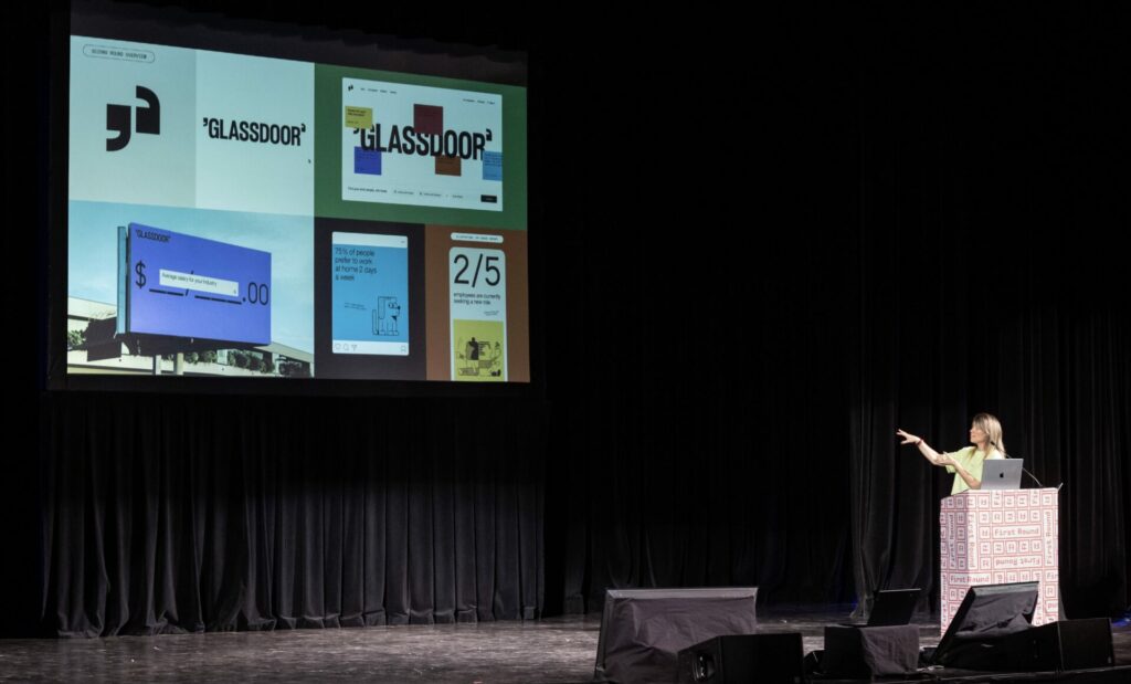
What people say and what people mean are two different things. In their work for Glassdoor, Koto went through an extensive research and interview process, and kept hearing that the team at Glassdoor felt their brand had become overly boring, not reflecting their rebellious spirit. The Koto team had trouble understanding how a workplace review platform was rebellious, until they discovered the story of how Glassdoor was born– an employee saw a salary list on a copier and found out they were being paid less, and set out to make a platform that would limit that possibility for others. The rebellious spirit was the concept that it was founded by workers, for workers. That informed their design in so many ways. Before the first round, you really need to know your client inside and out.
8. Pace your presentations.
Thinking about how to take the client on a journey through your presentation is key. Start with something to get them in the right headspace about what this is (just the start), show the elements of the brand, and then show mockups that include both big brand moments (billboards) and small ones (business cards). Koto had a really interesting approach that I quite liked– at the end of the concept, when showing all the graphic elements for that design option in a summary slide, they first showed a summary slide of the current brand elements. The idea was to say, “here’s where you are– and here’s where you could be.” It was an effective way to get excited, rather than scared, about a big change.
9. Only present work you love.
It might seem like a no-brainer, but it’s important to keep in mind. Make sure everything you present would be something you’d be happy to continue with. No one knows why, but the one concept you think is a “throw away” is oftentimes the one that gets picked. Designers are all familiar with feedback from client to combine elements of multiple concepts into one– it came up in almost every presentation at the conference. But as Ross Burwell of Hype Type studio pointed out, if every concept fits the brief and you love them all, combining pieces is just another exciting design problem to solve. It just makes the work better. You can certainly have a favorite, but make sure every option is meaningful.
There were so many more insightful moments from the conference. I felt like my brain was on fire! Thanks so much to Under Consideration, who also put on the yearly Brand New Conference and run the brand identity publication Brand New. They are doing such great things to bring our industry together and elevate the level of exchange that makes all of our processes– and the work for our clients– better. I can’t wait to go to the next one. Catch the next First Round in New York on May 10!
As 2024 ramps up and the Year of the Dragon begins, we’re thinking about time. February 10th marks the official start of the Year of the Wood Dragon in the Lunar calendar. The lunar calendar follows a 60 year cycle– bringing us back to the Wood Dragon for the first time in over half a century.
Brands across industries are marking the occasion. While dragons can be spotted in fashion, packaging, and print, one area that’s really caught our eye is watch design. As designers, we have to strategize how to make sometimes extremely small spaces as compelling as possible– a business card, a sachet package, a little notebook. We tip our hats to watch designers, the masters of making the absolute tiniest area as visually rich as possible.
The dragon-themed watches represent not only the celebration of a new year but also embody the essence of thoughtful design – where every line, curve, and color serves a purpose, creating a harmonious and captivating visual narrative. Let’s take a moment to appreciate the shared values between these exquisite timepieces and our work as designers: precision, balance, and a relentless pursuit of beauty in the details.
Vacheron Constantin Les Cabinotiers Grisaille High Jewellery
This stunning Vacheron features a dial with a grisaille enamel depiction of the Chinese imperial dragon. This technique of applying Limoges white enamel on a dark enamel base, layer by layer, creates a depth and chiaroscuro effect, enhancing the mythical allure of the dragon.
The Reverso’s history is rooted in the world of polo, where its reversible case was originally designed in 1931 to protect the watch crystal during matches. This functional aspect eventually opened up new avenues for artistic expression, as the reverse side of the watch offered a canvas for exquisite craftsmanship.
For the Year of the Dragon, Jaeger-LeCoultre has adorned the Reverso Tribute Enamel Dragon with a meticulously engraved dragon, enhanced by black rhodium and set against sandblasted clouds. The complex technique of modeled engraving used here is particularly challenging as it involves working on Grand Feu enamel, where any mistake could mean starting over. It takes the master engraver approximately 80 hours using 10 different-sized chisels to achieve the final result.
Hublot Spirit of Big Bang Titanium Dragon
Check out Hublot
And now for something completely different! This unique timepiece, a collaboration between Hublot and Chinese artist Chen Fenwan, is a testament to the traditional art of paper cutting reimagined in a modern horological context. Chen Fenwan’s detailed, layered creative approach is evident in the way the dragon’s design integrates components of the dial and movement, including the cogs and Hublot’s signature H-shaped screws.
The dragon’s head is rendered in 3D relief using five layers of appliqués in bright pink, blue, and frosted gray, offering a vivid and multi-dimensional aesthetic. Adding to the uniqueness of the watch is its strap, which showcases a dragon scale marquetry motif in vibrant colors.
This more understated option from IWC plays on the Lunar New Year association with the color red. The dial is a captivating burgundy, commonly associated with the Lunar New Year in China and throughout Asia, believed to bring longevity and good luck.
A unique feature of the Portugieser Chronograph Year of the Dragon is the gold-plated rotor in the shape of a dragon, visible through the sapphire glass case back.
Bell and Ross BR 05 Artline Dragon
Check out Bell and Ross
This intricate watch features detailed laser engraving that covers the entire watch, including the band, case, and dial. Graphic in black and white, it’s a nod to the ancient Chinese art of tattooing. Each link of the bracelet is individually engraved, ensuring a seamless flow of the pattern across the watch. The watch’s hands are filled with black lacquer and highlight the dragon’s whiskers.
Incorporating elements from nature such as the sun, moon, and even a swallow motif, the BR 05 Artline Dragon is not just a timekeeper but also a carrier of cultural significance and mythological symbolism. The dragon design represents balance, bringing luck and symbolizing power in the world.
AI seems to be everywhere these days. With the wide scale availability of numerous AI-generated imaging and text softwares, we’ve reached the tipping point. What was once the purview of programmers and scientists can now be used by anyone, anywhere. Artificial intelligence has been a presence in our lives for some time– but it is now quickly becoming incorporated onto the surface of how we live and work. The collaboration between human and machine is ever more apparent and undeniable. And this is what makes Refik Anadol’s “Living Paintings” such a timely and fascinating exhibition.
“Living Paintings” is Refik Anadol’s first major solo exhibition in Los Angeles, on view at Jeffrey Deitch until April 29, 2023. Truly hypnotic, Anadol’s AI-generated paintings transform data– images of national parks, ocean currents, electrical impulses of the brain– into abstract digital works that seem to leap from the confines of the LED framed screens that hold them. Colors and textures roil together, reminiscent of the natural world and also wholly distinct from it, like a landscape from a dream. It is both familiar and new, an unsettling combination that mimics the experience of conversing with a chatbot that’s so human you almost forget it’s not.
The exhibition forces us to consider the collaboration between human and machine, but also brings up interesting questions about different ways of seeing and knowing. What does it mean to see data like this? How does putting numbers or electrical impulses into these visualizations change their meaning? Don’t miss the large scale video in the room to the left of the gallery entrance– a 30 minute loop, its immersive scale, dazzling colors, and intricate animation feel like entering a new dimension.
Anadol’s body of work addresses the challenges, and the possibilities, that ubiquitous computing has imposed on humanity, and what it means to be a human in the age of AI. He explores how the perception and experience of time and space are radically changing now that machines dominate our everyday lives. Anadol is intrigued by the ways in which the digital age and machine intelligence allow for a new aesthetic technique to create enriched immersive environments that offer a dynamic perception of space.
Refik Anadol (b. 1985, Istanbul, Turkey) is an internationally renowned media artist, director, and pioneer in the aesthetics of machine intelligence. He currently resides in Los Angeles, California, where he owns and operates Refik Anadol Studio and RAS LAB, the Studio’s research practice centered around discovering and developing trailblazing approaches to data narratives. Anadol is also teaching at UCLA’s Department of Design Media Arts from which he obtained his Master of Fine Arts.
Would you describe Google as smart? SpaceX as bold and fearless? Hershey’s as an old friend?
Chances are, the brands you like have distinct, human-like traits. When you think of them, it’s like thinking of someone you know and like– they’re funny, reliable, comforting, exciting, or a whole host of other things. When you engage with them, you’re not just buying something. You feel like you’re connecting to a much bigger feeling.
Companies aren’t people. But successful brands make us feel like they are.
Powerful brands know who they are and speak it loud and clear, elevating transactions to meaningful connections. Successful brands have personality.
Knowing and expressing your brand personality means you’ll communicate beyond words. Connect directly to your customers’ hearts and minds.
This month, as we launch our new Brand Personality Quiz, we’re talking about the importance of personality in branding. What does it mean? How can you tap into it? Read on to find out.
Brand personality refers to a set of human traits and characteristics that are attributed to a brand. Just like people, brands use particular personality traits that help us understand who they are and what they’re all about. A brand personality is a way of defining the written and visual tone of a brand in human terms, and helps to create a human-like identity for the brand.
Your brand personality is something you sense innately about your own brand, simply based on the experience you give your customers and the kinds of services you offer. For example, a bank usually won’t be fun and silly, but will have a personality that feels trustworthy, safe, and formal. If your company is customer-centric and friendly, your personality might be more cheerful, upbeat, and casual.
All brands have a personality– but not all of them communicate it effectively across the many facets of their brand experience.
Why You Need a Brand Personality
Brands that have a well-defined personality create a deeper connection with their customers because they communicate a unique and recognizable identity that customers can relate to and feel emotionally connected to. A brand’s personality reflects its values, attitudes, and beliefs, and it humanizes the brand, making it more relatable and appealing to customers.
When customers feel that they share similar values and beliefs with a brand, they are more likely to form a bond with that brand, making their relationship more meaningful and long-lasting. A strong brand personality can also create an emotional connection by appealing to customers’ desires and emotions, whether it’s through creating a sense of security and stability, or by inspiring customers to pursue their dreams and reach their full potential.
But a brand personality isn’t just for your customers. It’s also for your competitors, your employees, and your stakeholders. Having a strong brand personality is important for a number of reasons:
Differentiation: A well-defined brand personality helps to differentiate a brand from its competitors and sets it apart in the market. This makes it easier for customers to identify and remember the brand, and can help to create a competitive advantage.
Emotional connection: A brand personality helps to establish an emotional connection with customers by creating a human-like personality for the brand. This emotional connection can lead to increased loyalty and a stronger bond between the brand and its customers. They aren’t just buying– they’re connecting.
Consistency: A strong brand personality provides consistency in the brand’s messaging and communication, making it easier for customers to recognize and remember the brand across all touchpoints. It also makes it easier for your marketing, branding, and social media teams to all stay on the same page, speaking with the same voice no matter where your brand shows up.
Credibility: A well-defined brand personality can help to build trust and credibility with customers by demonstrating the brand’s commitment to its values and identity. When you are authentically yourself, your customers take notice.
Marketing: A strong brand personality creates the foundation for creative campaigns that effectively target and engage with specific customer segments. And it’s not just that brands with personality engage more effectively with their audiences, it’s also that having a well-defined personality could save you tons of money in your marketing budget. When your personality is clear, your team knows who you are and how you show up, taking much of the guesswork out of creative campaign creation and streamlining the process. You won’t be getting the question, “Would our brand say that?”
How To Develop Your Brand Personality
Developing a strong brand personality requires a thoughtful and strategic approach. To express your brand personality, your brand adopts specific traits in visual, written, and experiential communication. But before you do, you need a deep and authentic understanding of what you do and why you do it. To uncover your brand personality, you’ll need to take several steps:
Conduct market research: Start by understanding your target audience, what they want and need, and what they look for in a brand. This information will help you identify the traits and characteristics that your target audience values and that can be incorporated into your brand personality. Ensure you also have a clear understanding of your competitors– you don’t want a personality that sounds exactly like everyone else.
Define your brand values: Clearly define the values that your brand stands for. What is your mission? What are you committed to? Why do you do what you do? Your brand values will shape the personality of your brand and help to guide your decisions.
Determine your brand voice: Decide on the tone and language that your brand will use in its communication. This voice should be consistent across all touchpoints, including your website, social media, advertising, and customer service. If you’re committed to brightening people’s lives, perhaps your voice is funny and cheerful. If you’re committed to protecting people from harm, perhaps your voice is serious and knowledgeable. Whatever you choose, it’s important that it comes from a deep understanding of your personality.
Create a visual identity: Develop a visual identity that reflects your brand personality. This can include things such as a logo, color palette, and typography. Your visual identity should be consistent with your brand personality and values– a brand that’s happy and easy probably wouldn’t use dark, moody colors. The brain processes images before words, so the visual tone of your personality is just as important as the voice.
Integrate your brand personality into everything you do: Your brand personality should be integrated into everything you do, from your products and services to your customer service and marketing efforts. This helps to reinforce your brand personality and ensure consistency in your messaging and communication. Let your personality inform your campaigns, not the other way around.
These aren’t easy steps– each one takes time, resources, and strategic thinking. But the revenue you’ll generate with a strong brand personality more than pays back the effort. If you’re not sure where to start, our Brand Personality Quiz is a great place to begin– you’ll find out your personality in just six questions, and get concrete tools for bringing it to the world.
The Brand Personality Quiz
We think personality is so important, we’ve created an assessment to help more brands get in touch with their personality. After working with hundreds of brands across industries, we’ve found that there are four major brand personality types. Each type can effectively tap into particular personality traits to inspire action and loyalty. Below is a graphic representation of how the personality types and their traits work together, with example brands.
The axes of the wheel represent two critical dimensions of every brand: the offering and the experience. How you answer the questions in the Brand Personality Quiz place your brand on the X and Y axes, determining your brand personality type.
Horizontal Axis = OFFERING
The offering is your product or service. Is your offering historic and recognizable, or is it totally new in the market?
Heritage Offering: Established and familiar products and services (example: Rolex watches) Innovative Offering: Products and services that disrupt the market or have never been seen before (example: iPhone)
Vertical Axis = EXPERIENCE
The brand experience is what happens when someone engages with your offerings and services. Is the experience you offer to customers familiar and expected, or new and/or constantly changing?
New Experiences: Customers are drawn to your brand because it helps them discover new things about themselves and the world (example: Google) Known Experiences: Customers are drawn to your brand because it is comforting, nostalgic, or trusted (example: Campbell’s Soup)
The 4 Quadrants = PERSONALITY TYPES
Where a brand falls on the axes places it into one of four quadrants, each representing a particular brand personality type. There are four main types of brand personalities: Dreamer, Protector, Explorer, and Lover. Each of these personalities appeals to different emotions and desires, allowing brands to connect with their target audience in a unique and meaningful way.
Dreamer brands are creative and innovative, always looking for new and exciting ways to do things. They create a sense of transformation and change, appealing to customers who are looking for new experiences and a sense of novelty. Apple is an example of a dreamer brand, with its bold marketing campaigns and innovative products that introduce us to completely new realities.
Protector brands provide stability and comfort, offering trusted and familiar products and services to established markets. They create a sense of nostalgia and security, appealing to customers who value reliability and tradition. Johnson & Johnson is an example of a protector brand, known for its high-quality products that help people care for their families and maintain a healthy lifestyle.
Explorer brands are disruptors, taking familiar products and services and doing them better. They create a sense of excitement and adventure, appealing to customers who are looking for something new and innovative. Tesla is an example of an explorer brand, known for its electric vehicles that are changing the way people think about transportation.
Lover brands are warm and nurturing, helping customers to discover new things about themselves and the world. They create a sense of belonging, happiness, and possibility, appealing to customers who are looking for a sense of community and a connection to something greater. Coca-Cola is an example of a lover brand, known for its cheerful marketing campaigns that bring people together and spread happiness.
The quiz is an easy way to understand your brand personality type in just six questions. You’ll get immediate results, and a customized report that will give you concrete strategies for communicating your personality to the world.
Customized report with insights into your specific brand personality type.
Personality is Everything
Personality is the key to infusing your brand with humanity. The result is a much deeper affinity that goes beyond a particular offering or price point. That’s the magic behind branding: a clear personality elevates a transaction to a connection, making it much more meaningful, inspiring action and forging loyalty.
When brands show their personalities, they make clear statements about who they are and what they believe. But if the story doesn’t feel real, the spell is broken. Brands must be authentic in order for us to believe.
Uncovering your authentic personality and speaking it clearly can be a challenge. It’s what branding specialists do– bring out your brand personality and communicate it to the world.
Our brand personality quiz pinpoints your core brand personality, then gives you specific traits you can use to craft campaigns that resonate. Get the tools that will help you connect on a level deeper than words– speak directly to your customers’ hearts.