As we commemorate Women’s History Month, it’s crucial to shine a light on the pioneering women who have left an indelible mark on the world of graphic design. Despite facing significant obstacles, these creative powerhouses have broken barriers, set new standards, and inspired generations of designers. Their innovative work spans various mediums, including typography, branding, poster design, and digital art, showcasing the diversity and richness of graphic design as a field. Here, we celebrate five women whose contributions have not only enriched the design world but also paved the way for future talents.1. Paula Scher
1. Paula Scher
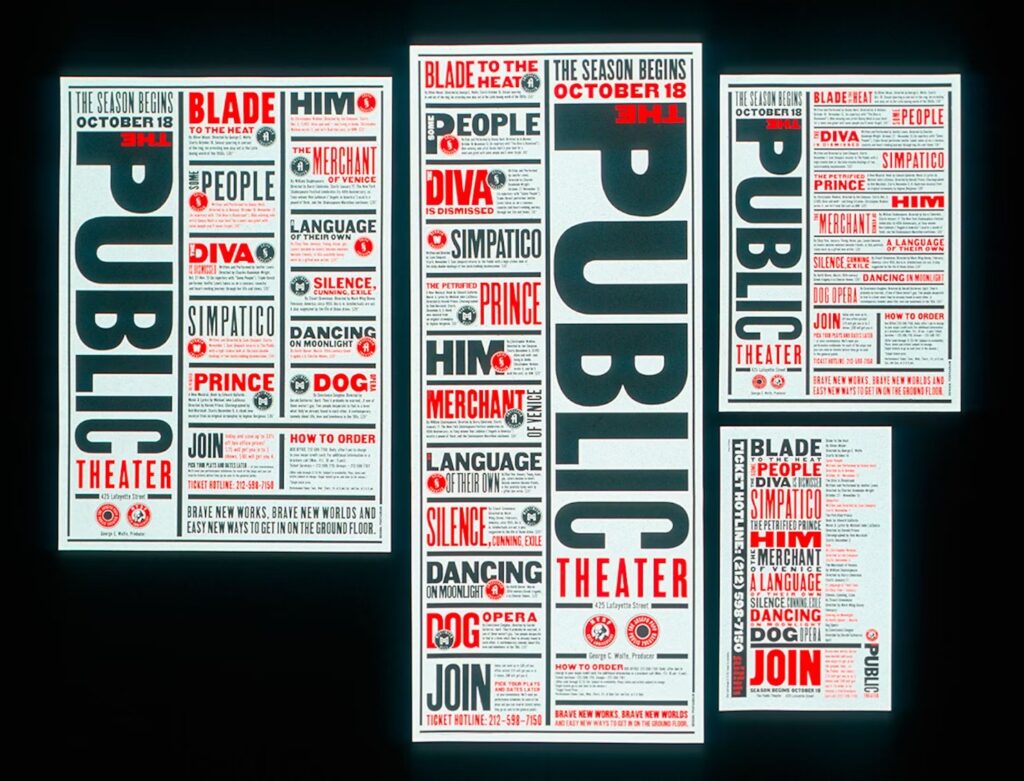
Paula Scher is a titan in the world of graphic design, known for her revolutionary approach to typography and identity branding. As a partner at Pentagram, the world’s largest design consultancy, Scher has redefined the visual language of culture and commerce. Her work for The Public Theater in New York City, with its bold typography and dynamic visuals, breathed new life into the institution’s branding, making it iconic within the arts community. She also developed the logo for one of the world’s largest financial institutions, Citibank.
Scher’s designs are characterized by their clever use of type, vibrant colors, and energetic compositions, making her an enduring influence in the design industries. Described as the “master conjurer of the instantly familiar,” Scher straddles the line between pop culture and fine art in her work. Iconic, smart, and accessible, her images have entered into the American vernacular. She has designed identity systems, environmental graphics, packaging and publications for a wide range of clients that includes, among others, the Public Theater, the Museum of Modern Art, the High Line, the Metropolitan Opera, Tiffany & Co., Citibank and Microsoft.


1. April Grieman
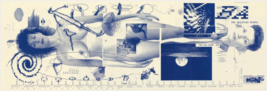
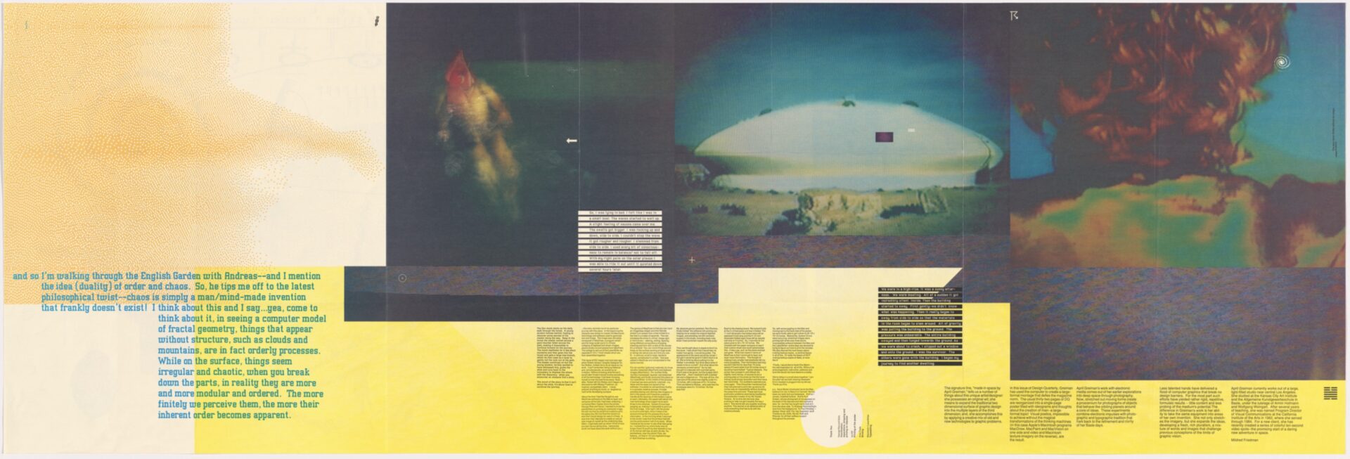
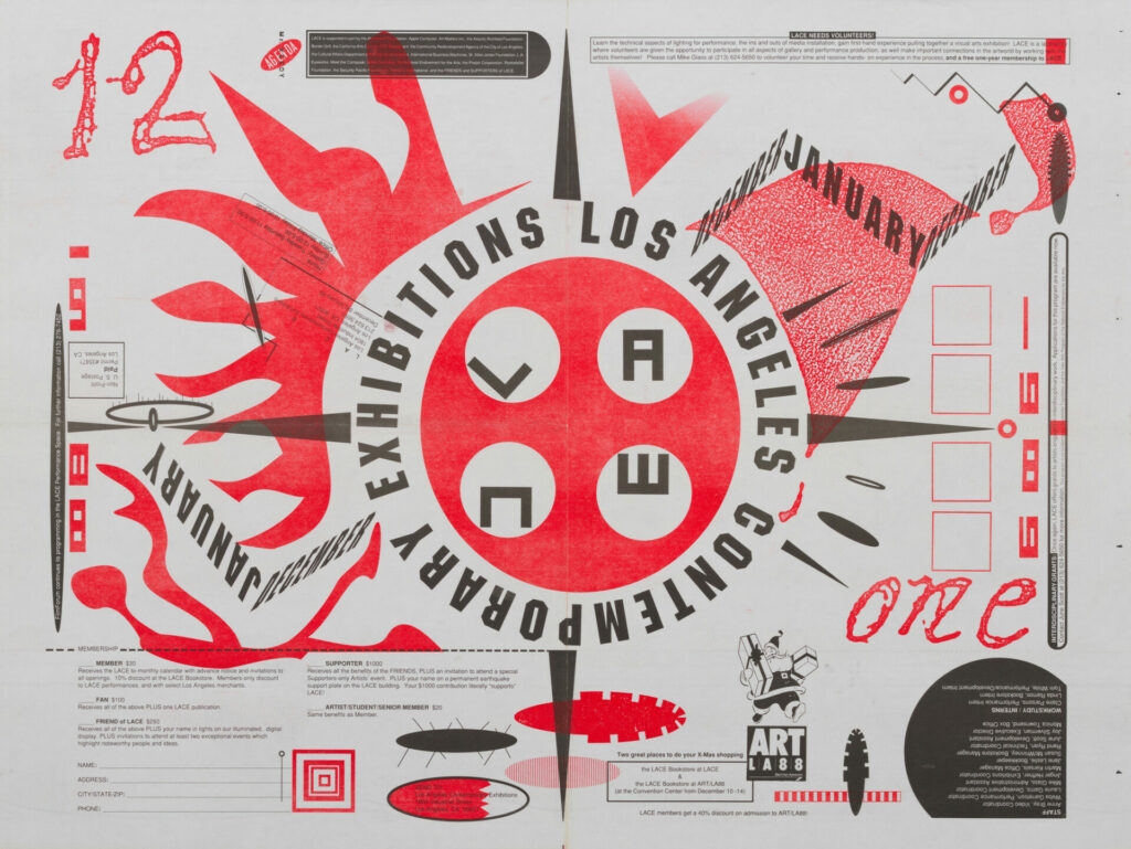
April Greiman is a trailblazer in digital art and design, recognized for her innovative use of technology in graphic design. Often considered as one of the first designers to embrace computer technology as a design tool, Greiman’s work in the 1980s heralded a new era in digital design. Her project “Does It Make Sense?” is famously known for its explorative use of digital imagery and typography, challenging the traditional boundaries of design. Greiman’s contributions have significantly influenced the evolution of graphic design from print to digital, showcasing the potential of technology in creative expression.
Greiman studied typography—the design and arrangement of letterforms—in Basel, where she was trained in the style of classic Swiss modernism. Returning to America to open her own design studio in Los Angeles, she found herself at the vanguard of a graphic movement: one that eschewed the grids, sans serifs, and clean look of most modern typography, embracing instead a digital aesthetic and adopting the computer as a design tool. Does It Make Sense? is Greiman’s design for a two-sided fold–out issue of Design Quarterly magazine. Produced in 1986 entirely with MacDraw—an early digital drafting application—Does It Make Sense? layers textures of pixilated video, text, and appropriated imagery, evincing Greiman’s interest in time–based media, textiles, and environmental graphics
1. Lorrain Wild
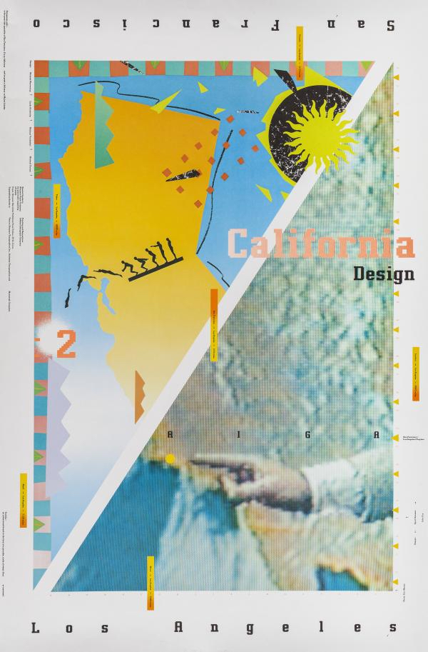
Lorraine Wild is celebrated for her contributions to book design and her influence on the Californian design scene. As a graphic designer and educator, Wild has been instrumental in shaping the approach to contemporary book design, blending historical techniques with modern sensibilities. She was among the first American designers to take apart the clear grids and minimalistic forms of Modernism, believing that collage could better respond to the fractured nature of modern society.
Through much of her career Wild has specialized in books, particularly visually sophisticated collaborations with artists, architects, and museums. She has designed award-winning publications on the work of Daniel Libeskind, John Hejduk, Mike Kelley, Richard Tuttle, Bill Viola, Morphosis, and many others. If her work shares any signature, it is a sense of flow that gives even the most diverse typefaces, disparate layouts, strange images, and dense bodies of text an intrinsic and logical relationship to the other elements on the page.
3. Deborah Sussman
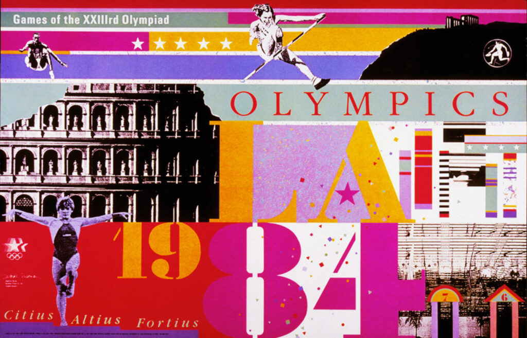
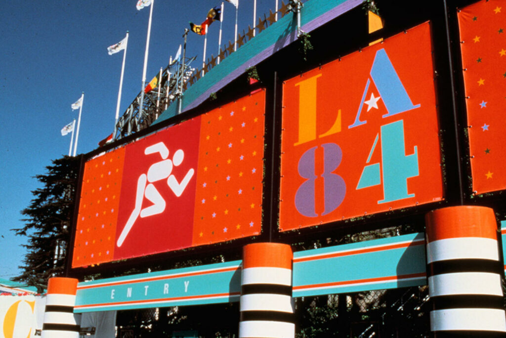
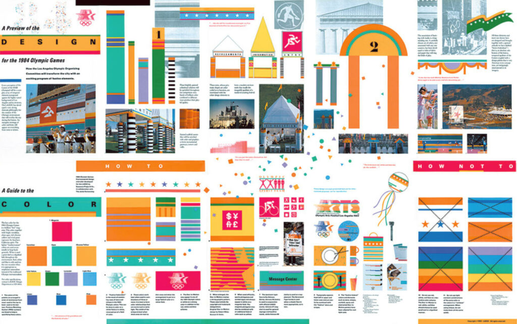
Deborah Sussman is renowned for her pioneering work in environmental graphic design and urban branding. Her most notable project, the visual identity for the 1984 Los Angeles Olympic Games, showcased her ability to blend vibrant colors, bold graphics, and local culture into a cohesive visual language that transformed the cityscape. Sussman’s work is characterized by its playful yet structured approach to design, integrating graphic elements into physical spaces in a way that enhances and enlivens public environments. Her legacy is evident in the continued relevance of environmental design in shaping our experience of shared spaces.
She got her first job for Charles and Ray Eames at the age of 22, where she worked on seminal exhibits for IBM. Shortly after, Sussman won a Fulbright Scholarship to study at the Hoschschule für Gestaltang, an art and design school in Ulm, Germany. Eventually, Sussman opened her own design practice in 1968 and years later, her husband, Paul Prezja, an urban planner and architect, joined her. Some of their projects included designing wayfinding systems for Walt Disney Resorts and interiors for Hasbro, Inc. One of the last projects she was involved in was signage for Grand Park, which opened in downtown Los Angeles in 2012. It included 16-foot-high entrance totems that read “the park for all” in 26 languages.
5. Susan Kare
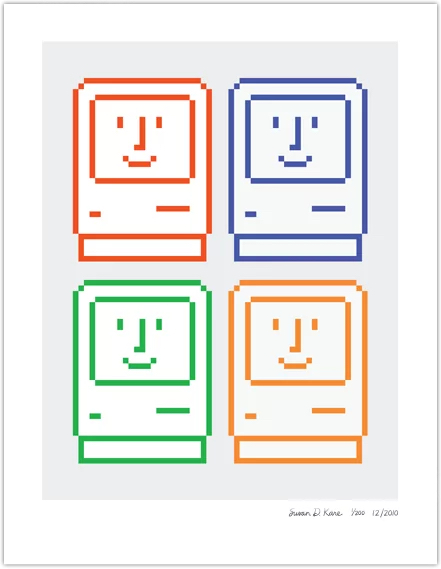
Susan Kare, a pioneering figure in the field of digital interface design, is best known for her work on the original Macintosh team at Apple. Her iconic bitmap graphics, including the lasso, the grab hand, and the happy Mac icon, have become deeply ingrained in the fabric of digital culture. Kare’s designs are celebrated for their simplicity, humor, and universality, qualities that have made the Macintosh interface friendly and accessible to millions of users worldwide. Her work demonstrates the power of design in making technology approachable and intuitive for users, marking a significant milestone in the history of digital design.
“Bitmap graphics are like mosaics and needlepoint and other pseudo-digital art forms, all of which I had practiced before going to Apple,” she told an interviewer, in 2000. The command icon, still right there to the left of your space bar, was based on a Swedish campground sign meaning “interesting feature,” pulled from a book of historical symbols. Kare looked to cross-stitch, to mosaics, to hobo signs for inspiration when she got stuck. “Some icons, like the piece of paper, are no problem; but others defy the visual, like ‘Undo.’ ” At one point, there was to be an icon of a copy machine for making a copy of a file, and users would drag and drop a file onto it to copy it, but it was difficult to render a copier at that scale. Kare also tried a cat in a mirror, for copycat. Neither made the cut. She also designed a number of the original Mac fonts, including Geneva, Chicago, and the picture-heavy Cairo, using only a nine-by-seven grid.

As we reflect on the contributions of these remarkable women, it’s clear that their creativity, resilience, and vision have not only shaped the landscape of graphic design but also challenged and expanded the possibilities of visual communication. Their legacies serve as a testament to the transformative power of design and a source of inspiration for future generations of designers.
Did you find this article interesting? If yes, you might also enjoy our post on chocolate packaging or the 2024 Pantone color of the year.