flux branding
Feed Your Mind
EAT WTR is a sustainable bottled water company that donates a percentage of their profits to supporting mental health organizations and suicide prevention resources. We designed a brand to catch eyes on the shelf and clearly communicate how they’re making a difference
Client
EAT Water
Consumer
EAT wtr
- Strategy
- Brand Identity
- Visual language
- Packaging & Merchandising
- Website
Brand Identity
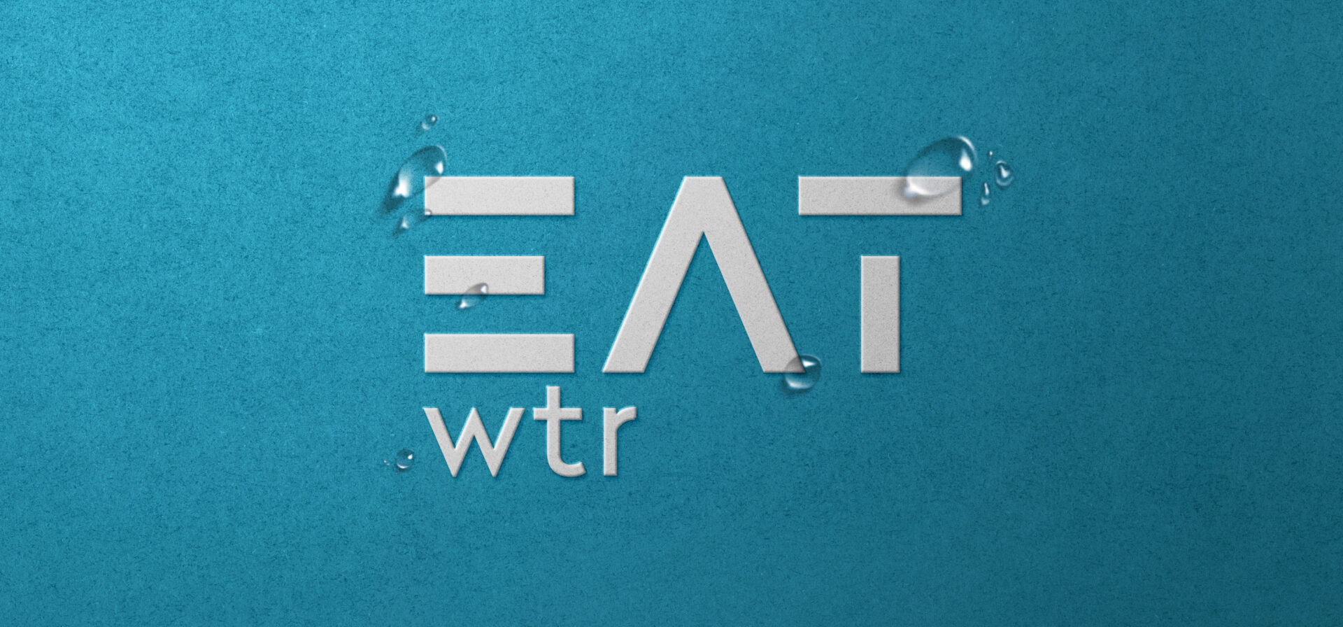
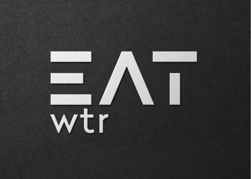
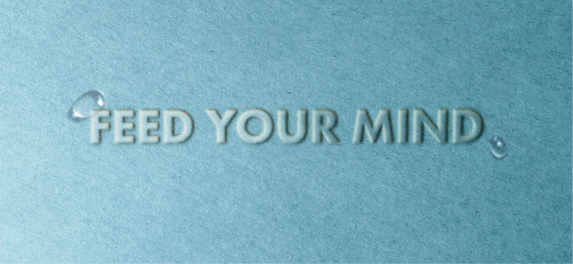
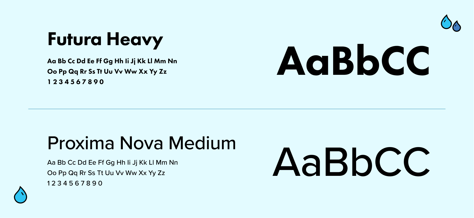
A bold, black and white logo with modern sans-serif font feels streamlined and clean. Born from the idea that how you feel depends on what you put inside, we wanted the visual language to be uncluttered, evoking the idea of clear water and clear minds. The tagline “Feed Your Mind” links their cause and name together.
Packaging & Merchandising
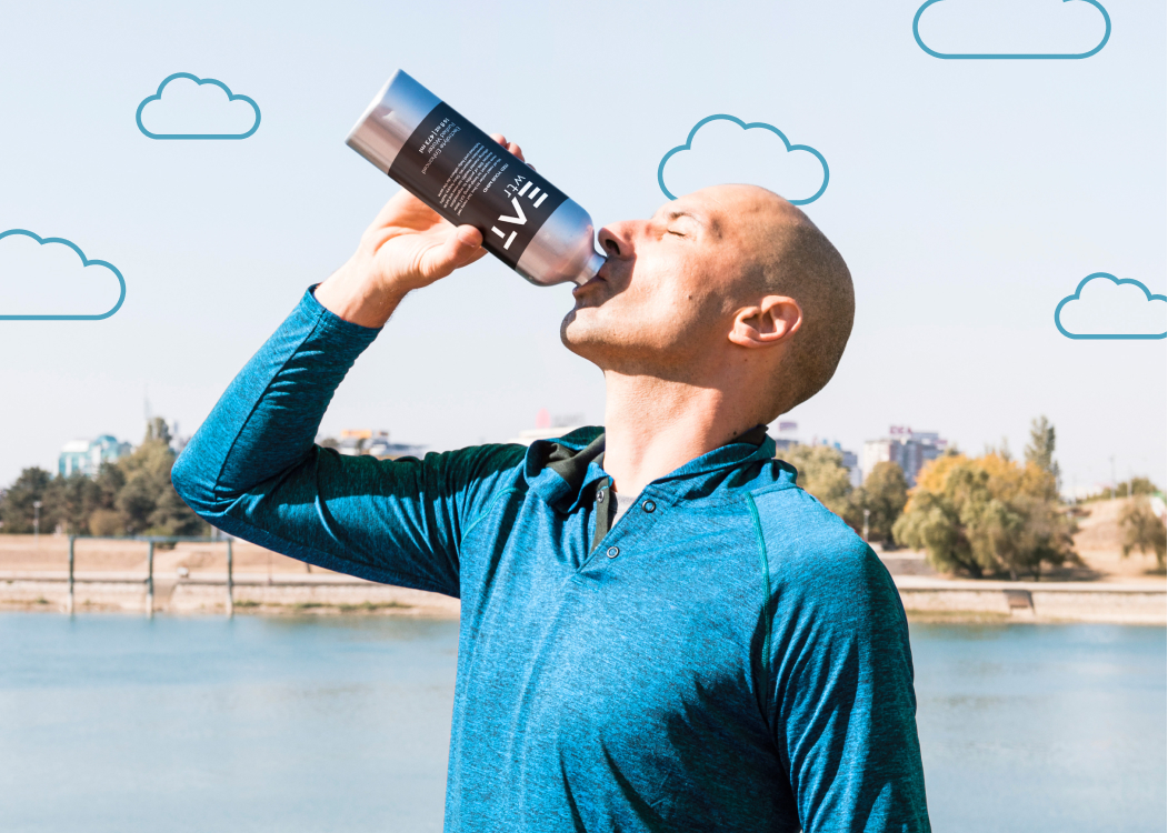
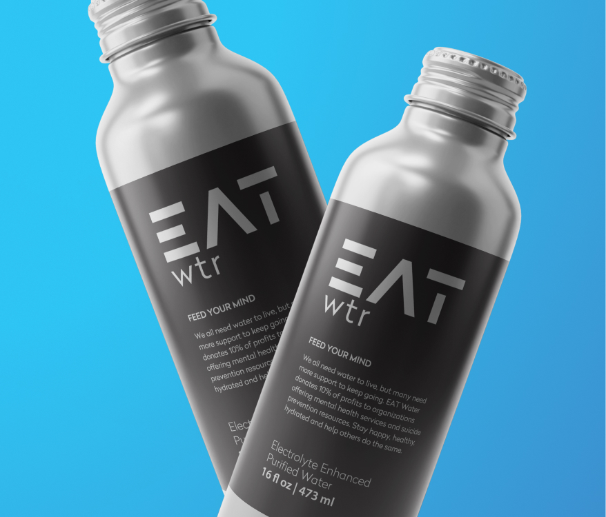
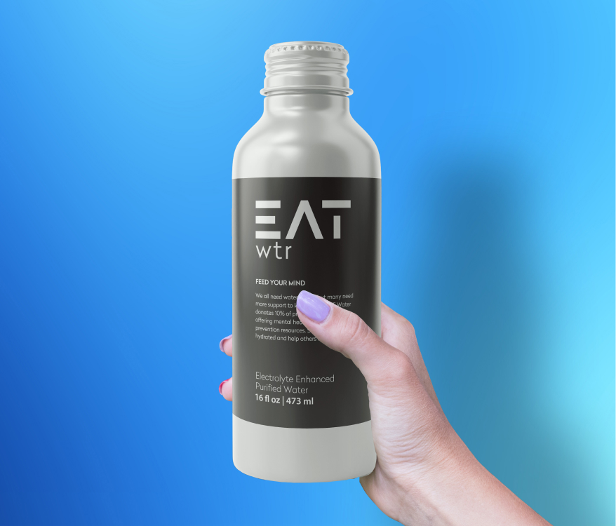
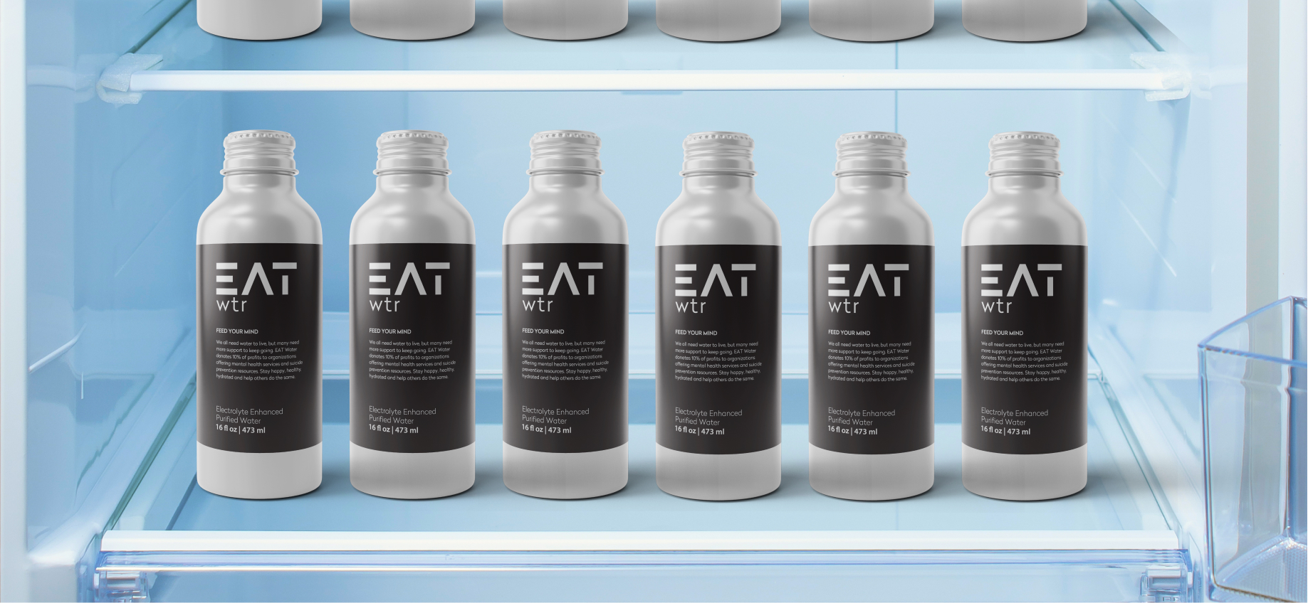
For packaging, we sourced a sustainable aluminum bottle. The matte black label contrasts nicely with the silver, creating a unique look that stands out among the competition.
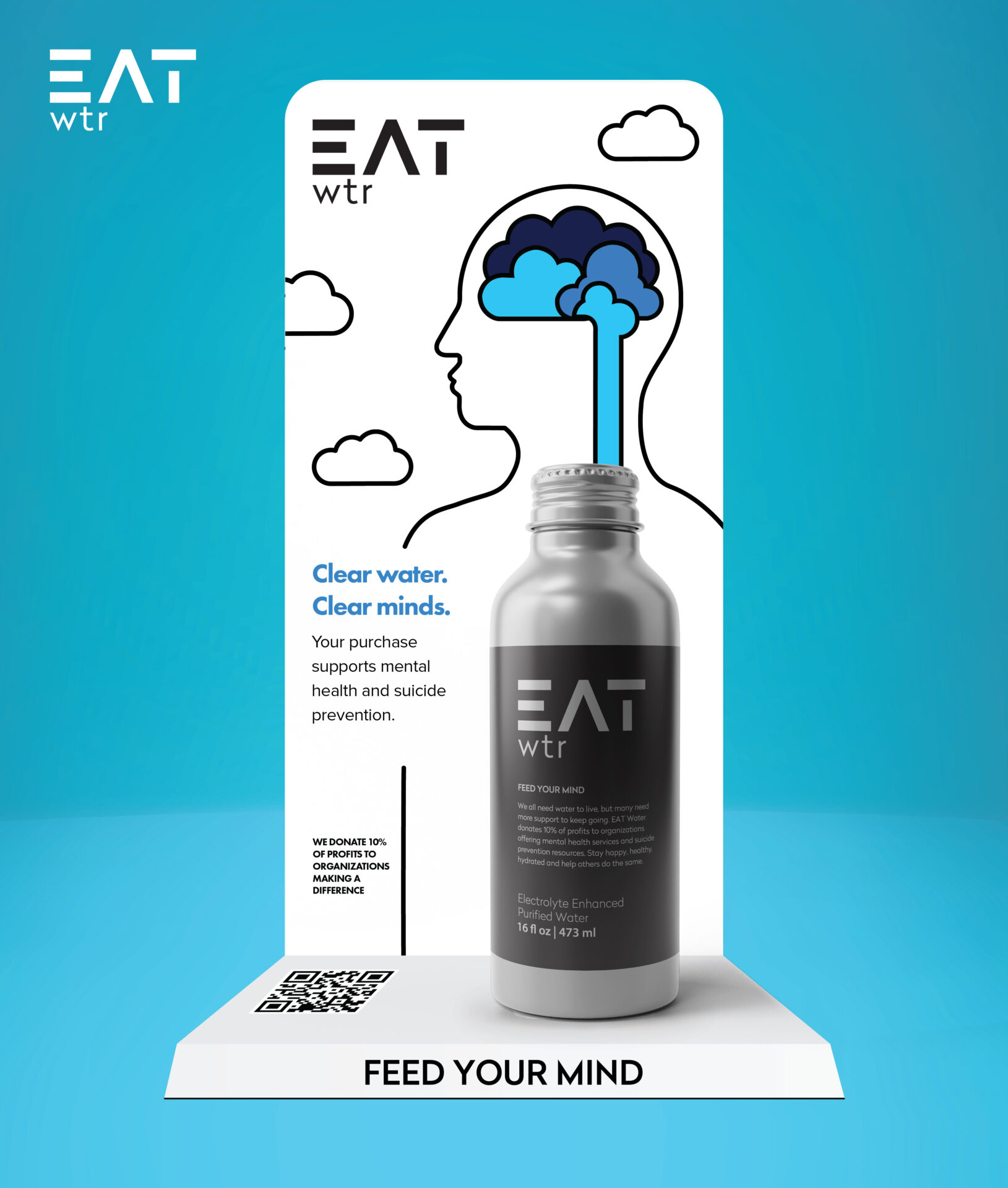
We designed and sourced a merchandise display to promote the product at the register of several fast casual restaurants in Southern California.
Visual language
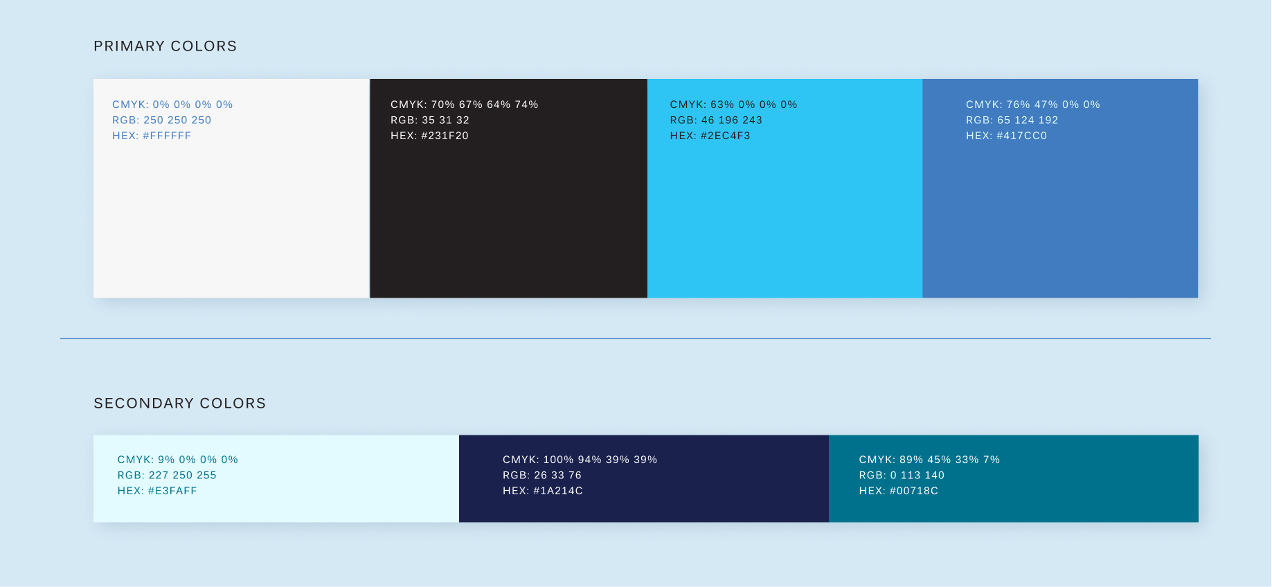
We created a set of custom illustrations for the brand, combining brains, water drops, and clouds. The monoline style feels friendly and clean, and a blue color palette reinforces the product.
Website
We wrote, designed, and developed EAT WTR’s website to bring all of these elements together. Incorporating animations and realistic bottle mock ups allowed us to launch the site while packaging was still in production to build interest for the brand before it hit shelves.
