
Over on our portfolio this month, we’re doing a deep dive into the new brand we crafted for EDS, a leading provider of vehicle service contracts. And it’s August– the season of summer road trips, scenic highways, and holiday weekend traffic. That’s all to say: we’ve been thinking about cars a lot.
When you’re stuck bumper to bumper on PCH on the first hot Saturday of the year, you get well acquainted with something we see all the time but usually don’t think too much about– the license plate. At Flux, we’re always thinking about the design we live with, the design that’s so ubiquitous we barely notice it anymore. How does design find it’s way into our everyday? Every piece of design has a history. Today on the blog, we’re diving into the history of the California license plate.
The California license plate is one of the most boring plates in the country.
But it wasn’t always that way!
Check it out in 1914:

And in 1920:

By 1956 the state of California decided to standardize plate design and format. Here’s the first standard plate issues by the state:
We love that yellow!

Then they reversed the colors from 1963-1969. The black and gold is WAY cooler than our current red white and blue situation.

Then in the 1970’s, the base color was changed to blue with gold lettering. The state name remained embossed.

Then in the 1980s, they switched to a classic 70’s surfer look. We’d put this on our car today in a heartbeat.
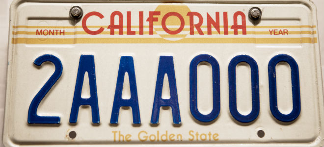

Tragically in 1987, it was changed again to our current look. The script font just screams late 80’s.

Looks like many Californians agree that the late 80’s look is no longer preferred. Many are willing to special order the black with yellow (1963-1969) for a custom plate fee of $50.
So there you have it. A bit of design history to keep your mind moving when you’re stuck in traffic this summer. What’s your favorite plate? We’d love to find out.