flux branding
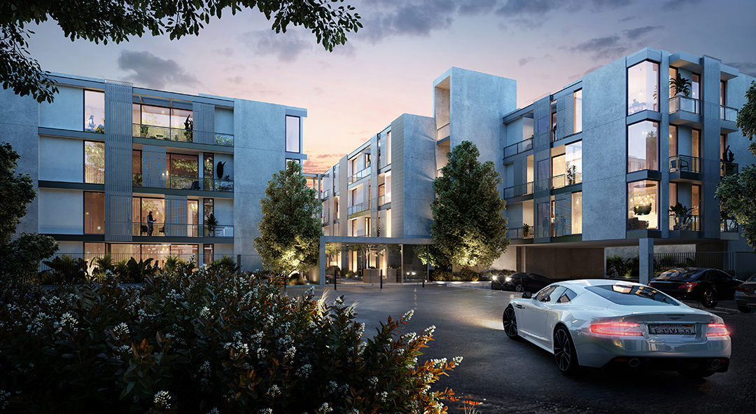
Brentwood's best kept secret.
This new collection of high-end rental residences in one of LA’s most desirable zip codes needed a way to tell their story. We crafted a brand that exudes curated sophistication and secluded tranquility.
Client
Respara
Real Estate
Respara
- Positioning
- Messaging Strategy
- Naming
- Signage
- Identity
- Logo
- Website
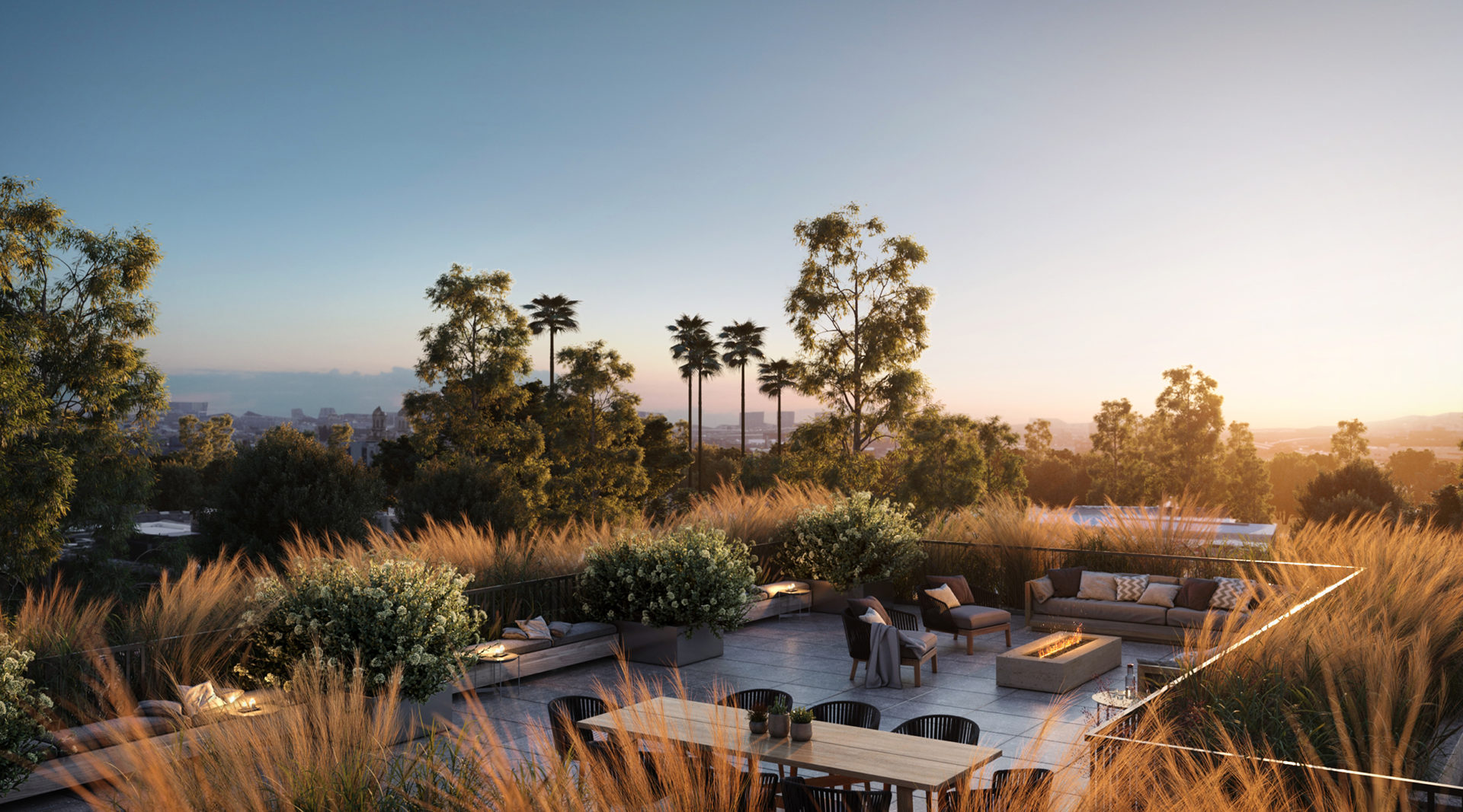
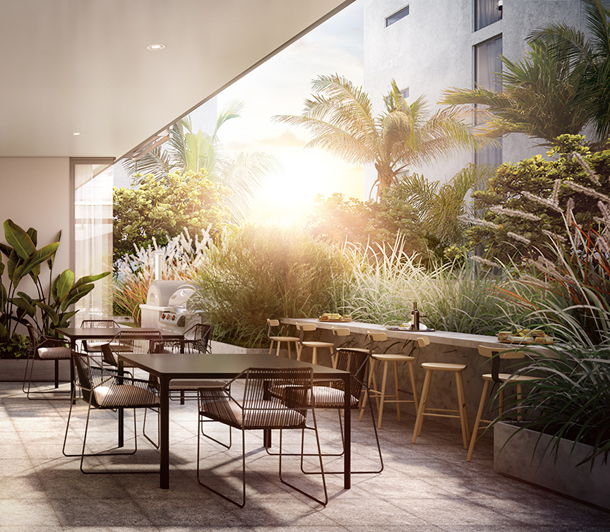
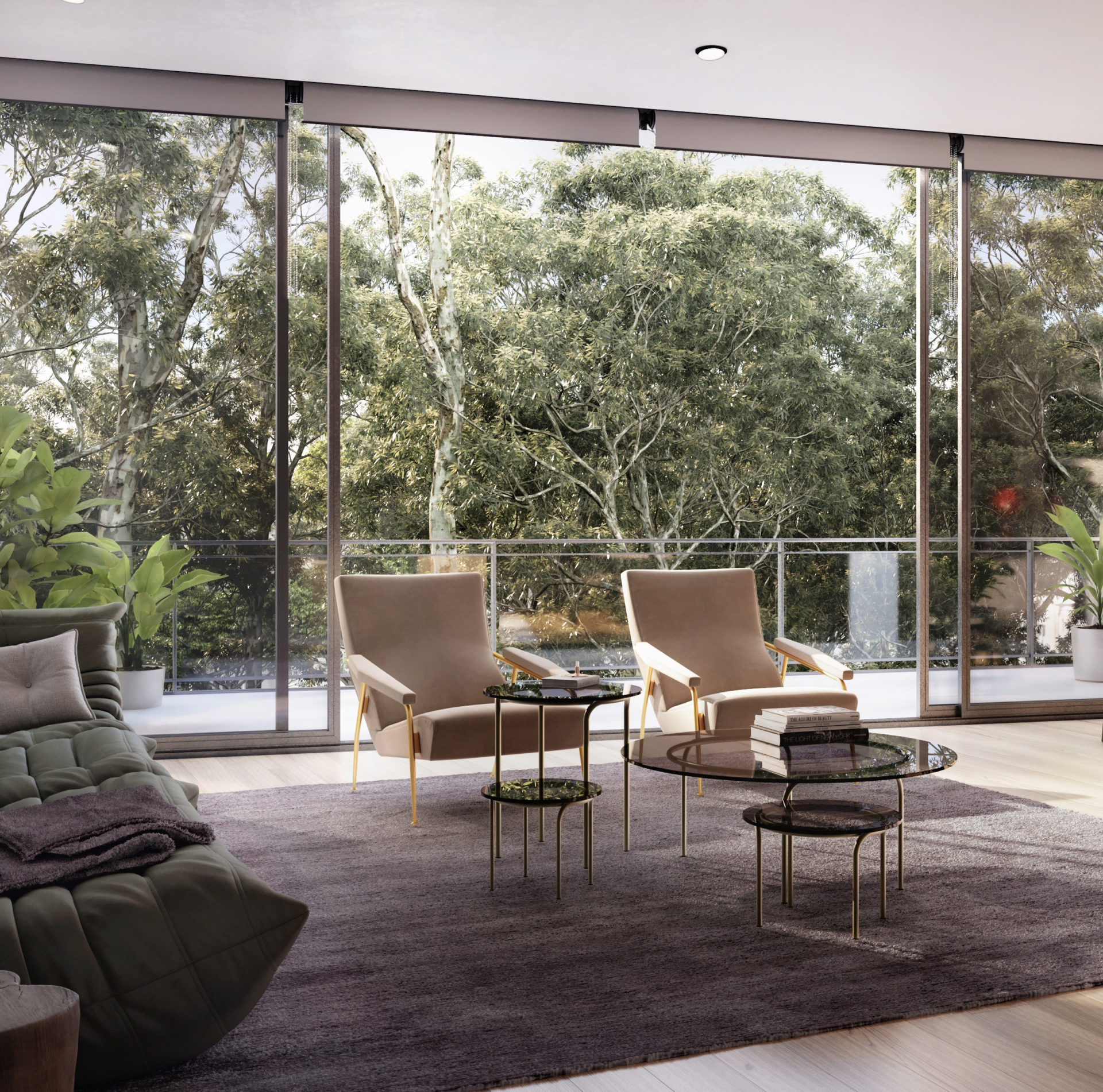
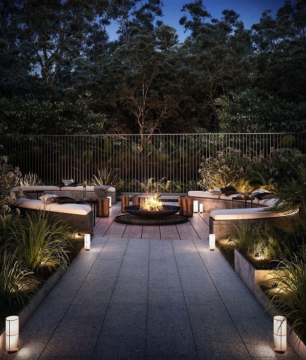
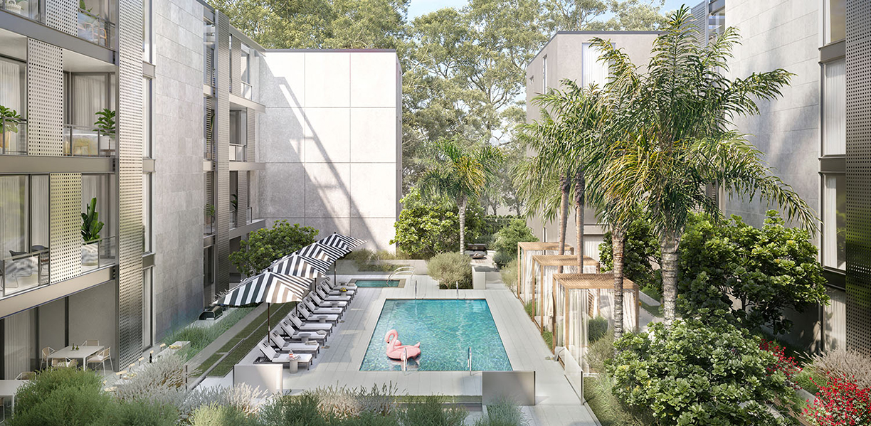
A lushly landscaped property tucked away at the end of a quiet cul-de-sac, to find this hidden oasis you have to know where to look. We set out to create a brand that would support leasing at above-market rents, emphasizing the rarity of this private location that typifies laid-back California luxury.
Positioning
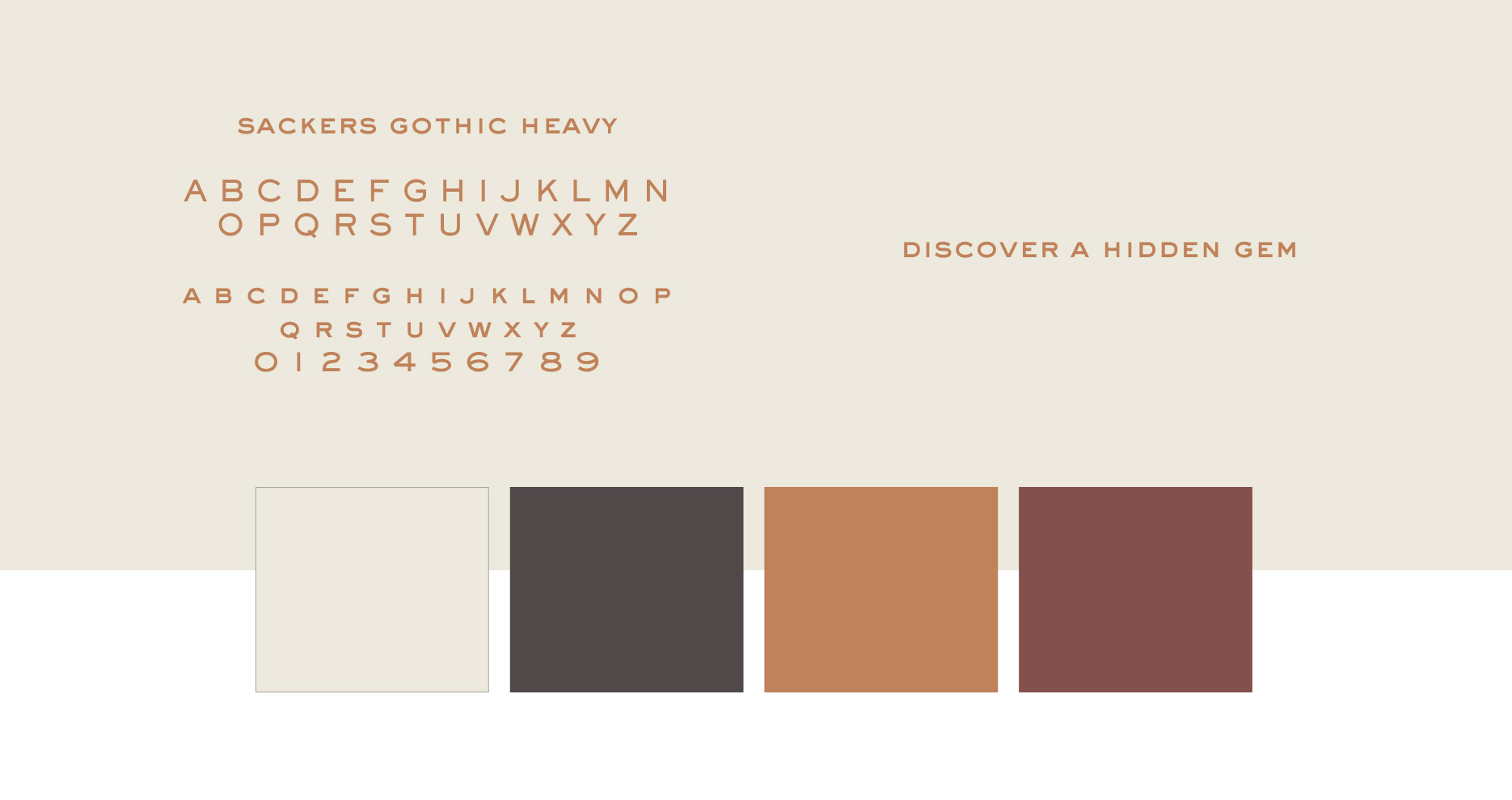
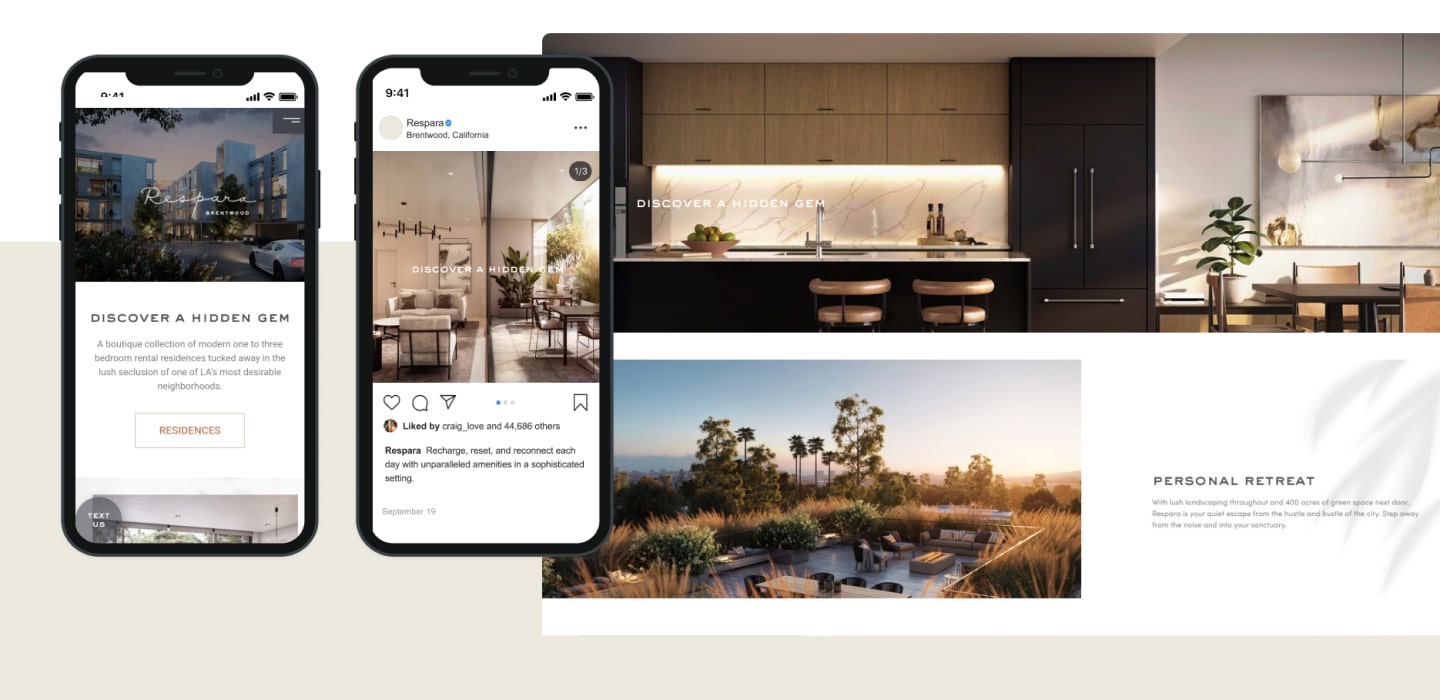
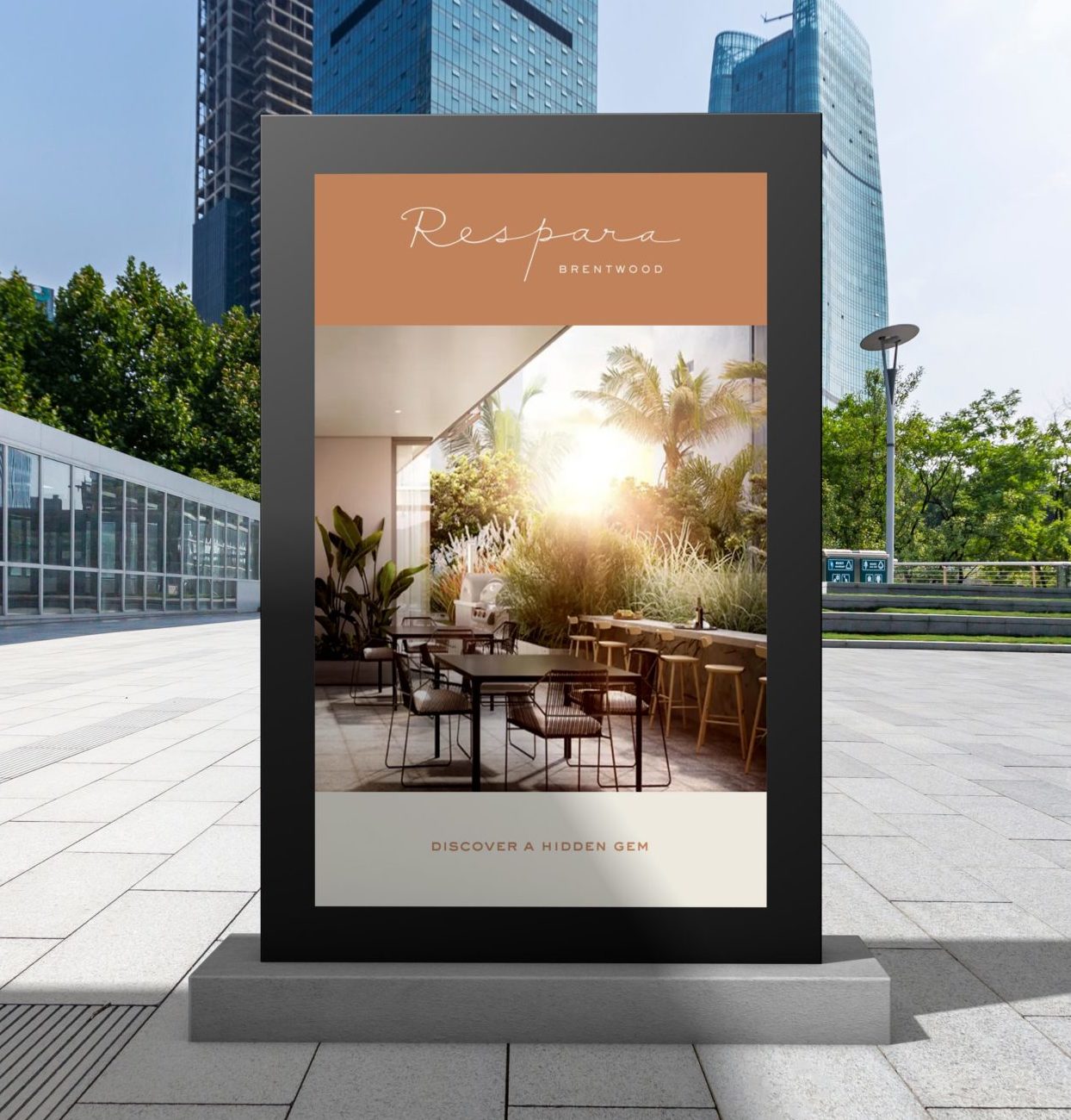
We positioned the building as a secret garden in the city, inviting residents to “discover a hidden gem.” A brand voice that balances elevated luxury with down-to-earth relaxation communicates that this is a unique space to unplug from the hustle and tap into your potential.
Naming
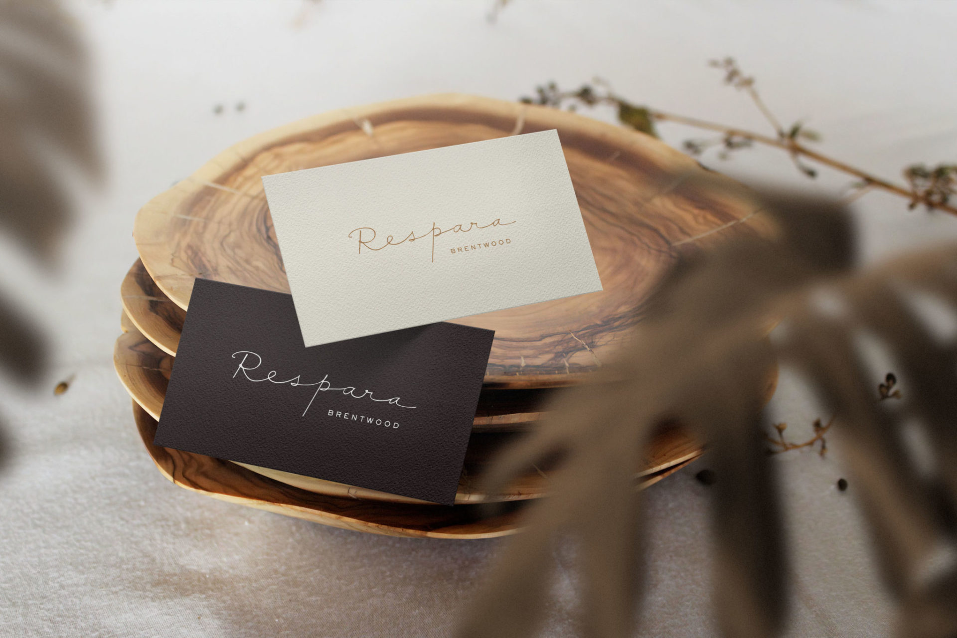
The name Respara is derived from the Italian word for breath. Bringing to mind rest and retreat, speaking the name aloud feels like a soft exhalation, setting a calm and relaxing tone.

Brand Identity
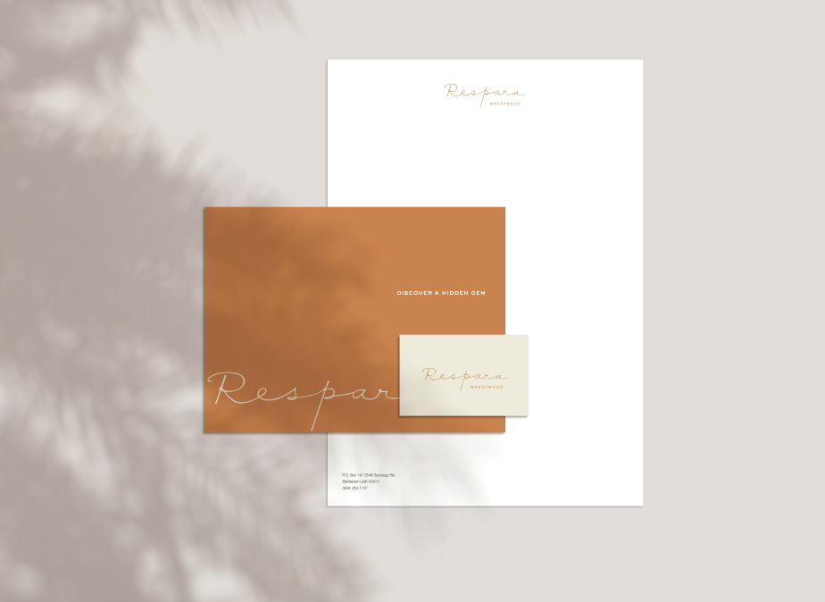
Logo and visual language focus on warm, natural colors and incorporate delicate, handwritten script. The brand identity recalls sunlight spaces, California nature, and attention to fine details, immediately communicating what makes Respara special before you even walk through the door.
