flux branding
Mindful living in Palo Alto
This intimate collection of luxury residences in a lush corner of downtown Palo Alto needed to tell their story to a highly discerning audience. We positioned the property as a unique space for those looking to clear and expand their minds.
Client
Wilson Meany
Hospitality
Arbora
- Brand Positioning
- Naming
- Brand Identity
- Website
- Print Collateral
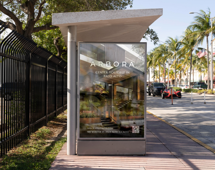
- Digital Ads
Market Insights
Wilson Meany Developers came to us when this property was still in construction to craft a brand that would resonate. Working closely with the team, architects, interior designers, we created a detailed insight report including market dynamics, target audiences, and unique differentiators.
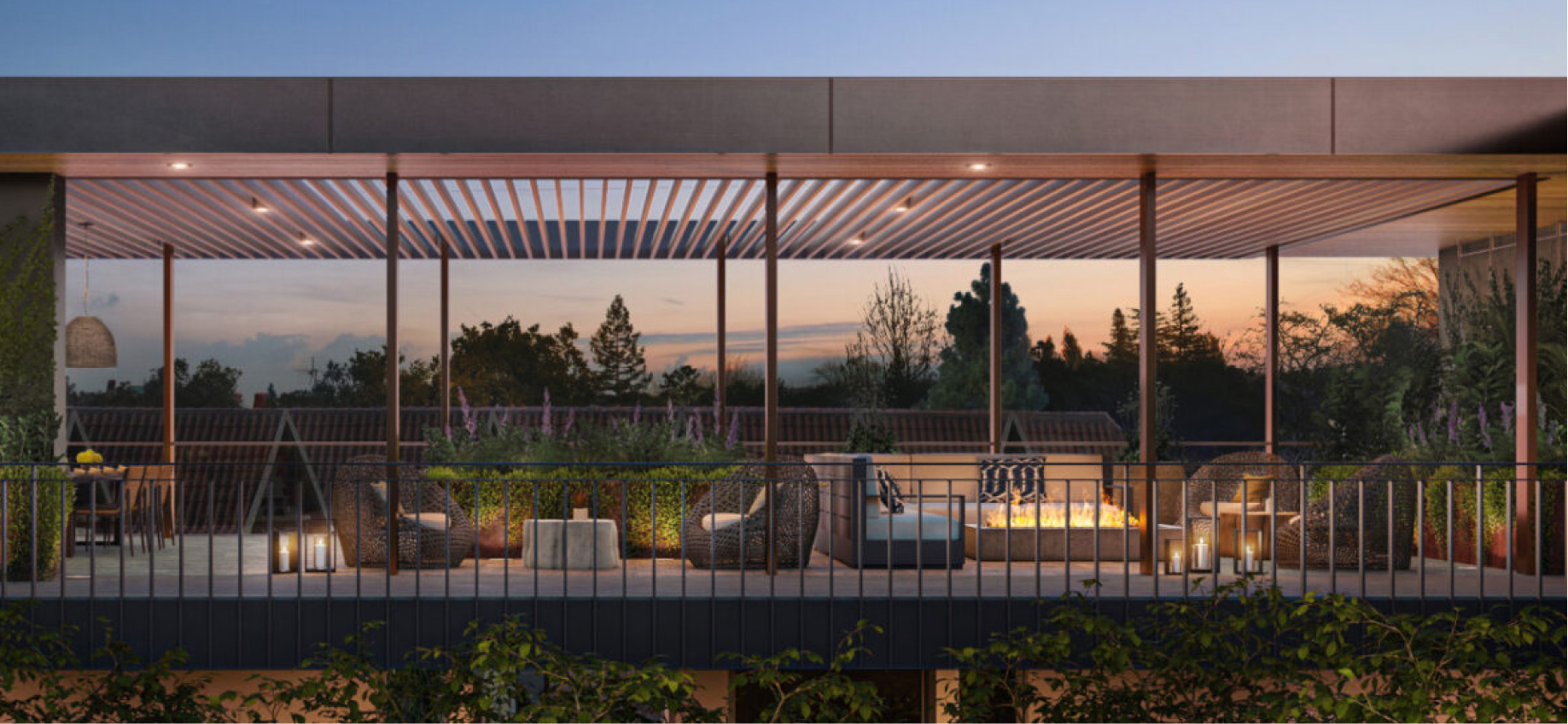
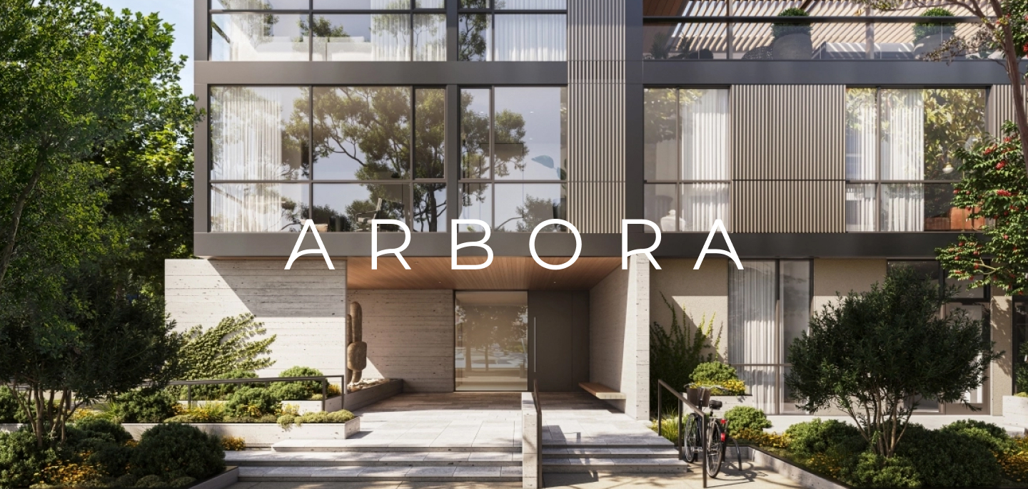
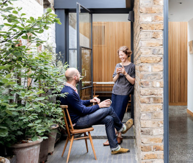
During our site visit, it became clear that this building was one of the only luxury options in downtown Palo Alto, and definitely the most design-forward space in the area. We were struck by the fluid connection between indoor and outdoor, a hallmark of California modernism, and the beautiful light from the floor to ceiling windows.
Brand Positioning
To capture this feeling of serenity and calm, we came up with the concept of “Mindful Living”. Surrounded by redwood trees and maples, the space brings residents into their awareness. Surrounded by the visionary minds of Palo Alto and just a stone’s throw from Stanford, this is the ideal place to think big.
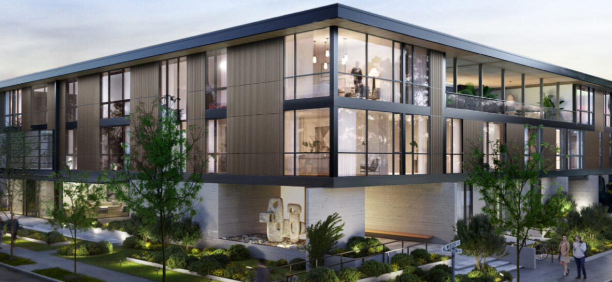
The idea encapsulates both what makes this place so peaceful and what makes it so exciting. All messaging grew from this foundation, focusing on ideas of sensory awareness, intentional living, and thoughtful design.
Brand Name
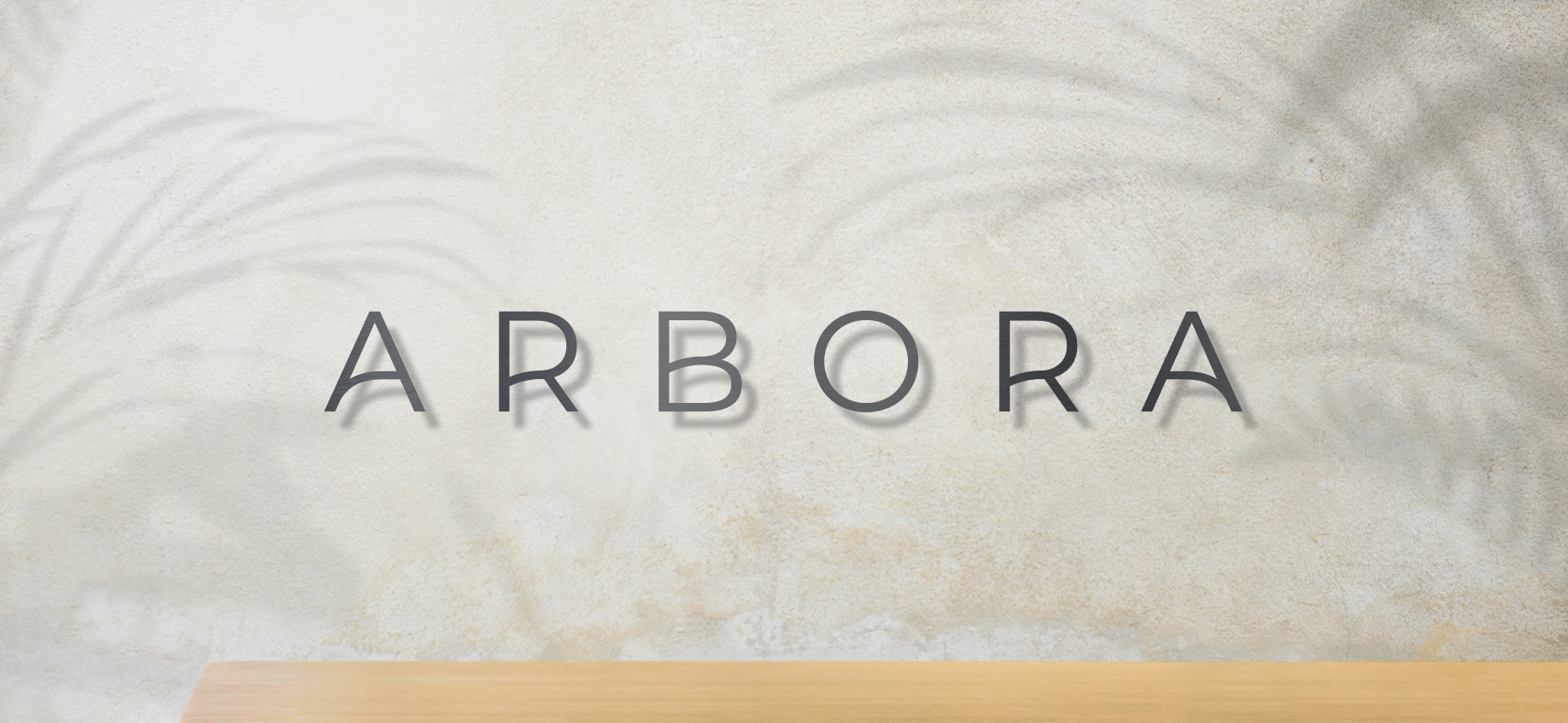
After a rigorous naming and encumbrance process, we decided on the name Arbora. Drawn from the Latin word for trees, it plays on the fact that the property is surrounded by redwoods and maples. The soft sounds are relaxing and melodic, while the repeated r’s and a’s create a beautiful frame for the word.
Brand Identity
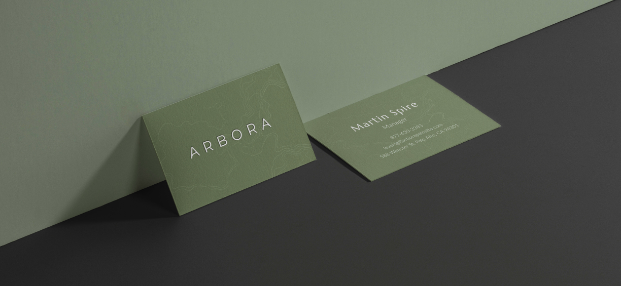
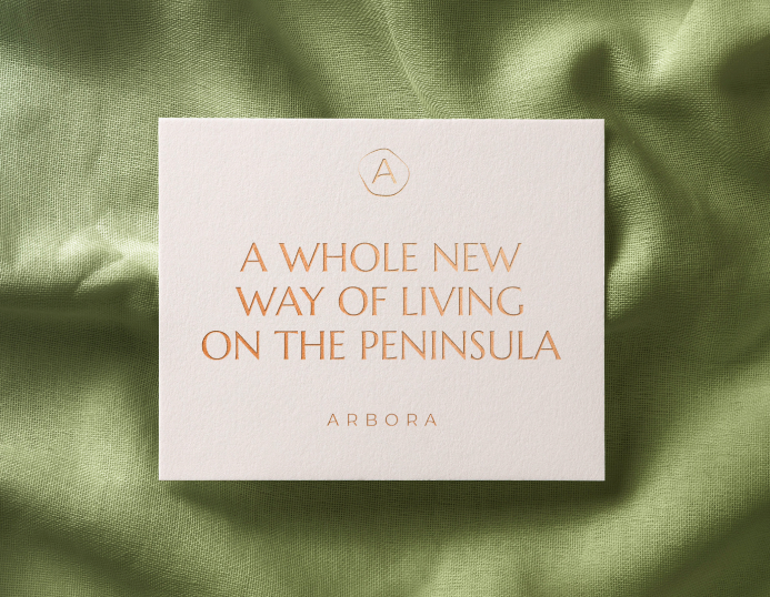
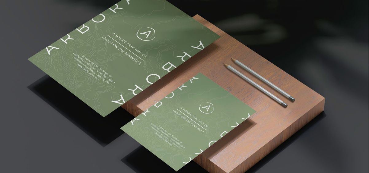
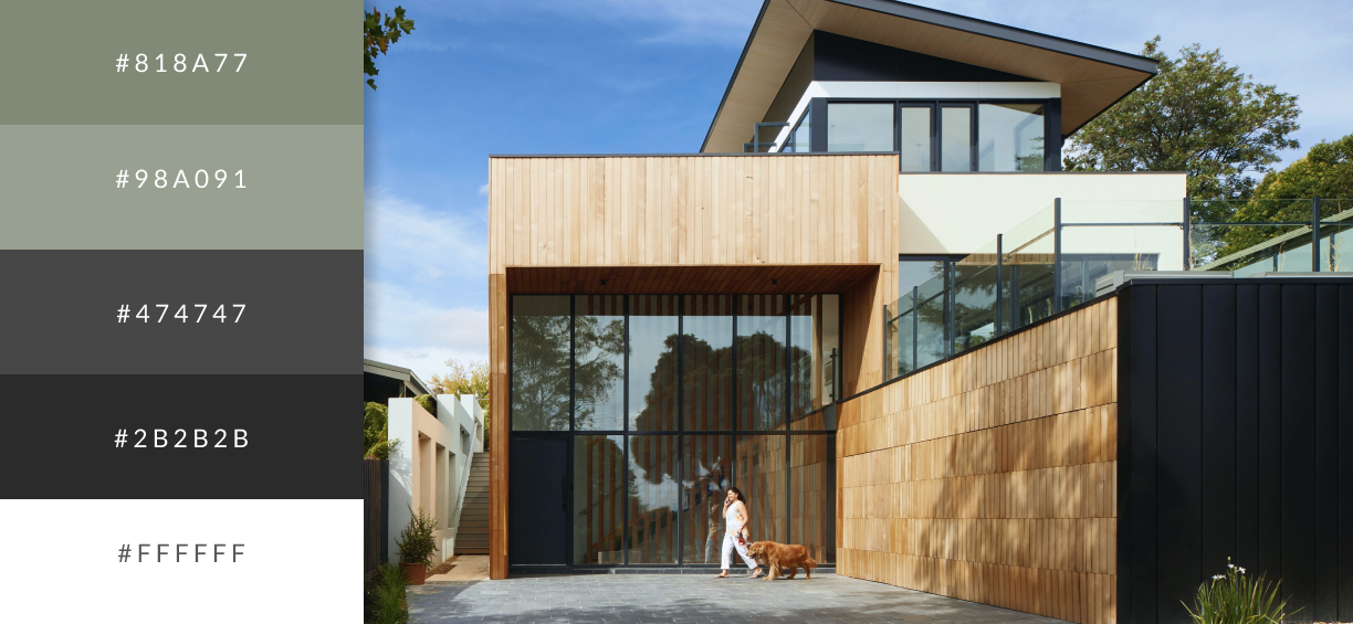
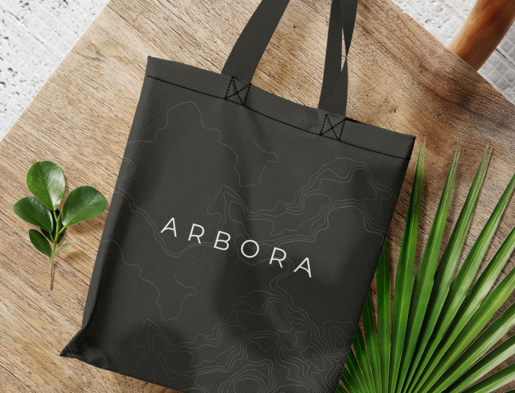
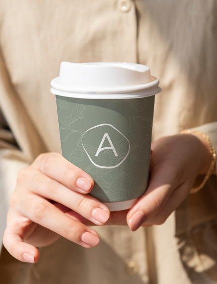
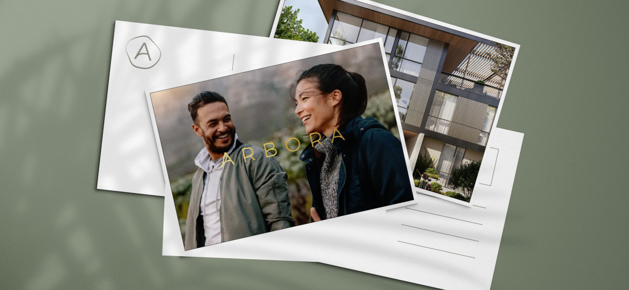
We drew inspiration from mid-century modern Danish and Japanese design, but combined it with slightly curved letterforms and an organic line pattern to bring in a sense of warmth and femininity.
Website
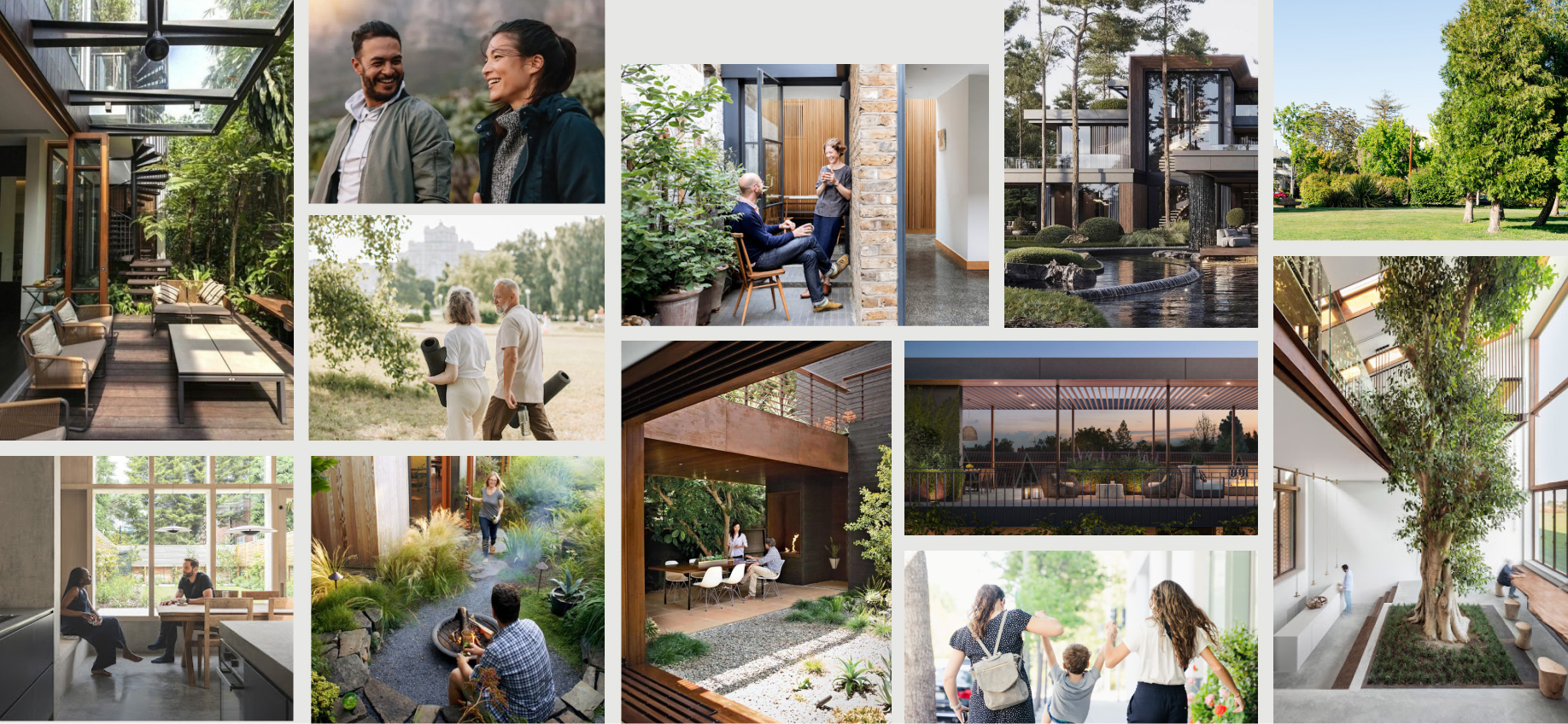
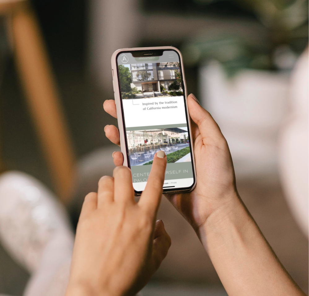
Using carefully selected lifestyle imagery, textures, and colors, we successfully communicated the peaceful atmosphere that makes Arbora such a desirable place to live. The site feels sophisticated and luxurious but still grounded, appealing to design savvy residents who are seeking a truly stunning space to come home to.
